DPChallenge: A Digital Photography Contest You are not logged in. (log in or register
 
Browse Settings
Currently viewing:
Registered UserKiwiShotz

Show comments:

Per page:

Order:

Comments:


Comments Made by KiwiShotz
Pages:   ... [150] [151] [152] [153] [154] [155] [156] ... [216]
Showing 1521 - 1530 of ~2151
Image Comment
The Morning Nebula
10/05/2005 03:21:08 PM
The Morning Nebula
by Beach_mel

Comment:
So simple yet so effective. I believe that this demonstrates the strength of good composition. The light is smooth, low and interesting and the overall effect of the black areas gives the image its strength
Photographer found comment helpful.
Waiter,I asked for LIGHTENER,not BRIGHTENER !!
10/05/2005 03:18:11 PM
Waiter,I asked for LIGHTENER,not BRIGHTENER !!
by elderell

Comment:
Great idea, I expected to see that in "Beverages". This just feel over lit. The light is flat and gives the cloth too much significance in the image. I'm trying to imagine it on a dark background,
Photographer found comment helpful.
A Simple Life
10/05/2005 03:15:20 PM
A Simple Life
by joysee

Comment:
Ok, this is interesting. Love the shapes, this image *does* love the almost B&W and the simplicity is attractive. I can't make up my mind about the composition, something is "off" a little but I can't decide what that is. The book is a key element in the contrast of shapes so its not that although I feel the cup may be too centreed in frame. A major niggle though (looses at least a point) is that you haven't rotated the image to get your horizon level.
Photographer found comment helpful.
Solid coffee
10/05/2005 03:06:51 PM
Solid coffee
by olipall

Comment:
This is quite centred and the depth of field is just too shallow
Photographer found comment helpful.
Perfect - Good Coffee, Good Music
10/05/2005 03:05:34 PM
Perfect - Good Coffee, Good Music
by kari1

Comment:
Great composition, good light, and an interesting take on the challenge
Photographer found comment helpful.
Friendship
10/05/2005 02:31:04 PM
Friendship
by stupot

Comment:
::: Critque Club :::
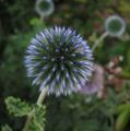
What a great subject for a generic photo. I agree with others about how this almost has a 3D quality to it. That flower has some amazing visual properties, at times it looks like its moving. Isn't nature wonderful.

This meets the challenge well because it is a generic but interesting and attractive shot. No, its not spectacular but although it doesn't have a wow factor, it does have an invlvement factor. The flower is so intriguing that it stops you and requires you to examine it. Thus the image transcends the first barrier to mediocrity - passivity. I can thing of no worse condemnation for any image than getting a flatline response from a viewer.

Photographically you have good light, good exposure, good focus and an ok depth of field. The DOF I can't make my mind up about. Like the commenters who seem equaly divided between making it sharper or making it blurrier. Currently the eye is drawn to the background at some cost to the main point of interest. That's perhaps a little confusing or distracting and may be a reason for it not scoring higher.

I believe this reaction is more a result of composition than the DOF. I know I sound like an old broken record on composition and the Rule of Thirds but I believe photographers, artists and cinematographers ignore it at their risk.

In this case I'd like you to have a play with it by cropping it differently and seeing what is the most pleasing to your eye. Try moving it around until and save a copy with the flower centre on all four of the thirds intersecting lines. Then see what you have as background when you crop it in a 6:4 (card shaped) format. From the odd sizing of the image as submitted, I suspect this bothered you too and that you spent some time trying to get a pleasing composition. You may find from this exercise that the two background flowers become a feature or need to be cropped out. Only fiddling with the original will tell you for sure.

I'm actually tempted to take a copy and try it myself as a test of the Thirds theory but I'm strong, I can do this, I can keep my hands off. However, I *would* like to see it done and would like to see you post the results back in your portfolio and your comments here.

Lastly, a pet peeve about Photographers Comments. This is not just to you, but to all DPCers. If you are asking people to give of their time to consider your image in voting then it is more than a courtesy to take the time to write a few paragraphs about the shot, the day, the subject and the setup. This is a learning and sharing environment and we all want to learn. If you click the Critique box, then making that effort becomes an obligation.
Photographer found comment helpful.
Get Well Soon
10/05/2005 08:18:17 AM
Get Well Soon
by hubbardr1

Comment:


If you tick the box requesting to have your images critiqued, it is a courtesy for you to make the time and put in the effort of filling out all the fields relating to the image.

Brett

Message edited by HBunch - removed crit club status.
Photographer found comment helpful.
Missing You
10/05/2005 08:09:20 AM
Missing You
by mawear

Comment:
::: Critique club :::
Part of the enjoyment of CC is being able to spend time with an image and explore it in greater depth than the usual passing glance.

In this case, it probably wouldn't have meant very much without the greeting card category. But that *is* what this challenge is all about and so the B&W which at first appears inappropriate, is in context. The result is wonderfully melancholy and poignant.

Pictures of children always attract and 'sells' as the picture editor of any daily newspaper will tell you. When you study this little guy in the context of the category, he looks melancholy, he looks reflective, he looks like hes not really fishing, he looks like he's dreaming. Yes, some of that reaction is by power of suggestion from the title - but isn't that what this is all about? Photographs are a communication and this one does it very well.

So is it perfect? No photograph is. Can this one be improved? Probably but I can't for the life of me think how. I wasn't particualrly attracted to the image at forst. It doesn't have a wow factor, it's not cleverly coloured or post-produced with the sole design of winning. It is a simple picture, simply shot with a simple message and it works. Because of the balance in the composition from his right leg, I don't even think that re-cropping so that his torso fell on the vertical thirds line would make a great deal of difference.

The exposure of low contrast and soft halftones is also appropriate for the title and the card category.

This photograph is not a "star" and I believe it would be inappropriate for it to be so. It is an underrated well crafted communication. Well done

Brett
Photographer found comment helpful.
Autumn Evening
10/05/2005 04:21:51 AM
Autumn Evening1st Place
by paul58

Comment:
So come on Paul, don't rip us off. How about a bit of a story about the shot and the process of getting it. Taht's the least you owe the voters :)
Photographer found comment helpful.
uncaffienated trend
10/04/2005 11:53:49 PM
uncaffienated trend
by totaldis

Comment:
Cute idea, nice macro work
Photographer found comment helpful.
Pages:   ... [150] [151] [152] [153] [154] [155] [156] ... [216]
Showing 1521 - 1530 of ~2151


Home - Challenges - Community - League - Photos - Cameras - Lenses - Learn - Help - Terms of Use - Privacy - Top ^
DPChallenge, and website content and design, Copyright © 2001-2025 Challenging Technologies, LLC.
All digital photo copyrights belong to the photographers and may not be used without permission.
Current Server Time: 06/27/2025 03:19:27 PM EDT.