|
|
|
Showing 1121 - 1130 of ~2151 |
| Image |
Comment |
| 12/21/2005 04:12:33 AM | |  Photographer found comment helpful. Photographer found comment helpful. |
| 12/21/2005 04:11:20 AM | | | Photographer found comment helpful. |
| 12/21/2005 04:10:33 AM | | | Photographer found comment helpful. |
| 12/21/2005 04:09:17 AM | | | Photographer found comment helpful. |
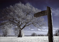
| 12/21/2005 01:53:59 AM | Moonlight Serenade by patrinusComment: If, as you tell us, this image was not taken between 4 and 5 am then it is cheating!. I don't know how you can accept the ribbon and feel good about yourself.
The Challenge was "Set your alarm, and take a picture between 4:00 and 5:00 AM."... No way does a picture takem outside of those hours qualify for anything (other than a 1!)
Someone who did get up in the middle of the night has been denied recognition of their efforts. This stinks! Message edited by author 2005-12-21 01:57:44. | | Photographer found comment helpful. |
| 12/19/2005 12:23:04 AM | Extinguishing by soupComment: We would appreciate you sharing your Photographer's Comments with the community since they took the time and trouble to vote and comment on your entry
Brett | | Photographer found comment helpful. |
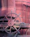
| 12/13/2005 06:10:34 AM | Wheel of Progressby brassilComment: ::: Critique Club :::
First Impression - the most important one:
I just loved the look of this the minute I saw it, but I was disappointed that it looked dull because the subject is so interesting. You can't see the full item, only a tanatalising portion of it, so you are drawn into it to try and work out what it is. Any image that actively engages the eye and mind like this starts ahead of the pack.
Composition:
Technically right on for the rule of thirds with the wheel centre right on the thirds intersection. Nice and tightly cropped so that as i said above, you have to really explore it.
Subject:
Perfect for this challenge but also very very good just as a general image about technology. I had no idea it was old until I read your comments, I just thought it looked interesting and timeless. Sure the wheel looks old design but the rest of it looks in such great condition.
Technical (Colour and light):
Your first two commenters picked up on it straight away. This image has just soooo much power and potential which aren't realised because it just looks a little 'flat'. It's nice and sharp too so I'd stick with the Powershot :)
The other thing to look for is the little details. We're a picky lot here and as we wade through hundreds of images to vote on, anything that looks like the photographer has been a bit lazy on, will get a point or two slahed off it. Most of the basic editing packages allow you to rotate and straighten images. I don't think I;ve taken one straight in the camera yet. Your verticals are not vertical. It's not a life and death thing but it does niggle. In this case it will be 1 deg or something like that - thats all.
Growing its vote?:
It's the colour. Only the colour. If you have the benefit of some reasonable photo editing software that does three basic things, contrast, hue and saturation, then you can quick jazz it up and give it a heightened degree of wow factor.
I am usually reluctent to tell people what I whould have done with their images because most photographers think long and hard about the shot before its taken. Post-processing is a little different simply because it takes a long time to learn and the best tips are usually those that have been passed on by someone else. So I thought perhaps you might not take offence if I demonstrated what we're talking about with the colour here by doing a quick edit on it.
I have taken your image into Paint Shop Pro and made the following adjustments to demonstrate. Contrast +37, Hue +19, Saturation +26, that's all, it took 35secs.
 (Click image for full size)
As you can see, the result fairly 'pops'. Yes it is overdone and the blue tinge needs to be adjusted out, but this is just a very quick demo of what is lurking in every negative we take.
Summary:
This is a cracker image that could have really rocked in the voting with a little post shot editing. I looked at your portfolio and like what you are doing, good luck.
Brett
| | Photographer found comment helpful. |
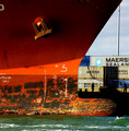
| 12/11/2005 02:59:30 PM | Tying Upby joezlComment: ::: Critique Club :::
Love to do a full critique on your image but it is difficult if you don't give us any information in your photographers comments. When we do a critique, we go past just the photographic result, that's what voters comments do. The critique looks at what you were trying to achieve, how you wanted it to look and what issues you had in getting the image captured and ready for voting.
First Impression - the most important one:
Captivating. Draws you immediately into the image looking for the story. The people play a big part in that immediate engagement.
Composition:
The bow forms a perfect leading line. The eye starts with the vibrant colour, and is taken by the bow to the people on the dock. Even the veritcal part of the bow is on a thirds line alough it's its almost impossible to strictly use thirds in an image like this, the concept is there. The people give the ship it's size.
Subject:
I love it. Heavy, massive and interesting. Just look at the bulb, it got me wondering about all the floating containers or sailboats it had met mid atlantic in the dead of night. You see, the viewer is engaged by this image because as I've just done, I start to weave stories into it. Superb stuff.
Technical (Colour and light):
Assuming that you were probably passing in another vessel and this was a spur of the moment snap (we'll never know, you didn't comment) makes it even more remarkable. The bright harshness of the sunlit orange contrasting with the silhouettes of the dockers is what gives this its depth beyond just 2D.
I'm almost certain that part of the drama in this shot is the way the light hits the bow itself. Bows are generally not razor sharp as this appears to be but the light has made it so and it is dramatic.
To get a Ribbon?:
It's hard to know how you can make this capture work any better. It's scored well and 88% is a damned fine place to be. I'd be interested in the effect of cropping at the water line but I suspect then that the bulb would teeter on the edge of frame with its impact lost.
I guess if you were doing this on assignment then you'd ask the port company to move the containers to give you a neutral backgound and maybe have the crew clean up the black smudgy bits.... :) It's the dirty part of the hull that is least pleasing to the eye and the only place I can see where it cost you a higher score.
Summary:
This image is not a one-off success, your portfolio shows that. I particularly like your minimalist eye in Wall and White. An average score of 5.7 is good and we look forward to your first top 10 and then ribbon. They're not far away.
Brett Message edited by author 2005-12-11 15:02:51. | | Photographer found comment helpful. |
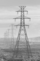
| 12/11/2005 01:58:11 AM | industrial power 260kvby stumpyComment: ::: Critique Club :::
Hi Steve and welcome to the DPC Challenge. Congratulations on a good start by scoring 58% in your first try.!
Thanks for putting in your photographer's comments, they help enormously in doing a critique. The Photograph information really helps a critique too. You can get it from your images by right-clicking it in Win Explorer -> Properties -> summary -> Advanced. That will give you the Aperture, ISO and shutter details plus a whole lot more. Be aware that if you edit in any way the file that comes out of your camera and save it to the same name, all that (EXIF) data will be lost. Always do a Save As for the first step.
First Impression - the most important one:
I'm a sucker for snow and winter, it's where my soul is, so my first impression is always a warm one:) Photographically, this really gets a comfortable reaction from the eye and as you see, has attracted votes accordingly.
Composition:
The composition in this image is that of a trained photographer or a very good photographer's natural eye. Whether by accident or design, you have used perfectly the two main basic rules of composition in this image.
The Rule of Thirds: the foremost pylon is on a vertical thirds line. It is comfortable to the eye there and strikes a chord with the viewer. Rule of Leading Lines: you've got the pylons leading the eye into the picture as they have the perspective lines to follow. Believe it or not, this gives the image 3D depth rather than a flat feel. Research proves these 'rules' to be effective pleasing elements to viewers of paintings or photographs.
There is a third 'rule'. Research again tells us that the eye naturally enters an image bottom left and goes out top right, failing that, at least left to right. That could apply in two ways to this image. You could say it already does that by the eye following the line from the small pylon to the large. Or, you could consider the large pylon as the starting point from which the eye travels along the perspective to the smaller one. To test the latter case, I would try a mirror of the image and see which works better.
Remember though that rules are for the Adherence of Fools and the Guidance of Wise Men.
Subject:
This is a simple mood and geometric image that meets the challenge well. Less is often more and this image has that. It's not overstated but a simple study of the one thing that no industry can do without - energy. I also applaud your lateral view of the obvious response to this challenge ... factories and smoke with water/clouds/reflections etc. It is "different" that has the most chance of cutting through all of the rest.
Technical (Colour and light):
This is the weakest aspect of the image. That it scored so well, yes it did, with this flat grey slightly overexposed look is a testament to how well you got those other elements so right.
In a way, the misty look is appealing. It gives the image mood and isolation, both are useful emotively on voters. You could preserve that feel whilst making the contrast a little more pronounced and giving the image some oomph. If you have editing software that does adjustment layers, you can make non-destructive (original pixels untouched) adjustments to things like brightness and contrast. If not, most graphics programs will let you adjust brightness, contrast or gamma.
Take this image and try some differing settings, they can transform your ex-camera original in ways you couldn't imagine. Don't push it though, they're a savvy lot here and they can tell when you're desperate and trying too hard :)
Summary:
This is a damned fine start, you have the eye. See you again we hope :)
Brett | | Photographer found comment helpful. |
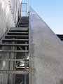
| 12/11/2005 12:56:59 AM | To Industrial Heightsby ernaComment: ::: Critique Club :::
Great fun to do a critique on your image but it is difficult if you don't give us any information in your photographers comments. When we do a critique, we go past just the photographic result, that's what voters comments do. The critique looks at what you were trying to achieve, how you wanted it to look and what issues you had in getting the image captured and ready for voting.
First Impression - the most important one:
This is quite a fetching shot. The first impression is that you want to engage with it and explore it. That's the very best reaction you can get with any image (painting or photograph). That's a double-edged sword in this case because it's when you do look longer at the image that some of its failings show up.
Composition:
The composition is not bad at all. The rail forms a terrific leading line. Leading lines take the eye and give them a track to follow to the point of interest in the image. In this case, we take it that the open door is that focus. That was reinforced by one of the commenters saying it looked ominous - so it worked.
What does look lazy is that the verticals are all falling over. The inside of the rail is vertical, but that's not one of the elements that should be. Use walls or doors with your photo software grid display to rotate the image and get it looking right. If voters think you're lazy and don't care about details, they'll really hammer you hard.
Subject:
It's on challlenge and actually nicely industrial in look. The open door at the top of the stairs is tantalising because there's probably a story behind it. The whole idea of an attractive image is to tell a story above and beyond the title. I think you've started to do this ahead of an awful lot of entries. No, the voters didn't "get it" because it didn't vote well, but I don't believe that is a fault of the subject. If you want to try something like this in the future, think to yourself "what is the story I want to tell, what are the questions I want the viewer to be asking about what's happening here?". You might find then that a small prop helps the story.
Technical (Colour and light):
This is where you lost your voters. The light and colour are appropriate to industrial but perhaps they lack a wow factor or any implied drama. Sometimes all you need to do is ask yourself what everyone else would do with this shot ... and then go and do something completely different.
The noise, you got hammered with the noise. This is where we need your photographer's comments. If it was deliberate because you wanted a grungy, ominous look then we would discuss how to get that accepted and understood. If it was an accident, then we could discuss how to avoid it next time.
Summary:
This image was a good idea with some fine elements which just needed tweaking with quality and details to make it work.
Brett
| | Photographer found comment helpful. |
|
Showing 1121 - 1130 of ~2151 |
Home -
Challenges -
Community -
League -
Photos -
Cameras -
Lenses -
Learn -
Help -
Terms of Use -
Privacy -
Top ^
DPChallenge, and website content and design, Copyright © 2001-2025 Challenging Technologies, LLC.
All digital photo copyrights belong to the photographers and may not be used without permission.
Current Server Time: 06/24/2025 09:24:11 AM EDT.
|