| Image |
Comment |
| 09/04/2006 09:14:41 PM |
Flightby naplesmuscComment: Technical: great contrast, great coloring, nice composition
Creativity: it's a bird with the water...not too creative, but the fact that you actually have the bridge in the background helps greatly!
Personal Opinion: i like it, it's not the average bird in challenges...but it is still pretty sweet!
Score: 10 |
 Photographer found comment helpful. Photographer found comment helpful. |
| 09/04/2006 09:12:06 PM |
Ocracoke Sunsetby agrimaceComment: Technical: the color contrast (imo) could be a little more, having three items in a line is nice (sun, boat, and whatever is in the water), the contast seems ok...the water is a little dull but that's ok...
Creativity: if the boat was a little more off centered i would really like it...
Personal Opinion: i still think it's a great photo! a little more contrast in coloring would help me out!
Score: 6 |
| Photographer found comment helpful. |
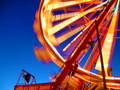
| 09/04/2006 09:09:56 PM |
Ferris Wheelby dynamomomof2Comment: Technical: The composition is good, the coloring is great. the only thing is the areas that should be focused aren't. not sure if you used a tripod, but if you didn't consider either that or a fence post or something!
Creativity: it probably isn't the most creative image...but it also isn't one that i have seen! so i will give you a couple extra points there!
Personal Opinion: not a bad image, could use a little more cleaning up or practice, but I still like it!
Score: 5 |
| Photographer found comment helpful. |
| 09/04/2006 09:03:10 PM |
Flying Soloby philupComment: Technical: Great focus, nice contrast and levels, great back lighting
Creative: Na, probably not too creative...but I really like the sepia tone you did! that's what makes it different from others!
Personal Opinion: I still love it...a little off-centered which helps!
Score: 10 |
| Photographer found comment helpful. |
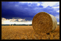
| 09/03/2006 09:57:07 PM |
Harvestby h2Comment: Technical: wonderful composition and coloring. The lower half of the sky seems a little blown out but i don't think it's too bad!
Creativity: it might not be the most creative image, but I do think what helps with this is the other bails in the background.
Personal Opinion: I like the image, i am mutual on the border...i don't think it was necessary, but it does look nice!
Score: 9 |
| Photographer found comment helpful. |
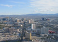
| 09/01/2006 07:16:04 PM |
Las Vegasby NigelComment: That's so intersting to see the improvement! Wow in only 3 years....Vegas...an everchanging city, proved once again! Great shot! |
| Photographer found comment helpful. |
| 09/01/2006 12:24:17 AM |
Determinationby bvoiComment: Technical: great composition and coloring, the black background really helps, the focus seems to be alittle off...can't quite tell what you are focusing on.
Creativity: because you focused on a closer image of a bird, i think the creativity area deserves a bump
Personal Opinion: the title helps in my opinion...
Score: 8 |
| Photographer found comment helpful. |
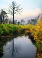
| 09/01/2006 12:20:14 AM |
In the Marshby fotomann_foreverComment: Technical: the colors are amazing, the composition is great because it isn't quite centered...
Creativity: it might not be too creative in the fact that there are alot of landscape type of photos, but the fact that you have many different landscape elements is what makes this photo stand out from the others.
Personal Opinion: i love the softness of the photo with the bright bold colors of nature...absolutely beautiful!!!
Score: 10 |
| Photographer found comment helpful. |
| 09/01/2006 12:17:43 AM |
amish cornerby cheleComment: Technical: i think the idea is great, if the chairs weren't so centered in the frame it would be even better! the coloring is great, dodging and burning works well...
Creativity: it difintely is out of the norm...which i love!!!
Personal Opinion: it's one of those photos that makes you wonder who sits there and the work they might have put into each and every chair...
Score: 7 |
| Photographer found comment helpful. |
| 09/01/2006 12:15:20 AM |
Old Soulby mandyturnerComment: Technical: love the coloring, composition, pose and lighting. Seems like the white is a little blown out but it's ok!
Creativity: the saturation is what makes this photo fit the name! great job.
Personal Opinion: she looks like a doll that may grandma used to have sitting on the shelf...too cute...
Score: 7 |
| Photographer found comment helpful. |
Home -
Challenges -
Community -
League -
Photos -
Cameras -
Lenses -
Learn -
Help -
Terms of Use -
Privacy -
Top ^
DPChallenge, and website content and design, Copyright © 2001-2025 Challenging Technologies, LLC.
All digital photo copyrights belong to the photographers and may not be used without permission.
Current Server Time: 08/18/2025 03:35:37 PM EDT.