| Image |
Comment |
| 03/12/2005 06:45:23 AM |
|
 Photographer found comment helpful. Photographer found comment helpful. |
| 03/10/2005 02:12:53 PM |
Woman2.jpgby ebertdjComment: Originally posted by eostyles:
That is simply amazing she can carry all that on her head and not even have to hold it so it won't fall off... |
that's some balancing art :) |
| Photographer found comment helpful. |
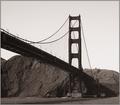
| 02/16/2005 01:39:43 AM |
The Bridgeby TiberiusComment: somehow I like this low contrast shot.. blue sky is very normal, but this looks great |
| Photographer found comment helpful. |
| 02/16/2005 01:38:04 AM |
Kelvedon Bridgeby Mr_PantsComment: good depth of filed and very good lightig.. nice colors on the bridge.. and yes you chose a great angle |
| Photographer found comment helpful. |
| 02/16/2005 01:36:43 AM |
Golden Gate from beneathby shuchiComment: convering this to duotone is not helping this much as the contrast between the bridge and the hills in the background is lost... may be using a channel mixer to add conrast between green and red would help this shot. |
| Photographer found comment helpful. |
| 02/09/2005 01:48:16 PM |
Migration 1by soupComment: This is very well done indeed. Nice colors and excellent details in the drops. |
| Photographer found comment helpful. |
| 02/08/2005 09:05:14 PM |
Twins... Only their mother can tell them apart...by blurredvisionComment: Hello from the critique club !!
First look at the image doesn't really tell what's going on here as the subject is not that clear with the angle you chose. The title is interesting and attracts the viewer to give it a closer look.
Lighting is too harsh and the blown out areas are distracting. Looks like you are using natural light coming from some sort of door or window for the lighting. you could use a more diffused light by not letting the sunrays fall directly on to the subject.
Blur of the subject is not helping it in any manner and a deeper DOF would be better.
Overall, a great idea but needs some improvement in the way its shot.
If you have any questions, feel free to pm me.
-Gaurawa
|
| Photographer found comment helpful. |
| 02/07/2005 06:32:31 PM |
|
| Photographer found comment helpful. |
| 02/07/2005 06:30:10 PM |
Just Playingby TallblokeComment: expression is good, also the way hair goes across the face ia great
hair and skin have a very plastic like look.. may be you tried to reduce noise more than you needed..
|
| Photographer found comment helpful. |
| 02/07/2005 05:37:47 PM |
Roseate huesby bicrayComment: Not very fond of the composition here ... looks too crowded and the background is distracting |
| Photographer found comment helpful. |
Home -
Challenges -
Community -
League -
Photos -
Cameras -
Lenses -
Learn -
Help -
Terms of Use -
Privacy -
Top ^
DPChallenge, and website content and design, Copyright © 2001-2025 Challenging Technologies, LLC.
All digital photo copyrights belong to the photographers and may not be used without permission.
Current Server Time: 06/28/2025 12:06:17 AM EDT.