| Image |
Comment |
| 04/17/2005 10:24:24 AM |
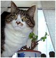
Emilia in the windowby lastefComment: Hello from the critique Club :)
First look at the photo doesn't really say its a portrait as I am distracted by the other elements in this photo. For one, the right third of the photo is predominantly occupied by blown-out outdoors which serves no purpose.
A portrait should be such that it draws the attention of the viewer to the subject and let it be distracted. From your description, you wanted to portray her nature about looking out the window, but even in this case, donot let the window steal the show, it can be a part, but just a minimal part, for reference only and the major part should be yout cat.
This is one quick and dirty fix trying to remove some of the distracting elements from the photo

If you have any questions please feel free to pm me
thanks,
Gaurawa
|
 Photographer found comment helpful. Photographer found comment helpful. |
| 04/16/2005 09:48:39 AM |
|
| Photographer found comment helpful. |
| 04/16/2005 12:03:53 AM |
|
| Photographer found comment helpful. |
| 04/11/2005 10:09:49 PM |
On the verges of sanityby nico_blueComment: hmm this says "this photo has been validated" so that makes me wonder why was this called for a proof in the first place.. may be I am mising to something :)
I like this... 7 |
| Photographer found comment helpful. |
| 04/06/2005 01:44:50 PM |
Snow Bellsby sherComment: I like the duotone conversion.. Can you tell me which color you choose in duotone ? I am always confused about what to do |
| Photographer found comment helpful. |
| 04/06/2005 09:51:26 AM |
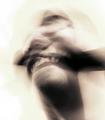
The beginning of defianceby mlhop05Comment: got to this photo from "a bomb from nowhere " thread...
beautiful model and I would say a good pose, but the quality of the photo is not so good which is why you can see it didn't score well...You need a better lighting, the image looks like its underexposed and if you try to use levels/curves it will make it noisy as I can see here.. most likely you used not so bright light and camera was at a high ISO setting...also the white balance is a little off giving a yellow cast to the whole image.
this is my attempt at editing...
 |
| Photographer found comment helpful. |
| 04/05/2005 10:15:00 PM |
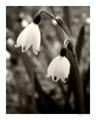
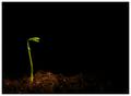
Simple Truthby ebertdjComment: Is that leaf real ? hmm interesting. I am not very fond of the too tight crop here..looks like you could have used some room on the left to let the shadow grow .. |
| Photographer found comment helpful. |
| 04/05/2005 10:12:30 PM |
|
| Photographer found comment helpful. |
| 04/05/2005 10:19:17 AM |
great wallby saintaugustComment: She's beautiful :)
The blown out parts on her forehead and nose are a little distracting. Not sure if there were there to start with or were accentuated with your soft focus effects. I am not very fond of the positioning of your model here, looks like you left more than needed space on the right side of photo...you could have moved her to the right of the frame leaving space only one one side. This is what I meant..
 |
| Photographer found comment helpful. |
| 03/31/2005 08:44:35 PM |
|
| Photographer found comment helpful. |
Home -
Challenges -
Community -
League -
Photos -
Cameras -
Lenses -
Learn -
Help -
Terms of Use -
Privacy -
Top ^
DPChallenge, and website content and design, Copyright © 2001-2025 Challenging Technologies, LLC.
All digital photo copyrights belong to the photographers and may not be used without permission.
Current Server Time: 06/28/2025 06:02:11 AM EDT.