| Image |
Comment |
| 08/04/2006 01:04:12 AM |
Very Young, Very Goldenby magnusComment: ** Critique Club **
Greetings!
A lovely image captured. Technically you were able to achieve what you wanted, the reflector did soften the shadows, but the reflection in Kira eyes need to be cloned out, it doesn't look any good.
Also there is still some part of her face blown out, you may want to reduce your exposure, and move your reflector closer to lighten the shadows more, to be able to avoid blown out parts.
Challenge: It doesn't fit the challenge very well, not enough gold for the voters and its directly reflected in the votes received.
if you have any questions, please feel free to pm me
thanks,
Gaurawa |
 Photographer found comment helpful. Photographer found comment helpful. |
| 08/02/2006 06:30:25 PM |
Loversby MacDonaldComment: ** Critique Club **
Greetings!
Lovely image, well composed and the colors are great. Technically, its well shot, the colors in sky and silhoutte are captured nicely, the reflection in the foreground adds interest.
I agree with the comment about sun emerging from the back of the person. I would have definitely liked it to be hidden behind or in between the couple and not behind him.
if you have any questions, feel free to pm me
thanks,
Gaurawa
|
| Photographer found comment helpful. |
| 08/02/2006 02:44:24 PM |
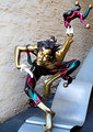
Basking in the Reflected Glory of a Golden Victoryby Shy ClickerComment: ** Critique Club **
Greetings!
Photograph: Well taken, the title is very appropriate and technically, its very well captured.
Challenge : the challenge was Gold, and I am sure not many people will find enough gold in this picture, there is are more colors in this picture which fight for attention, which I believe is the reason for a lower score.
Overall, a well taken photograph which doesn't meet the challenge very well.
if you have any questions, please feel free to pm me.
thanks,
Gaurawa |
| Photographer found comment helpful. |
| 08/02/2006 02:37:39 PM |
Golden Jesterby lifternessjtComment: ** Critique Club **
Greetings!
My very first impression was that the image looks very ordinary, its a snapshot look and not a well thought out capture.
the reason, I think is that the subject is not accentuated in this capture, but its rather mixed up with its surroundings. Also the photo takes away from the moving sense, they you have composed it. its a bit too centered, I would keep some more room on a side to make it more dynamic.
also since its advanced editing, I think it could benefit from some vignetting.
if you have any questions regarding this, please feel free to pm me.
thanks,
Gaurawa
|
| Photographer found comment helpful. |
| 07/31/2006 11:59:05 AM |
IMGP8199-01.jpgby faidoiComment: Nicely done. I like the way sky is totally white, no details, the colors pop very well |
| Photographer found comment helpful. |
| 07/31/2006 01:58:56 AM |
|
| Photographer found comment helpful. |
| 07/28/2006 11:00:28 AM |
colorsofgreen.jpgby vikasComment: I saw this on flickr and thought you are going to use this for color on color, but its your portfolio, do you have something for the challenge too ? |
| Photographer found comment helpful. |
| 07/19/2006 03:34:38 PM |
# 10by LalliSigComment: You predicted your final placement in the challenge results perfectly :) |
| Photographer found comment helpful. |
| 07/19/2006 09:43:39 AM |
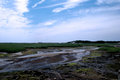
Cape-Cod.dpc.jpgby RayEthierComment: the foreground seems soft, what was your aperture setting and where did you focus ?
also the horizon is dead centered which doesn't work for me |
| Photographer found comment helpful. |
| 07/19/2006 09:41:47 AM |
|
| Photographer found comment helpful. |
Home -
Challenges -
Community -
League -
Photos -
Cameras -
Lenses -
Learn -
Help -
Terms of Use -
Privacy -
Top ^
DPChallenge, and website content and design, Copyright © 2001-2025 Challenging Technologies, LLC.
All digital photo copyrights belong to the photographers and may not be used without permission.
Current Server Time: 06/27/2025 03:20:53 PM EDT.