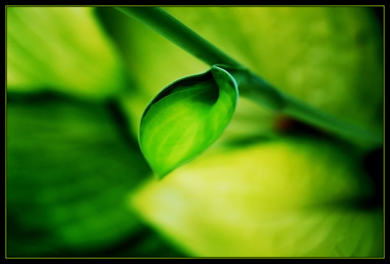
Overall, a lovely photograph with an interesting composition, and nice flowing lines from the leaf, to the stem, to the bokeh. Lots of people will complain about the mostly centred leaf and violations of various rules, but it works for me in this image. One is left to look at the gentle, feminine curve, from the tip, through the lines along the leaf, down through the fold that encompasses a very organic-looking shadow. It's a very pleasant picture to look at. I think it may have benefitted from an even shallower depth of field. I don't know what lens you used to take this, but had the stem been out of focus at top, with the slightly in focus part as it is now, and receding into the bokeh the way it does, it may have been more effective. The post on this looks really saturated, maybe a bit too much. Lots of yellows that could have been darkened, maybe singling out the leaf even more. There are shadows in the background that perhaps would have benefitted from dodging, though it could be argued that they add to the overall rich contrasts that make the foreground so appealing, for me. Though a nit-picky point having nothing to do with the picture and prone to individual taste, the border does not help this image. I personally prefer borders without that "3-D" kind of look on the interior, and much prefer understated complementary colours, or white. The star is your image, and its not helped by something that ponderous.
Message edited by author 2006-07-28 15:53:23. |