| Image |
Comment |
| 03/11/2006 09:03:31 AM |
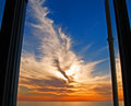
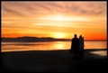
Saturday.jpgby dolphnz8Comment: Nice colours. But as Falc pointed out the composition could be improved. As it stands it looks off-balance, and the window frame spoils it.
Go down to the beach and find something more suitable to 'ground' the shot. For example, fill up the bottom third of the shot with the beach, or driftwood, or boats, or whatever subject you think would add interest to the foreground. |
 Photographer found comment helpful. Photographer found comment helpful. |
| 03/10/2006 03:02:49 PM |
CRW_9530.jpgby EnnilComment: Your portfolio just gets better and better. Great stuff! |
| Photographer found comment helpful. |
| 03/06/2006 08:03:05 AM |
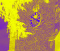
3:50 PM Gothic Mean Timeby obsidianComment: In the forums you asked for some extra feedback, so here goes. I can see two major technical problems here;
1) It doesn't look straight. The wall on the left hand side looks tilted.
2) The colours. Okay, perhaps not a technical problem exactly, but the combination of yellow and purple is just too jarring. If you look at the number of 1's you were voted on this, I'd say it was the colour combination that put most people off.
The post-processing looks as if it's been overdone. It makes the image look like a negative (the shadows are more highlighted than the highlights). The subject is reasonably interesting, but if I was to be a real perfectionist, I'd say it was 3.51pm and not 3.50pm :) |
| Photographer found comment helpful. |
| 03/06/2006 03:01:10 AM |
|
| Photographer found comment helpful. |
| 03/05/2006 08:35:11 PM |
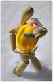
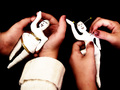
O U T C A S T S — A Tale of Forbidden Loveby Bear_MusicComment: Strangely enough, this is one of my favs of the challenge! You've somehow managed to capture a certain emotion with the way you've posed woody. And I love the 'snow' effect. The piece of snow on the duck is a nice touch.
But, it's just poor woody, standing there.... actually *looks* like an outcast! Lighting is good, focus is good, composition is great. |
| Photographer found comment helpful. |
| 03/05/2006 07:25:44 PM |
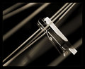
Bubba Bubbly - DNMC? You may be a redneck.by cislanderComment: Crop is a bit tight, and overall it's on the small side. But nicely composed. Lighting is okay, focus is good. An interesting contrast of objects so meets the challenge. To be honest, I'm not that fussy what I drink my champagne out of either, or my Jameson for that matter... :) |
| Photographer found comment helpful. |
| 03/05/2006 04:04:38 PM |
|
| Photographer found comment helpful. |
| 03/05/2006 03:52:58 PM |
|
| Photographer found comment helpful. |
| 03/05/2006 03:50:39 PM |
Swingers Rideby aznymComment: I love the light/shadow and tones in this. Very nice. I like the way you've used the lines. :) |
| Photographer found comment helpful. |
| 03/05/2006 03:49:57 PM |
Heaven & Hell by pearlseyesComment: Great idea, well executed. I like the way it's not totally in sillouette, and that you can still see the white of her wings. |
| Photographer found comment helpful. |
Home -
Challenges -
Community -
League -
Photos -
Cameras -
Lenses -
Learn -
Help -
Terms of Use -
Privacy -
Top ^
DPChallenge, and website content and design, Copyright © 2001-2025 Challenging Technologies, LLC.
All digital photo copyrights belong to the photographers and may not be used without permission.
Current Server Time: 06/18/2025 09:10:04 PM EDT.