| Image |
Comment |
| 04/11/2006 02:54:14 PM |
Yellow IIIby ChinabunComment: This is a great shot, really holds my attention. Mostly because I'm trying to figure out how you did it, and what the setup was!
I assume it's three lava lamps positioned in a dark room? - If so then you did a good job of controlling the lighting to ensure that only the insides of the lamps were illuminated. A great idea with good visual impact, and you executed it well.
The composition really adds to this, and technically I can't find anything wrong with it. |
 Photographer found comment helpful. Photographer found comment helpful. |
| 04/11/2006 02:50:34 PM |
Still Life In Black and Yellowby olddjComment: Most of what eschelar said below were also my thoughts on the technical aspects.
My only additional technical observation is that it would have been good to bring out the colours and contrast (especially the contrast) in post-processing. The lighting looks a bit flat, so post-processing would have made the contrast and tones more interesting.
While this is a nice 'classic' composition, it just lacks that extra something to hold my interest for very long. The most interesting part of the shot for me was the pattern on the vase. |
| Photographer found comment helpful. |
| 04/11/2006 10:34:32 AM |
Not Chicken but Definitely Yellow.by eschelarComment: I really like this, and think it was underrated - I thought it would have scored at least a 5.0
The composition and the simplicity work very well, I like the black background which helps the yellow stand out.
The only technical flaw I can see is the bright light coming in from the right. This causes a highlight which is a bit distracting.
Oh, I only realised this was tweety when I read your comments! - I originally thought this was a rubber duck. |
| Photographer found comment helpful. |
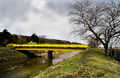
| 04/11/2006 07:52:28 AM |
Freshly Paintedby Pug-HComment: Nice bright vivid yellow, and an interesting subject - not very often you see bridges this colour!
However, even with that bright yellow bridge cutting across the middle of the shot, the lines and composition actually draw my eye to the tree on the right. If you look at the lines, the river bank and the bridge are almost 'pointing' at the tree (which itself is sitting on a thirds line)
Good post processing, brought out the contrast well, and made the grey sky look interesting. |
| Photographer found comment helpful. |
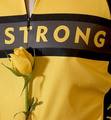
| 04/11/2006 07:23:44 AM |
LiveStrongby MelethiaComment: I'm not sure what 'Strong' means in this context, or what 'LiveStrong' means, or even who Lance Armstrong is! - So apologies for that. I can only comment on the technicals of the shot.
The lighting is fine, lit from the left with the rose pointing towards the light. Slight shadow falling across the jersey, but not so much to be distracting.
The main thing that doesn't sit well with me are the lines in the shot. Although the composition is fine in relation to the 'outside' frame, the lines on the jersey add a very strong framing element to the shot, which kind of puts everything else off-balance. There's a black line directly across the middle, and a strong black line down the right hand side, with nothing to balance it on the left.
For me, the word 'Strong' becomes the primary subject, with the yellow rose secondary. Message edited by author 2006-04-11 10:38:30. |
| Photographer found comment helpful. |
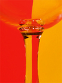
| 04/11/2006 07:11:05 AM |
Clicheby nards656Comment: Nice use of lines and reflections/refractions, good composition. Works well as a vertical layout, which helps to draw the eye along the stem of the glass, and follow that line from top to bottom.
It'd be good if the yellow was just a little bit brighter, and a bit... yellower! |
| Photographer found comment helpful. |
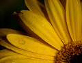
| 04/10/2006 05:55:55 AM |
rainy daisyby rachelellenComment: Interesting composition, the way you have the flower positioned in the bottom right corner. I think this works well and adds an element of interest to 'the millionth' of these shots!
The lighting could be improved, either that or some more post-processing to really make the colours and contrast pop. Right now it looks a little bit grey and flat.
The water on the petals adds nicely to the shot. |
| Photographer found comment helpful. |
| 04/10/2006 05:51:49 AM |
Ready for bathtimeby CoozComment: Very nicely done. Great expression on the baby's face. Good tonal range, and appropriate use of desaturation.
I also like the sharpness of focus.
Suggestions for improvement? Tough one. When I first viewed the shot my eye was drawn to the hairband, so perhaps this is a minor distraction. Also, it's a pity the baby isn't looking towards the duck. She's looking out of the frame.
The only reason it didn't do better in the scoring was because some voters automatically vote babies 1,2 or 3 regardless of how good the shot is! |
| Photographer found comment helpful. |
| 04/10/2006 05:45:41 AM |
pINkTRUDER ALERTby obsidianComment: Dynamic angle and composition. The lighting is very well done also, nice and even, with the highlights on the pot helping to shape it.
Believe it or not, at first my eye wasn't even drawn to the pink! - Perhaps the shot would have stood on its own without the need for the pink?
The lighting around the bottom edge flowers looks a bit odd - like it's been cut-off. It gives the impression that the pot is floating in mid air. |
| Photographer found comment helpful. |
| 04/03/2006 03:41:10 AM |
|
| Photographer found comment helpful. |
Home -
Challenges -
Community -
League -
Photos -
Cameras -
Lenses -
Learn -
Help -
Terms of Use -
Privacy -
Top ^
DPChallenge, and website content and design, Copyright © 2001-2025 Challenging Technologies, LLC.
All digital photo copyrights belong to the photographers and may not be used without permission.
Current Server Time: 06/18/2025 01:47:50 AM EDT.