| Image |
Comment |
| 09/23/2005 12:00:23 AM |
|
 Photographer found comment helpful. Photographer found comment helpful. |
| 09/23/2005 12:00:00 AM |
Bubbles and Rice Taste Badby angela_packardComment: Wow, cool shot. It look slike she is spitting, unforuntaly that took my attention away from the bubbles. I do like the black and white, it is very nice for the photo. |
| Photographer found comment helpful. |
| 09/22/2005 11:43:44 PM |
Raspberry Martiniby idnicComment: Nice shot, the bubbles on the raspberries are very nice. I also like the shading on the background. |
| Photographer found comment helpful. |
| 09/22/2005 01:51:42 AM |
Innocenceby PatrolComment: *Critique Club*
Great capture, especially with this young of an age group. The eyes and title are so perfect for the image. I really do like all the basic elements of this photo: lighting, focus, composition and depth. Personally I like the crop, I feel it allows the focus to be complete. The only thing I could see would be the background, if it were possibly a darker background I could see her popping off of the image. On other little thing I would play with the tones in the face. On my screen the cheeks and chin look a little blotchy. This is a great shot, congratulations! |
| Photographer found comment helpful. |
| 09/21/2005 11:26:46 PM |
|
| Photographer found comment helpful. |
| 09/21/2005 11:26:13 PM |
|
| Photographer found comment helpful. |
| 09/21/2005 10:20:38 PM |
Bad Hair Dayby ChiquiComment: I love this shot. I think voters are much picker based on their interpretation of the subject for contest. The colors in this shot are awesome, I love the difference between subject and background. The background really enhances the subject. I think the photo is taken very well. The focus in great on the face, which is where it should be in a portrait in my opinion. The definition is the feather is great. I would like to have seen a little more focus on the beck and more of the feathers, that is the only thing I could see. Personally I think you would have just scored higher in a different subject matter, based on the voters thinking inside the box. |
| Photographer found comment helpful. |
| 09/21/2005 08:16:17 PM |
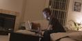
working lateby fitmpdnsthtrComment: Very nice angle. I think your angle defiantly helped this photo step from a straight on shot. The dim lighting is nice and very appropriate for the piece. I think this is probably a harder subject to photograph because the idea is basic but so perfect for this group. I would have brought the image in some, maybe cropped some of the fireplace or played with makes the subject fit into the law of thirds. Sometime I just try the law of thirds to make sure I am not missing anything. It is really interesting that he may be sitting on a bed, at first I thought it was a couch but since there is no back I would assume its a bed (in addition to the pillow). I also liked that you left the blinds half open. Overall I think you did a good job with the subject you chose. The lighting is nice, I think a harsher light would have taken away from the image. This is a much more respectable first entry then many, my self included. Oh one last thing, I really do like the reflection from the laptop on his face. Good job! |
| Photographer found comment helpful. |
| 09/20/2005 11:46:18 PM |
Flowingby sangeethComment: *Critique Club*
Your photo from first glance is very appealing, I do believe it is a very well earned 7th place. I think the first things that draws attention is the glow from the "branches". I am very glad to see an out of the box idea place so well.
The photo itself is very well taken. The lightning is great and highlight the end of end branch in a unique way. The clarity of the overall image is wonderful. I know there have been some comments on the composition but I do very much like the way you took this. The only thing I can really see that could have been done differently would be the "dust" or "scratches" that appear on the surface. I think it was an amazing photo to take and the minor imperfections are just that minor; they barely take away from the photo. I also find the blue to be a very pleasing and appropriate color for the image. Once again congratulations on your finish, especially among a contest with so many entries. |
| Photographer found comment helpful. |
| 09/20/2005 10:56:08 PM |
A Jedi's Viewby RulerZigzagComment: So true, great lighting. The image looks a little green but I think that is one of the things I like most about it. |
| Photographer found comment helpful. |
Home -
Challenges -
Community -
League -
Photos -
Cameras -
Lenses -
Learn -
Help -
Terms of Use -
Privacy -
Top ^
DPChallenge, and website content and design, Copyright © 2001-2025 Challenging Technologies, LLC.
All digital photo copyrights belong to the photographers and may not be used without permission.
Current Server Time: 08/08/2025 05:14:42 AM EDT.