| Image |
Comment |
| 03/21/2006 10:33:07 AM |
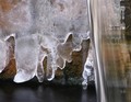
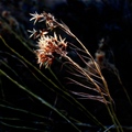
Waterby magpie5212Comment: *Critique Club*
"Water" is an interesting idea for the Master of Disguise, I am not sure most voters understood what you were going for.
This is a very different idea from many of the other entries. The image itself seems little off to me. I just wish you were able to cover like two-thirds of the shot with water to show more of the Disguise. The flow of the water is very nice and gives great attention to the movement of the piece. The reflection in the dark water below is also a nice attribute. Great idea, overall it is a nice image I just wish you had covered the image with more water so it was a little more hidden.
I can defiantly tell you are constantly improving yourself and I look forward to seeing your future entries. Keep trying there is so much you can learn here, I know I am constantly surprised. |
 Photographer found comment helpful. Photographer found comment helpful. |
| 03/21/2006 10:21:49 AM |
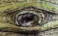
Blank Stareby obsidianComment: *Critique Club*
"Blank Stare" does meet the challenge of Master of Disguise. The shot really reminds me a piece I think someone did in the personification challenge. I had to double check to make sure it wasn't you.
I think your piece is a very nice idea and captures the image of something we might see in some movie where the tree comes to life and grabs one of the characters. The coloring of the shot is very natural. The little red dots towards the center are very small but still grab your attention. The composition is very nice. There is a complete eye with out other distracting additions. I also really like that you choose to you with a landscape layout instead of like a portrait, I think it would have taken away from the effect.
I think you had a very nice piece but voters were just hoping for something unusual that is not normally seen. Good work. |
| Photographer found comment helpful. |
| 03/19/2006 07:17:30 PM |
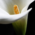
Callaby loveComment: *Critique Club*
"Calla" is one of the strongest flowers entered into the Square Crop challenge. Also excellent placement in the large challenge, top 6% is really great.
The clarity and DOF is absolutely amazing. The focus on the stigma (I think that is what its called) is virtually prefect. It is amazing how close you can get with a lens. I love the composition. The background is so deep and gives such a great contrast. I really don't see anything I would change this is an absolutely amazing piece and so glad that you chose to enter it into this challenge. This image is so clear it almost looks unreal. Great work on this piece. Keep up the work. |
| Photographer found comment helpful. |
| 03/19/2006 07:07:41 PM |
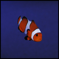
Out of the Blueby owenComment: *Critique Club*
" Out of the Blue" meets the Square Crop challenge, which is always a great way to start a challenge. Also finishing in the upper fifty percent is always good in such a huge challenge.
The image itself is very nice. I personally have tried a couple of times to take pictures of my fish (they are only freshwater) and bot is it a challenge in itself. So I really do appreciate the work you have done. I think the focus is good, probably without glass between the camera and the subject the clarity would be stronger. The most interesting thing I notice is the clear fins on the tip of the tail and on the fin. The background blue is very strong and I really like the depth it gives to the shot. The contrast between the fish and background really allows the viewer to focus on the subject.
Overall with the subject that you choose I think you did a great job. Keep up the good work! |
| Photographer found comment helpful. |
| 03/19/2006 05:54:20 PM |
Touched by the Windby KivetComment: *Critique Club*
"Touched by the Wind" is a very interesting piece and something different in the Square Crop challenge. Looking at the shot I feel it has a nice soft feel.
Overall the image is a nice soft piece. I really love the lighting and how it is just hitting the subject perfectly. It feel like the light is just capturing the tips of each leaf. I think just a little more focus or sharpness on the subject itself would have really bumped the score up some more. Also the background is one of the best that I have seen, it really is a nice soft piece. You have excellent photos in your profile I can see you have some serious talent. I am really glad you choose this enter this piece. Keep up the good work. |
| Photographer found comment helpful. |
| 03/19/2006 05:21:57 PM |
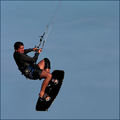
Hang Timeby idnicComment: *Critique Club*
"Hang Time" is a nice addition to the Square Crop challenge. 57 out of 364 isn't too bad is such a large challenge. The shot grabs viewers because we are looking at something a lot of us probably haven't seen before.
The image is very nice and grabs attention with the action shot. The shot looks very nice and clean. I think capturing the water droplets really enhances the shot and makes it look really since we cannot see the water. The only reason I don't think the image score higher is because people were really looking for the nice full frame. The border is nice on this piece, it really makes the image feel complete. I am glad you didn't choose to go with a bigger border. Overall this is an excellent action shot. |
| Photographer found comment helpful. |
| 03/19/2006 04:50:15 PM |
Historianby egillbjarkiComment: *Critique Club*
"Historian" is an excellent addition into the Square Crop challenge. Excellent 19th placement in such an huge challenge with 364 entries.
This image is prefect example of a black and white portrait. Something about the eyes just grabs you and pulls you into the image. I really don't see anything I would change, this is a great piece. After reading your comments I am sure it was hard to get him not to smile after graduating. But he does have that glazed over look I have because I work nights. I had to peek at your profile and you do amazing work with black and white portraits. I can say there is anything I would recommend this is just an excellent piece.
|
| Photographer found comment helpful. |
| 03/19/2006 10:41:31 AM |
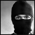
The Robberby kmbr2001Comment: *Critique Club*
"The Robber" does meet the Square Crop challenge. I think you have a nice idea and something different to stand out within such a massive challenge.
The image itself has a nice feel to it, even though the subject is harder. First off I really do like the side lighting it gives the image a different perspective then we are used to seeing. I think like many of the commenting people have stated possibly a harsher look would have enhance the image. I think it is hard sometimes to look mean without corny. To me the look is almost a blank stare. I still like the image because you did something different. Also is his mask inside out? It seems to me maybe you were trying to point that out by using the lighting you choose.
Overall this is a nice photo, I think it would have scored higher with a meaner edge. Your lighting choices were a nice difference to have in the challenge. |
| Photographer found comment helpful. |
| 03/19/2006 10:30:47 AM |
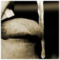
On the Rocksby glodaComment: *Critique Club*
"On the Rocks" does meet the Square Crop challenge. I think the subject itself is very different and also has a different perspective then most people would choose, which I think is a great quality to have. Unfortunately I think a lot time voters and people in general automatically have idea of what they would do and that is what they want to see.
The image itself is very interesting and has to make you stop and look. I am very glad you choose black and white, it allows us to see the frozen ice and not focus on a large pink tongue. Also I like your DOF, personally. I think if you went with the foreground more in focus you would loose the subject. Personally I feel this is a great piece and nice addition to your collection. Good work! |
| Photographer found comment helpful. |
| 03/19/2006 10:16:49 AM |
Not Bifocalsby fotomann_foreverComment: *Critique Club*
"Not Bifocals" defiantly meets the criteria of the pick two challenge. Normally I would say wow all those comments, but come on look at the photo of course that makes people want to comment. I personal thought with your fan base the score would have been higher, but hey top 50% and 60 comments not too bad.
As for the photo itself, it just has to make you laugh. It defiantly is a signature piece for you, I am really torn as to which one I do like better Peanut Butter or Cheese. I think you will probably be remembered as the cheese man but the extra characteristics of this shot make it just a little bit better. Like including the high heel, and something I missed during voting the peanut butter on the mustache. Overall this is a nice clean shot with good lighting and of course excellent subject!
PS I love the coach. It looks really expensive is that the reason for generic peanut butter (just kidding) |
| Photographer found comment helpful. |
Home -
Challenges -
Community -
League -
Photos -
Cameras -
Lenses -
Learn -
Help -
Terms of Use -
Privacy -
Top ^
DPChallenge, and website content and design, Copyright © 2001-2025 Challenging Technologies, LLC.
All digital photo copyrights belong to the photographers and may not be used without permission.
Current Server Time: 08/18/2025 03:39:06 PM EDT.