| Image |
Comment |
| 05/04/2006 12:36:42 AM |
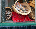
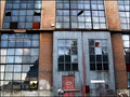
Five Loaves Bakeryby holdingtimeComment: *Critique Club*
"Five Loaves Bakery" is a nice entry into the Window Framed challenge.
The image itself has a different subject which I think grabs attention. I really like your idea and think you have a great idea. The contrast between the green and the red also grabs attention and enhances the shot. Unfortunately the reflections that we can see in the glass take away from the overall image. Also I might have tried cropping it a little differently. I would have tried it tighter on the right side like on half way on the column. Also possibly cropped the pole on the left side out completely because it is distracting because of how uneven it looks.
Overall this was a great idea and I look forward to your future works! |
 Photographer found comment helpful. Photographer found comment helpful. |
| 05/04/2006 12:29:02 AM |
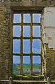
Historyby TejComment: *Critique Club*
"History" is an amazing entry into the Window Framed challenge. Congratulations on the excellent score and overall placement in the challenge.
The image is excellent because it is a subject that many voters are unable to see, which always makes it a rare treasure and the fact it was taken so well makes it even better. The frame you were able to use enhances the architecture of the subject with the contrast. The image does seem to be a little dark but it does look like the sun was going down which makes it pretty hard to get the right lighting. Even the lighting doesn't take away too much from the score for me.
Overall an extremely impressive shot and I am very glad you entered it. Keep up the good work. |
| Photographer found comment helpful. |
| 05/03/2006 11:47:54 PM |
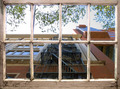
Hardwick Old Hall, Derbyshireby alpharichComment: *Critique Club*
"Hardwick Old Hall, Derbyshire" is a nice addition into the Window Framed challenge. I have to say congratulations on a new personal best, that is always a wonderful thing to see after the challenge ends.
The photograph itself is very interesting and did grab my attention. I think the image grabbed more of my attention because you left more of the surrounding frame in the shot unlike many of the other entries. I love the rustic appeal with the broken covering on the right-hand side. The composition is very nice. The subject framed looks so prefect it almost looks unreal. Like Konador said there is some halo on the blue in the frame that is showing up, but for me it was pretty minimal. Overall great work! |
| Photographer found comment helpful. |
| 05/03/2006 11:19:44 PM |
Escape from Povertyby cislanderComment: *Critique Club*
"Escape from Poverty" is a wonderful addition to the Window Framed challenge. Obviously very good work, it was nice to see this image finish in the top 25%.
The idea here is just excellent and nice and out of the box thinking! I really the position of the window and how the staircase is directly in the center. Overall the composition is very pleasing. The only thing that seems to hurt the shot is the lighting which I assume is the sun. The left hand upper square looks overblown probably from the placement of the sun at this time of day.
Great work and I look forward to your future challenges. |
| Photographer found comment helpful. |
| 05/03/2006 10:49:48 PM |
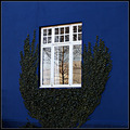
A window framedby GautiComment: *Critique Club*
"A window framed" is an excellent addition into the Window Framed challenge. I have to say first congratulations on the placement, top 5% very well deserved.
The first thing that grabs my attention is the contrast between the blue and white, what an excellent subject. Then you are able to see a reflection of a tree within the surround tree climbing the wall, how prefect is that? Pretty prefect in my opinion.
I do like the composition, it makes the piece feel complete. The focus is very crisp and we immediately know where our subject is. You did an excellent job capturing the reflection, it really do look pretty flawless. Normally I am not a fan of borders, but I think your choice really ties the piece together. Also the lighting looks great, prefect use of natural light from what I can tell.
Obviously I was a big fan of this shot and I am very glad you choose to enter this one. |
| Photographer found comment helpful. |
| 05/03/2006 01:36:10 AM |
Windowed historyby PainielComment: *Critique Club*
"Windowed history" was a nice different addition into the Window Framed challenge. It think you captured voters attention by finding this shot. I would have to agree with Larus in saying this would be an excellent place to shot models, such a natural grungy backdrop.
The image itself is very nice. The overall composition is excellent, I like the nice full frame. The coloring does have a strong artistic feel to it, but I think that is what makes it work so well. Unfortunately what I think hurt the score overall was that by the guidelines we were shooting a subject through a window frame. But spending sometime with the shot, I really start to wonder if maybe you were trying to focus on the one lower yellowish square on the left hand side of the door. Well now that I think about it I really wonder if that's what you were doing. If so I bet if voters realized this it would have just jumped right up the chart. Wow this piece is so much more looking at that. Congrats on this is an absolutely wonderful piece! |
| Photographer found comment helpful. |
| 05/03/2006 01:27:20 AM |
from my wineyardby gocComment: *Critique Club*
"From my wineyard" is an nice addition into the Window Framed challenge. I have to say honestly as I was scrolling down the page to check the image and your comments, I have to say wow. I have never seen anyone this detailed, it is so lovely to see someone take the time to explain their details. We could all learn a lot from trying to detail our photos like this.
The image itself is a very nice piece. I think the first thing that hits me as a voter is the duotones. I think this was an excellent choice, I am glad to see you posted the other image as well. By choosing the duotones you achieved a different feel that let you stand out from all the other shots. The image is very nice and I like the fact you left the railing in the shot, we didn't see many like this. Great use of the window frame! |
| Photographer found comment helpful. |
| 05/03/2006 01:11:38 AM |
Negatives and Doubles Negativesby _eugComment: *Critique Club*
"Negatives and Doubles Negatives" is a very nice addition into the Negative Image challenge. I think it is always wonderful to see something different, then the seem shot taken of the same subject. I love out of the box thinkers.
You defiantly had a great arsenal of very different photos to work with. I can image how difficult it might be to try and arrange the different photos, I would bet it was the longest part of the process. The composition is very nice and full. The only real issue I have with the shot is the Ben Franklins (or whoever that might be, but I really hope I wouldn't incorrectly identify such an important figure). I think I would have tried to invert one of them or something, they really do look like the same shot. Also I would say the same thing about the two fish heads facing right. Maybe you really wanted to express their important with the include of both of them, but I prefer the chaos theory. Either way this was a great idea and shot! |
| Photographer found comment helpful. |
| 05/03/2006 01:03:43 AM |
Hannahby wavelengthComment: *Critique Club*
"Hannah" is a nice portrait. The eyes you were able to capture are excellent, they are what really grabs my attention in this piece.
The image is a very pleasing one, even though the pattern on her shirt is pretty wild it still feels like a nice shot. I can see the our complimentary colors in the image are purple and yellow, but I think a lot of voters like myself were more focused on the girl. I might have tried to crop the bottom up a little, but I can see how that might be a concern about losing too much of the purple for the complementary colors. Overall I do think you have a nice shot, unfortunately I think it had a hard time in this category because the girl really does grab your attention. |
| Photographer found comment helpful. |
| 05/02/2006 10:49:53 PM |
Veteranby darnokComment: *Critique Club*
"Veteran" in my opinion was a prefect subject for the Something Old Challenge. This challenge was tough because everyone has a very different opinion of something old.
Looking at the image I was very happy with your work. I think black and white was a very appropriate choice based on your subject and the challenge. I also like the position on the camera off to the side and not centered. I wonder if it would have scored a bit higher if you had turned it slightly so that we (the voters) could see a little more of the lens. The lighting almost looks likes a flash which tend to take away from the shot. You might just try to add some fill light and or some reflectors. I really do like the shot and look forward to more entries from you! |
| Photographer found comment helpful. |
Home -
Challenges -
Community -
League -
Photos -
Cameras -
Lenses -
Learn -
Help -
Terms of Use -
Privacy -
Top ^
DPChallenge, and website content and design, Copyright © 2001-2025 Challenging Technologies, LLC.
All digital photo copyrights belong to the photographers and may not be used without permission.
Current Server Time: 08/21/2025 02:17:57 AM EDT.