| Image |
Comment |
| 05/10/2006 11:50:08 PM |
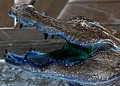
A Stitch in Time Saves Nineby xianartComment: ::Critique Club::
Subject::
"A Stitch in Time Saves Nine" was a clever idea for the Cliches and Sayings challenge. This was a very creative idea.
Technically::
The image itself is a very nice shot. I really do like the lighting, you have drawn direct attention to the subject we are supposed to be focusing on. You might have just stretched the lighting a little bit more so that the center spot was a little bit bigger. The clarity and focus appear strong. I would be curious to see the shot if you were able to make the stich line tight, at first glance I just thought it was a string before I read the title (during voting). I can understand that it was probably pretty hard to set a tight string without having a hand in the photo which might cause more shadows. You might even try something like the clear fishing wire, just a thought. I also like your cropping and placement of the subject, we as voters know exactly what the subject was.
Summary::
Overall this was a nice entry and very creative. I look forward to your future entries. |
 Photographer found comment helpful. Photographer found comment helpful. |
| 05/10/2006 01:45:30 AM |
Birds of a feather flock togetherby jdannelsComment: *Critique Club*
"Birds of a feather flock together" is an amazing photography into the Cliches and Sayings challenge.
Overall I have to say up front this is an excellent piece of work. The composition is prefect. I love the glow of the sun from between the hair, excellent angle. Technically this is just an amazing piece. Great warm orange coloring to change the tone of the piece.
I read your comments and would agree with your choice. I think some voters would have appreciated the other title, where others would just say huh and give you a lower score for it.
Wonderful job, keep up the wonderful work. |
| Photographer found comment helpful. |
| 05/10/2006 01:35:36 AM |
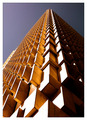
Up, up and awayby ericwooComment: *Critique Club*
Top ten, extremely well deserved. Congratulations on your new excellent work in "Up, up and away" this is an amazing piece in the Rhythm II challenge.
The overall image just grabs your attention. The pattern is obviously are very interesting, especially from this angle. At first glance I thought Jenja (that game where you stack the wooden blocks) but upon closer look realized it was a very intricate building. The composition is just wonderful, placing this subject just off of center works for me.
It must have been a sunny day to capture the much sun from the left side. The sunlight really brings out the pattern, great job! I look forward to your future entries. |
| Photographer found comment helpful. |
| 05/10/2006 01:24:01 AM |
The writing is on the wall ...by kari1Comment: *Critique Club*
"The writing is on the wall ..." is an interesting addition into the Cliches and Sayings challenge. Very good choice on subject and matching it up with your title.
The overall image does give off a harsh feel, but very appropriate for the title. I really do like the sharp angle to you took to put a different slant on the graffiti. Obviously from the shot and your comments you wanted a high contrast shot. I would have done the same thing to give it an edge. You wouldn't want to shot to be soft, but to really let the writing pop. This look like a tough shot, I might try cropping it so that the black triangle at the bottom isn't so distracting. I do like the include of the box on the upper part to give the image more dimension.
Overall good work, I think you really created an image that grabs attention and defiantly illustrates the title. I look forward to your future entries. |
| Photographer found comment helpful. |
| 05/10/2006 12:46:09 AM |
|
| Photographer found comment helpful. |
| 05/09/2006 11:44:30 PM |
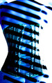
Negative Self Imageby arronrodComment: *Critique Club*
"Negative Self Image" is a very interesting shot in the Negative Image challenge. This is one image that made me come back multiple times to try and figure out what it was. So very good work on grabbing attention.
The image itself is very unusual, I was thinking it was someone in a corset. I would have never guessed how you had actually done this. You deserve some brownie points for creativity. The composition is very nice. The contrast between the subject background, gives the eye its exact focus. The only thing that stand out as a downfall is the over exposure on the right hand side. The lighting is very nice so I wonder if maybe you wanted the blown look to enhance the subject as well. Overall this is an extremely strong piece and fits the category very well.
Welcome to DPC and I have to say congratulations on your first entry, I am sure we will be seeing many great things from you. |
| Photographer found comment helpful. |
| 05/07/2006 01:49:18 AM |
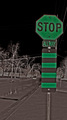
o.k...GO?by shenanigansComment: *Critique Club*
"o.k...GO?" is a really inventive idea for the negative image challenge. You have defiantly meet the requirements of the challenge.
Overall the image is good but the twist is the best part of the shot. I like the placement of the subject. Also the layers created by the background helps the shot. I just wish the sign was straightened to match the top of the frame, but that is just my opinion you may have been going for it to be specifically not straight. I also might have tried a tighter crop on both the top and bottom of the shot. A nice tight shot might have helped people stop and pay attention to what you were really saying.
Great work! Message edited by HBunch - Fixed CC Glitch. |
| Photographer found comment helpful. |
| 05/07/2006 01:42:47 AM |
Positive Force!by dolphnz8Comment: *Critique Club*
"Positive Force!" is a very interesting and different capture for the Negative Image challenge.
I think the Negative Image challenge was an extremely tough one, especially with 433 people entering the challenge. I personally was quite fond of your shot because it was so different from the norm. I also really like how the negative created that crazy green glow coming from his/her throat. The lighting to create the blue teeth is also excellent. The texture is also very appealing because it is enhanced by the negatives. Personally I liked the shot and thought voters would as well, but I guess based on the top ten they were really looking for some striking contrasts and colors.
Very interesting shot and I am glad you shared it! |
| Photographer found comment helpful. |
| 05/07/2006 01:31:30 AM |
Steps to championshipby KitaComment: *Critique Club*
"Steps to championship" is a very good entry into the Complementary Colors challenge. I remember your shot during the voting because I spent some time reading the ribbons.
The over image is a very nice entry. Great choice of the yellow and purple for contrast, I also like your idea of having the ribbons climb it really ties well into the title. I would try to map out your ribbon placement so they are spaced out a little more evenly because you might have filled the space a little more, especially on the lower left hand side. Also I might try other lighting to balance out the shot. The flash is just a little too strong for the shot and takes away and created that funky hazy/shadow on the winning ribbon. Overall good idea. Also good idea to use the border to tie the shot all together.
You defiantly have the ideas and the skills so I always look forward to your entries, keep up the good work. |
| Photographer found comment helpful. |
| 05/07/2006 01:21:11 AM |
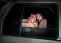
Bustedby LevTComment: *Critique Club*
"Busted" is a great entry into the Window Framed challenge. It is always good to see something different for the basic idea, anything out of the box is always nice to see.
The image itself is composed very nicely. The framing of the car really balances out the shot. Also the lighting looks just right by bouncing of the car and still lighting there faces. Her faced to appear a little blurred but not enough to take away from the score I gave. There expressions are very interesting for this situation. I see you got a lot of comments about this. Personally I think the corny shocked look would have taken away from the score for me. One thing that grabbed me during voting is her eyes, they look like she has been crying. All I could think it why is she crying? But that was just me.
Overall I think you had a great idea and implementation. |
| Photographer found comment helpful. |
Home -
Challenges -
Community -
League -
Photos -
Cameras -
Lenses -
Learn -
Help -
Terms of Use -
Privacy -
Top ^
DPChallenge, and website content and design, Copyright © 2001-2025 Challenging Technologies, LLC.
All digital photo copyrights belong to the photographers and may not be used without permission.
Current Server Time: 08/21/2025 09:58:56 AM EDT.