| Image |
Comment |
| 09/11/2005 10:05:38 PM |
Oopsy Daisyby dipaulkComment: I like the composition of your photo. I wish the pine (?) was more towards the black side for even greater contrast to the bright whites. Nice photo though. I like it. |
 Photographer found comment helpful. Photographer found comment helpful. |
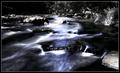
| 09/11/2005 10:03:49 PM |
Shocked!by ManicComment: An eye opening photo (sorry, couldn't resist). For me though, the whites seem overly saturated. |
| Photographer found comment helpful. |
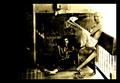
| 09/11/2005 10:02:42 PM |
One Monday Afternoonby ergoComment: I feel like I'm looking at an old time photo. I like it in that sense. For me, the very right side of the photo is too brightly saturated. |
| Photographer found comment helpful. |
| 09/11/2005 10:01:32 PM |
|
| Photographer found comment helpful. |
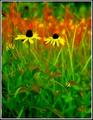
| 09/11/2005 10:00:14 PM |
August Bloomsby JeileenComment: Some nice contrast areas. For me the white and black border actually detracts. |
| Photographer found comment helpful. |
| 09/11/2005 09:58:25 PM |
|
| Photographer found comment helpful. |
| 09/11/2005 09:57:37 PM |
Wrapped Upby dw_photoComment: Bumping up after a second look. Crisp, simple - I like it. Good luck! |
| Photographer found comment helpful. |
| 09/11/2005 09:51:08 PM |
|
| Photographer found comment helpful. |
| 09/11/2005 09:50:20 PM |
|
| Photographer found comment helpful. |
| 09/11/2005 09:49:09 PM |
Convergenceby justin_hewlettComment: I like the concept, but for me, I wish there was even greater whites on the keys themselves. |
| Photographer found comment helpful. |
Home -
Challenges -
Community -
League -
Photos -
Cameras -
Lenses -
Learn -
Help -
Terms of Use -
Privacy -
Top ^
DPChallenge, and website content and design, Copyright © 2001-2025 Challenging Technologies, LLC.
All digital photo copyrights belong to the photographers and may not be used without permission.
Current Server Time: 06/23/2025 07:22:18 AM EDT.