| Image |
Comment |
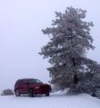
| 12/30/2002 10:59:19 PM |
White Knuckle Expressby inspzilComment: Cute picture. Just wondering what the colour cast is on the snow, looks like the white balance has been set for indoor lighting. |
 Photographer found comment helpful. Photographer found comment helpful. |
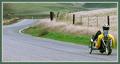
| 12/30/2002 10:57:56 PM |
|
| Photographer found comment helpful. |
| 12/30/2002 10:53:53 PM |
Remote Journeyby autoolComment: Excellent! Great idea, and great composition. Like the use of the complementary borders. |
| Photographer found comment helpful. |
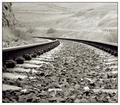
| 12/30/2002 10:49:59 PM |
Traveling By Rail by TarbiniComment: Great composition and sharpness. Wonder if less light would have been good here, some areas seem a bit wshed out. Great shot though! |
| Photographer found comment helpful. |
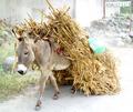
| 12/30/2002 10:46:42 PM |
Traveling Through Hidalgoby JEMComment: Love this!! Lighting is a bit harsh, especially on the right of the picture, could have been toned down a bit. Maybe a closer crop of the donkey would have been good |
| Photographer found comment helpful. |
| 12/30/2002 10:43:42 PM |
A site to see from the squareby YomiComment: Very pretty. Would like to have seen a bit more, maybe moving back or less cropping could have included more of the fountain and also the top of the tree. |
| Photographer found comment helpful. |
| 12/22/2002 08:46:02 PM |
Wailin' the Bluesby KarenBComment: This looks great, it has so much chararacter. Great shot! Should have done better. |
| Photographer found comment helpful. |
| 12/18/2002 08:56:15 PM |
Bloomingdales Candid 1by smellyfish1002Comment: Critique Club
This is a fantastic picture and I think that it should have been in the top three, it's a unique picture. The choice of B/W adds a cool feel to this and emphasises the composition. The guy in this would have been a perfect candid by himself but the billboard behind him adds the WOW factor, great composition and capture of this. The graduation of dark to light from left to right brings you into the picture and brings the viewers eyes to the two faces. To be honest, I have no recommendations to improve this picture, the lighting, exposure and focus all seem perfect, composition is fantastic and the mood of it has impact! Congrats on 7th place! |
| Photographer found comment helpful. |
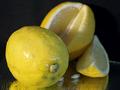
| 12/17/2002 11:11:19 AM |
Lemon DROPSby justineComment: Critique Club
It's quite hard to add any more insight into this picture as your comments have been very detailed and in my opinion, helpful. I think that your idea is great and I like the use of the water and reflection. The picture has a great sharpness to it. My previous comment was that i would like to see more of the lemon in the background, either through deeper DOF or through changing the composition and switching the two lemons. A bit more light in the background would also have been good to bring out a bit more detail and possibly a little less on the lemon in front. You have had lots of "makes my mouth water" comments, so I think if you could possibly change the DOF issue, then this would be a great picture! Good Luck in the next challenge! |
| Photographer found comment helpful. |
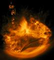
| 12/17/2002 09:20:24 AM |
Water and Fireby 'PongComment: Critique Club
OK, this looks like fire, but I if I understand your details correctly, this is only water? If this is so, you made a great job at making this look like fire, great illusion. Just a shame that your comments couldn't be seen during the voting. I like the way that you have made a ring around the outside and the lower part of the water has great texture. Also the colour and contrast here is good. Personally, think you would have been better off taking a picture of real fire, I think that it would have been more dramatic. Still, after all the bush fires over there, can understand the reason not too! |
| Photographer found comment helpful. |
Home -
Challenges -
Community -
League -
Photos -
Cameras -
Lenses -
Learn -
Help -
Terms of Use -
Privacy -
Top ^
DPChallenge, and website content and design, Copyright © 2001-2025 Challenging Technologies, LLC.
All digital photo copyrights belong to the photographers and may not be used without permission.
Current Server Time: 08/14/2025 09:19:33 PM EDT.