| Image |
Comment |
| 02/12/2003 08:05:06 PM |
Peek a Boo!by mcraelComment: That's an interesting effect, I'm curious as to how you achieved it. The shadows a bit distracting here, and I'd say the doily isn't necessary, and detracts. Still, neat work with the face. |
 Photographer found comment helpful. Photographer found comment helpful. |
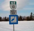
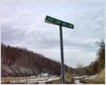
| 01/20/2003 01:43:40 AM |
The Huron Trailby margieComment: Have you tried placing the sign on the right side of the picture and then showing part of the trail? It doesn't quite work for me as a focal point at an angle and sort of randomly placed in the picture. |
| Photographer found comment helpful. |
| 01/20/2003 01:41:38 AM |
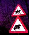
Beware of the Giant Toadby KonadorComment: There are certainly some odd signs popping up in this challenge. Nice find - I think the signs are a little too bright in contrast to the rest of the picture, though. |
| Photographer found comment helpful. |
| 01/20/2003 01:39:56 AM |
Go Away!by myqylComment: Certainly unfriendly. I think this would have been more effective at a little less of an angle to the sign. |
| Photographer found comment helpful. |
| 01/20/2003 01:38:26 AM |
|
| Photographer found comment helpful. |
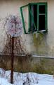
| 01/20/2003 01:37:57 AM |
Abandonedby miracComment: This is a very nice find for a subject. Have you tried this with the ground cropped out a little more? It seems to draw too much focus. |
| Photographer found comment helpful. |
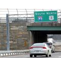
| 01/20/2003 01:35:23 AM |
Riseby PaulkComment: I like the feel of soaring evoked by this picture, but I wonder how it would have looked if the left side of the building had been aligned straight vertically. |
| Photographer found comment helpful. |
| 01/20/2003 01:30:45 AM |
No Crime Zoneby DianaComment: Funny concept, but the sign isn't really in focus and doesn't seem to be placed effectively in the picture. |
| Photographer found comment helpful. |
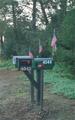
| 01/20/2003 01:25:09 AM |
Signs of the times by the roadside.by cvhs99Comment: You should submit a picture a little closer to the allowed maximum, as that is much more effective in presentation. Looking at this picture: the colors seem a little washed out, and it might have been better composed if the mailboxes were on the right side of the picture, and part of the road on the left...anything that didn't have the mailboxes smack dab in the middle. |
| Photographer found comment helpful. |
| 01/20/2003 01:23:12 AM |
Grillby ArtifactsComment: I'm a bit reluctant to qualify this as a road sign, even if it is a sign that's on the road. Aside from that, though, it's a little blurry, and you cut off bits of the letters that should've stayed. |
| Photographer found comment helpful. |
Home -
Challenges -
Community -
League -
Photos -
Cameras -
Lenses -
Learn -
Help -
Terms of Use -
Privacy -
Top ^
DPChallenge, and website content and design, Copyright © 2001-2025 Challenging Technologies, LLC.
All digital photo copyrights belong to the photographers and may not be used without permission.
Current Server Time: 07/31/2025 09:07:23 PM EDT.