| Image |
Comment |
| 06/28/2006 09:39:41 AM |
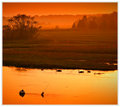
Through a Glass Darklyby raishComment: At first I thought there was a bit too much noise, but after looking at your entry a bit longer, I like it! the reflection in the glass ball is great, and the water really fits this photo. maybe you could've put the ball a bit more to the top or bottom to get that 1/3 rule. |
 Photographer found comment helpful. Photographer found comment helpful. |
| 06/28/2006 09:36:57 AM |
|
| Photographer found comment helpful. |
| 06/28/2006 12:36:46 AM |
|
| Photographer found comment helpful. |
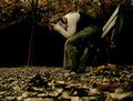
| 06/26/2006 12:44:48 PM |
Lonelyby Arti-ElviComment: great final score Elvi!
it was worth the musquito-bites ;) |
| Photographer found comment helpful. |
| 06/08/2006 01:44:16 AM |
|
| Photographer found comment helpful. |
| 06/07/2006 09:32:31 AM |
Dance of the Dandelion by alfrescoComment: congrats man!
You weren't bluffing. I was :P
Told you in the very beginning I had a bad score, and thought you were gonna win this H2H.
PM me with the punishments :P |
| Photographer found comment helpful. |
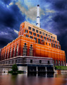
| 06/06/2006 03:26:46 PM |
Water and Lightby alfrescoComment: Hello, Greetings from the Critique Club.
As requested, here is an indepth critique of your submission. Please keep in mind this is a personal opinion.
Hello JP!
First Impression - the most important one:
Different! Strange colors. Weird water at the bottom. Hmm. Interesting!
Composition:
The composition looks great. My eyes follow the lines and capture a lot of details in the photo.
Technical (Color, focus, and light):
Focus: Focus is ok.
Color: The colors look surreal, especially the contrast between the orange bricks and the deep / dark blue sky & clouds. And the color in the water.
Light: It looks like you've used a major-fill-light to light up the building. Weird, huh!
I just can't get my head with the how and the why you did it. Some details of the post-processing might be very interesting.
Overall, after looking at your image for a long time, I still can't tell what to think about it. And I think that's good :)
I hope you've found this critique helpful. Good luck with future challenges! |
| Photographer found comment helpful. |
| 06/06/2006 03:16:21 PM |
Modern Day Colosseum: The MCGby hotpastaComment: Hello, Greetings from the Critique Club.
As requested, here is an indepth critique of your submission. Please keep in mind this is a personal opinion.
First Impression - the most important one:
Sharp & detailed.
Composition:
Composition looks good for me. I love super wide angle lenses with architecture, so I think that's a great decision. Makes everything look a bit "different" with the distortion. The dark road / sides and sky really work here.
Subject:
The subject doesn't really do much for me (sorry!)
Technical (Color, focus, and light):
Focus: Focus is very sharp, maybe a bit too sharp with USM, but that doesn't bother me.
Color: Colors look allright.
Light: I think you've exposed just the right time. Nothing to say about that. The lights at the top of the stadium look quite awesome. Great to see how they spread over the top of the building.
Overall I think you did a nice job with this long exposure shot. The only reason I could think this didn't end higher is because I think the subject is a bit boring. But that's a personal opinion :)
I hope you've found this critique helpful. Good luck with future challenges! |
| Photographer found comment helpful. |
| 06/06/2006 02:53:39 PM |
The Space Needle- 44 years old.by cabaComment: Hello, Greetings from the Critique Club.
As requested, here is an indepth critique of your submission. Please keep in mind this is a personal opinion.
First I want to say I have absolutely no idea what I'm looking at ;-)
The image you're showing is a complex one, full of lines and shapes. That's a thing I find very interesting. The composition is great and well balanced.
There are two things I think could have been better.
- The colors (blue and yellowish/goldish) look nice, but I think bumping up the contrast with an S-curve would have made the colors pop up just a little bit more.
- The image doesn't look tack sharp to me. A bit more USM might have worked, but I'm not sure about it.
Overall I like this image very much, and I think you got a nice score with it.
I hope you've found this critique helpful. Good luck with future challenges! |
| Photographer found comment helpful. |
| 06/04/2006 01:09:00 PM |
|
| Photographer found comment helpful. |
Home -
Challenges -
Community -
League -
Photos -
Cameras -
Lenses -
Learn -
Help -
Terms of Use -
Privacy -
Top ^
DPChallenge, and website content and design, Copyright © 2001-2025 Challenging Technologies, LLC.
All digital photo copyrights belong to the photographers and may not be used without permission.
Current Server Time: 08/14/2025 03:36:25 PM EDT.