| Image |
Comment |
| 04/10/2007 08:41:21 PM |
Rushup Edgeby PurpleFireComment: This is one of those images that almost looks unreal, like the trail is pasted ontop of a sky image, simply because of the way the trail and land just end. It's pretty cool, really. Also excellent color tones in the grasses! |
 Photographer found comment helpful. Photographer found comment helpful. |
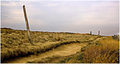
| 04/10/2007 08:39:56 PM |
Mam Tor to Losehillby PurpleFireComment: I really enjoy the composition of this one, how the land leads you deeper into the image. And there is an amazing sense of depth between the hill and the background sky. |
| Photographer found comment helpful. |
| 03/19/2007 11:44:59 AM |
Bubbles and Blossomsby CitadelComment: I think much of the problem here lies in the lighting. For starters, it has a harsh spread from the blown petal tips to the dark, black upper corners. Furthermore, this lighting gives the water drops a flat, milky appearance. A second light source above the setup, coming in at an angle, perhaps almost a raking light might have given the whole thing more "pop" and removed the milky look. It would also have balanced out the light and dark areas. I do like the blue glow coming from behind. I also wonder about the size of the water drops, and if having more smaller ones might have been more effective. I say this because the ones over the blue don't really do anything except look interesting, while it's the ones over the flower that create neat distortions. My last observation is that I'm unsure about including the edges of the bowl at the corners simply because it creates reflections and color-bands that draw the eye from the center of the image. |
| Photographer found comment helpful. |
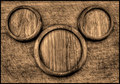
| 03/14/2007 11:47:58 AM |
Mickey Mouseby MAKComment: The textures in this shot are really wonderful, and the orientation of the plates (?) so they are somewhat against the grain of the table below really makes them stand out. |
| Photographer found comment helpful. |
| 03/14/2007 11:46:55 AM |
colloidal universeby skewsmeComment: This is interesting, as the leaf dominates at first, until you see the circles in the background. Quite the different view, I like it. |
| Photographer found comment helpful. |
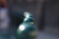
| 03/14/2007 11:46:02 AM |
In a rowby mflensesComment: I understand what you're getting at here, but your DOF is so limited that the idea of a sequence is lost, and instead appears as one sphere amid a blur. If the spheres directly before and after the central one were just a little less blured out, the effect would be much stronger. |
| Photographer found comment helpful. |
| 03/05/2007 09:34:57 AM |
|
| Photographer found comment helpful. |
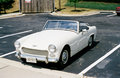
| 02/26/2007 10:40:38 PM |
Austin1.jpgby RainMotorsportsComment: You do indeed have a great DOF in this shot, it holds the car perfectly. The hood is a bit overexposed, but its white anyway, and it isn't so much that it detracts from the shot. Actually, the whole thing has a surreal look to it, like it's a toy car on a model train track or something. I actually like the inclusion of the back corner of the other car and the wooden fence around the dumpster - they give it good grounding in a specific place. |
| Photographer found comment helpful. |
| 02/02/2007 01:25:57 PM |
Windswept Beautyby annependletonComment: I like the lighting and the overall compensation, the few locks of hair across her face under her eye is distracting. |
| Photographer found comment helpful. |
| 01/29/2007 07:49:13 PM |
Hotelby dimitriiComment: I like the shadowy overall effect, but a little light on her face, at least in her eyes, would make it pop better and bring the eye to her, whereas now it's attracted to the background a bit more. But still very well done! |
| Photographer found comment helpful. |
Home -
Challenges -
Community -
League -
Photos -
Cameras -
Lenses -
Learn -
Help -
Terms of Use -
Privacy -
Top ^
DPChallenge, and website content and design, Copyright © 2001-2025 Challenging Technologies, LLC.
All digital photo copyrights belong to the photographers and may not be used without permission.
Current Server Time: 12/20/2025 08:36:08 PM EST.