| Image |
Comment |
| 02/27/2021 01:25:21 PM |
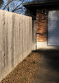
Up there by SistoComment: yes, this works, good one. Simple but effective. |
 Photographer found comment helpful. Photographer found comment helpful. |
| 02/27/2021 05:58:13 AM |
|
| Photographer found comment helpful. |
| 02/26/2021 05:58:46 AM |
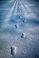
Show Yourself!by GeneralEComment: I had to copy and paste it into photoshop to see the scene (on calibrated screen). Would have worked if it was not so extremely dark. |
| Photographer found comment helpful. |
| 02/26/2021 05:55:27 AM |
Beyond by GolferDDSComment: Very fitting to the challenge and gorgeous light. Are the stripes real or added? I see light coming from the low left to to provide depth to the footsteps and snow and then I see the stripes coming from the front. Extra light through a fence? |
| Photographer found comment helpful. |
| 02/25/2021 04:01:51 PM |
Parallel Universe by pgirish007Comment: Parallel Universe I don't know, more like twin planets. Nice clean image. Wow factor is missing for me due to lack of colour. |
| Photographer found comment helpful. |
| 02/25/2021 03:22:50 PM |
Eleganceby LevTComment: Originally posted by LevT:
Originally posted by willem:
Originally posted by posthumous:
Originally posted by willem:
The light on the front of he face and shoulder is very nice, drawing the outlines. But in my view the transition from light to dark is too harsh for the shape of her face and then the light from the left is too strong again. Rather then a light (or reflector) from the left I think a slight reflection from the direction of the camera could have filled in some too strong shadows and emphasised the round shape of her cheeks and face. |
this is like telling an artist who works in ink that he should use charcoal.
|
I made the comment because in my view chiaroscuro is more about using charcoal than it is about using ink, i.e. use the pressure of the charcoal (the intensity of the light) to provide shape and depth to an object. If you prefer to use ink, please feel free. |
 willem in any BW photography the intensity of the light reflected from an object provides shape and depth, there is nothing else there. Chiaroscuro implies strong contrasts between chiaro (bright) and oscuro (dark), that's the whole point. I intentionally left the front in strong shadows, actually I even darkened it in post-processing a little bit specifically to amplify this effect. I also did not understand your original comment that the light from the left was too strong - I think it is very soft actually. willem in any BW photography the intensity of the light reflected from an object provides shape and depth, there is nothing else there. Chiaroscuro implies strong contrasts between chiaro (bright) and oscuro (dark), that's the whole point. I intentionally left the front in strong shadows, actually I even darkened it in post-processing a little bit specifically to amplify this effect. I also did not understand your original comment that the light from the left was too strong - I think it is very soft actually. |
No problem, there might be different interpretations of what chiaroscuro is about. I was describing my interpretation and I was describing how I saw your image related to that interpretation, in order to explain the background of my scoring. I realise in my style of comments I often focus mainly on improvement points (again: from my perspective) maybe without emphasising the strong points of an image. To explain better my original comment: I see for example the forehead highlights almost blown out and then the temple almost fully black. To me this was a very rapid transition from light to dark over a very small distance of the face, which in my view created a too harsh look. Considering the soft rounded shape of the face I would have preferred a more gradual transition which could have been obtained by some extra reflection from the front. Again, all subjective, all to explain the scoring, and to offer suggestions. If your interpretation and preference is different, no problem. |
| Photographer found comment helpful. |
| 02/25/2021 03:49:35 AM |
Eleganceby LevTComment: Originally posted by posthumous:
Originally posted by willem:
The light on the front of he face and shoulder is very nice, drawing the outlines. But in my view the transition from light to dark is too harsh for the shape of her face and then the light from the left is too strong again. Rather then a light (or reflector) from the left I think a slight reflection from the direction of the camera could have filled in some too strong shadows and emphasised the round shape of her cheeks and face. |
this is like telling an artist who works in ink that he should use charcoal.
|
I made the comment because in my view chiaroscuro is more about using charcoal than it is about using ink, i.e. use the pressure of the charcoal (the intensity of the light) to provide shape and depth to an object. If you prefer to use ink, please feel free. |
| Photographer found comment helpful. |
| 02/24/2021 04:49:22 AM |
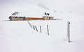
Snowed inby MargaretNetComment: Great leading line of the fence up to the farm. Nice scene. I can't see the separation between the roof and background but does not matter to me since the weather is not fully bright so it matches the atmosphere. There is a purple colour cast caused by the vignette. |
| Photographer found comment helpful. |
| 02/24/2021 04:44:21 AM |
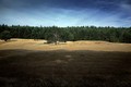
Sunset Farmby tnunComment: I like the four layers in this image. For me the foreground layer is a bit too much, I would crop away part of it to bring it more in balance with the size of the other layers. |
| Photographer found comment helpful. |
| 02/24/2021 04:39:00 AM |
Colorful hillsby Alex_PetriniComment: Gorgeous. I love the low light and how it makes the yellow trees jump out. The three layers (warm foreground, then low clouds, then mountains) work great together. |
| Photographer found comment helpful. |
Home -
Challenges -
Community -
League -
Photos -
Cameras -
Lenses -
Learn -
Help -
Terms of Use -
Privacy -
Top ^
DPChallenge, and website content and design, Copyright © 2001-2025 Challenging Technologies, LLC.
All digital photo copyrights belong to the photographers and may not be used without permission.
Current Server Time: 06/21/2025 06:25:21 AM EDT.