| Image |
Comment |
| 08/25/2004 03:31:19 PM |
Ashamedby KonadorComment: I like the minimalistic approach and the sculpting with light. |
 Photographer found comment helpful. Photographer found comment helpful. |
| 08/25/2004 03:27:01 PM |
mother natureby SeanachaiComment: good idea to desaturate the subject instead of the surroundings, she looks like a statue, which I assume was also the intention. |
| Photographer found comment helpful. |
| 08/25/2004 03:24:31 PM |
Bed Headby ElemmennopeComment: A classic, with nice soft window light matching her beatiful body. I think you could have gone a bit closer and avoid the view of the wood and the corner of the room. |
| Photographer found comment helpful. |
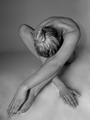
| 08/25/2004 03:21:09 PM |
Bashfulby DufusComment: I like the creation of the lines with the arms and legs, almost abstract. nice soft light as well. Maybe the hand should not have crossed over to the other side of the foot. |
| Photographer found comment helpful. |
| 08/25/2004 03:17:20 PM |
Attractionby bobdaveantComment: fantastic image but I don't see a nude statue fitting the challenge theme. |
| Photographer found comment helpful. |
| 08/25/2004 03:14:56 PM |
Odalisqueby JesuispeureComment: good focus on the head and eyes, but the focus on the body looks unnaturally soft. the edge of the bed shoulod not have been included. |
| Photographer found comment helpful. |
| 08/25/2004 03:12:53 PM |
Serenity by grigrigirlComment: great lighting to achieve beautiful toning of the body. Great pose. |
| Photographer found comment helpful. |
| 08/25/2004 03:10:03 PM |
FREE WILLYby siggiComment: reminds me of the winner of the freedom challenge. but the light and clouds in this one is even better. Good image but you're up against some tough competition. |
| Photographer found comment helpful. |
| 08/24/2004 04:18:59 PM |
At Peace With Curvesby mocabelaComment: nice curves, nice hair, nice face, I like her expression. The light is nice and soft but I do see some greenish tints on her body, especially close to her hair. I find the placement of her hands and the fact that they push her breasts out of shape less attractive. Good cropping |
| Photographer found comment helpful. |
| 08/24/2004 04:15:32 PM |
Twinsby debitiptonComment: alway special to me, since I am one of twins as well. I would have brought them more to the middle by cropping away some of the right part of the image, nice light and tones. |
| Photographer found comment helpful. |
Home -
Challenges -
Community -
League -
Photos -
Cameras -
Lenses -
Learn -
Help -
Terms of Use -
Privacy -
Top ^
DPChallenge, and website content and design, Copyright © 2001-2025 Challenging Technologies, LLC.
All digital photo copyrights belong to the photographers and may not be used without permission.
Current Server Time: 06/28/2025 12:00:57 AM EDT.