| Image |
Comment |
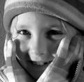
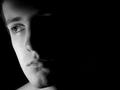
| 01/03/2003 05:42:46 PM |
My Kateby redfigComment: The one shadowed eye really hurts this shot a lot. Having an eye shadowed really doesn't fit with the tone of this shot at all. Otherwise, this is a wonderful shot that I really enjoy. Nice crop. Without the shadow over the eye this is probably a 9. As is, I'll say a 7. |
 Photographer found comment helpful. Photographer found comment helpful. |
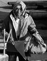
| 01/03/2003 05:39:49 PM |
Fishermanby NatashaComment: Whatever the flag/stick thing in the front is, it's quite distracting to the shot. It seems you incorporated it intentionally, (I'd assume it has some significance to fishing), but it'd have been much better if it didn't obstruct your main subject. 5 |
| Photographer found comment helpful. |
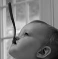
| 01/02/2003 06:17:48 PM |
Spoon Fedby nards656Comment: The soft focus is a little bit much for me. It's a cute shot that is cropped well. A little more contrast with the background might have been a slight improvement. 6 |
| Photographer found comment helpful. |
| 01/01/2003 10:36:27 PM |
A good prospectby jjbeguinComment: The shadow behind him detracts from the shot. At the bottom of the shot there isn't enough contrast between the background and his legs, which tend to look awkward because of it. The striped thing he's sitting on tends to distract as well. Perhaps cropping just above the knee would have been a good idea. I like the pose, but it's hard to see the details of the face and such. Perhaps a closer shot with a horizontal orientation would have worked well. Overall this is a good shot, but it has some detracting factors to it. 5 |
| Photographer found comment helpful. |
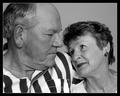
| 01/01/2003 10:28:39 PM |
35 Yearsby albright1Comment: I'm not sure if it was intentional, but the two expressions almost seem to be contrasting. His seems harsh and almost disapproving with a hint of happiness, while hers seems nostalgic and somehow both joyed and desperate (for returned affection?). I'm probably reading into it too far, but that's how they strike me. This is enhanced by the fact that he is slightly more in the foreground than she is, and he dominates the frame, suggesting more power than she does. His skin tones are darker as well. Intentional or not, it is an extremely interesting (and for me, effective) dynamic. However, your title leads me to believe that wasn't the expression you were going for at all.. I could be wrong though. Great shot. 8 |
| Photographer found comment helpful. |
| 01/01/2003 10:20:21 PM |
On the Vergeby KonadorComment: Somewhat similar to my shot. I like the framing and the shadow a lot. The face here strikes me as being remarkably crisp and smooth, with a perfect complexion (almost to the point of looking surreal or made up) which creates an interesting effect. It might have improved it slightly if the lighting weren't more concentrated on the cheek than the forhead. Great shot though. 8 |
| Photographer found comment helpful. |
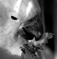
| 01/01/2003 03:57:55 PM |
mmmm good stuffby CreativeFlyPhotoComment: Great framing, I love the claw/talon (I lack the proper terminology) at the bottom. Excelent shot. Lighting might have been better without the two stripes, but it's easily overlooked. 8 |
| Photographer found comment helpful. |
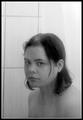
| 01/01/2003 03:56:27 PM |
Bathroom Mirror Realityby lisaeComment: I think a tighter crop would help, although I think you might be leaving a wider shot in order to simulate an entire bathroom mirror with your shot. I think the title is vital to the shot, as alone I don't think it's particularly impressive in terms of expression or portraiture, however, if I think of it as you actually looking into a bathroom mirror suddenly it all starts to fit and seems to capture a look of dull self-evaluation that strikes me as very real. Although I could just be reading into it way to far. 8 |
| Photographer found comment helpful. |
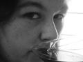
| 01/01/2003 03:47:09 PM |
untitledby shedonistComment: The glass she is drinking out of has an abstract feel to it, but it doesn't seem to fit the feel of the rest of the photo, and it ends up being distracting instead (at first I couldn't figure out what it was). I like the bright background and the darker face, and the tight close up works well here... there's just something about that wine glass that seems like it almost worked but didn't. Maybe it's just that it obstructs the mouth, which is so vital to facial expression. But that's just me. = ) 6 |
| Photographer found comment helpful. |
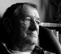
| 01/01/2003 03:44:02 PM |
Introspectionby PtmanComment: the bookshelf behind is somewhat distracting. I'm tempted to say I'd have cropped out the right side past his face, but I do like having the extra space, it'd just be better if there were nothing there. Of course I understand this was probably unavoidable. It looks like the light is a little bit harsh as well. I do like the expression and the pose in general. It's a good shot. 7 |
| Photographer found comment helpful. |
Home -
Challenges -
Community -
League -
Photos -
Cameras -
Lenses -
Learn -
Help -
Terms of Use -
Privacy -
Top ^
DPChallenge, and website content and design, Copyright © 2001-2025 Challenging Technologies, LLC.
All digital photo copyrights belong to the photographers and may not be used without permission.
Current Server Time: 08/23/2025 03:54:09 PM EDT.