| Image |
Comment |
| 04/10/2003 02:30:26 AM |
Wooden Crayolasby PlaceboComment: This shot looks like it needs some better lighting. In my opinion, it is essential that this background comes out as a crisp white, so taht the colors contrast effectively with the white. Using a solid white background and a more powerful light would increase the impact of the colors in this shot by a lot. Some post-processing to brighten and increase contrast could help as well, but the adjustments would be more effective if they were made in the process of shooting. |
 Photographer found comment helpful. Photographer found comment helpful. |
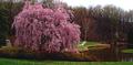
| 04/10/2003 02:24:05 AM |
Springby bioshoreComment: I like the subject/background contrast here. This is a nice shot all around. It'd probably have been better if you would have maxed out size, but it looks nice as is. There also seems to be a bizarre red dot at the trunk of your tree, but I can't say I know how to fix that. Good work. Good luck. 7 |
| Photographer found comment helpful. |
| 04/10/2003 02:18:50 AM |
.......by dimitriiComment: Looks oversaturated. The color here doesn't seem natural or impactful, it seems somewhat awkward. |
| Photographer found comment helpful. |
| 04/10/2003 02:08:56 AM |
Sistersby karmatComment: Beautiful composition. It seems a little on the bright side to me and the blue one seems to have a rainbow fringe to it at the bottom left. I'm not sure if that's naturally occuring or as a result of excessive post-processing, but it does look somewhat unnatural. I really like the rhythm and symetry that the strings create here, lining up in the same spot on each corner. And the curve down the center works great as well. Good work. I think my only complaint here, ironicly, is maybe the colors.. the yellow and blue just don't seem very powerful to me, they seem somewhat washed out. Regardless of that I think this is a great shot. 7 |
| Photographer found comment helpful. |
| 04/10/2003 01:51:49 AM |
Colorful!by nathaliedooComment: Colorful indeed! I like the abstract feel to this shot, and the colors are certainly strong. Nice work. The flower centers (I lack the correct term) does seem to lack aesthetic appeal though, their drab colors contrasting sharply with the impressive petals, and I think that hurts the image a little. Good luck. 7 |
| Photographer found comment helpful. |
| 04/06/2003 10:39:48 PM |
Prickly Greetingsby JeileenComment: Needs to come in sharper. A bit more color contrast would help too, as the green in this shot seems rather washed out. I do like the composition and the idea here a lot though. |
| Photographer found comment helpful. |
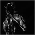
| 04/06/2003 03:01:01 AM |
Tabletop Warriorby autoolComment: As a rule I don't like figurine shots.. but this seems to be an exception. I like the lighting on this shot a lot. The dark slick feel of this shot really appeals to me. Nice work. |
| Photographer found comment helpful. |
| 04/06/2003 01:40:32 AM |
|
| Photographer found comment helpful. |
| 04/06/2003 01:39:14 AM |
Red leafby xertionComment: The ring of the light source in the background seems to detract from this shot a lot. |
| Photographer found comment helpful. |
| 04/06/2003 01:37:15 AM |
The Nuts N Boltsby dg02Comment: The clarity and detail is great. The colorful highlights seem to add character as well. Good work. 8 |
| Photographer found comment helpful. |
Home -
Challenges -
Community -
League -
Photos -
Cameras -
Lenses -
Learn -
Help -
Terms of Use -
Privacy -
Top ^
DPChallenge, and website content and design, Copyright © 2001-2025 Challenging Technologies, LLC.
All digital photo copyrights belong to the photographers and may not be used without permission.
Current Server Time: 08/23/2025 08:09:02 PM EDT.