| Image |
Comment |
| 05/02/2003 08:11:23 PM |
create. submit.by helgihelgiComment: I love the style of this one. It is simple, stark, but also attention getting. I'm not sure if it gives enough information (something about digital photography or a contest might have helped) to draw in a good potential user, but I love the general appeal of this. 9 |
 Photographer found comment helpful. Photographer found comment helpful. |
| 05/02/2003 08:08:06 PM |
sticker project 1c by jjbeguinComment: Excellent shot. The shutter effect ties perfectly to the website, the sky is an effective backdrop. The design is eye catching and simple, and gives all the necessary information. 10 |
| Photographer found comment helpful. |
| 05/01/2003 12:40:25 AM |
Untitledby PHOTOCHlXComment: cool design, but it's kind of odd to use a roll of film to advertise a digital only photo site. |
| Photographer found comment helpful. |
| 04/30/2003 07:57:21 PM |
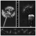
Breaking Free by FranziskaLangComment: Wow. I\'m not sure there\'s anything I can recommend to improve. The contrast and crispness is wonderful. The images flow together with each other perfectly. Each individual image is powerful, yet is more powerful in the presence of the others. The composition of the multiple images into one is excellent. If I wore a hat, it would be off to you. Beautiful work. 10 without a single second thought. I hope this wins. |
| Photographer found comment helpful. |
| 04/30/2003 07:45:46 PM |
|
| Photographer found comment helpful. |
| 04/30/2003 07:42:25 PM |
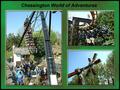
Theme Parkby marboComment: The overall series is well composed and flows together well, but the individual images here have problems. All of them seem to lack a necessary amount of detail, especially the top right one, followed by the left side one. The bottom right one is my favorite of the three, because the composition doesn't rely on the details of blurred out people, it relies on the structure of the ride and the treeline and sky. The other two shots just aren't particularly effective. Good concept, but it didn't quite work out. |
| Photographer found comment helpful. |
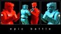
| 04/30/2003 07:36:09 PM |
ROCKem SOCKemby scab-labComment: I like this one. The two outside shots work great for demonstrating the two sides of the battle. The reversal of sides in the center frame forms great color contrast. The amusing nature of the shot is demonstrated effectively. The shots flow together well. Beautiful. 9 |
| Photographer found comment helpful. |
| 04/30/2003 07:25:22 PM |
Heineken: Smooth and Refreshing!by BigSmilesComment: These pictures have an obvious tie together, but the composition doesn't really seem to flow together well. It feels unbalanced and somewhat random. Perhaps having the large bottle in the center and the multiple bottles on the left would have made the composition seem more even (and perhaps more sequential: 5 bottles, one bottle, glass). The shots in this series are each crisp and individually pretty well done, but they don't seem to form one cohearent composition here. 5 |
| Photographer found comment helpful. |
| 04/30/2003 06:59:27 PM |
Suds 'n Sonby tcherringComment: This is an intersting piece of photoshop work, but it ends up looking very fake and rather cheesy. 3 |
| Photographer found comment helpful. |
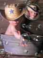
| 04/30/2003 06:53:08 PM |
groogy dayby JeileenComment: I like the back two shots, but the front shot doesn't seem as interesting or as effective as the other two. It also doesn't seem to flow together with the rest of the composition very well. I do like the idea and I like the back two shots. 5 |
| Photographer found comment helpful. |
Home -
Challenges -
Community -
League -
Photos -
Cameras -
Lenses -
Learn -
Help -
Terms of Use -
Privacy -
Top ^
DPChallenge, and website content and design, Copyright © 2001-2025 Challenging Technologies, LLC.
All digital photo copyrights belong to the photographers and may not be used without permission.
Current Server Time: 08/24/2025 03:21:38 AM EDT.