| Image |
Comment |
| 05/04/2003 03:24:11 AM |
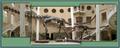
Pick On Someone Your Own Size!by whitetigerComment: The people (and staircases) provide a sense of scale that makes this shot immensely more effective. This shot made me think about how I can't even imagine a living one of those suckers. |
 Photographer found comment helpful. Photographer found comment helpful. |
| 05/04/2003 03:21:57 AM |
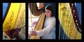
Jeni's Etudeby sagestudioComment: This was a good choice for a multi-image shot, because the right and left side shots are good shots, but without a context they would be hard to identify for someone not familar with the harp. However, the middle shot provides that context, and therefore makes the other shots more effective. Good work. 7 |
| Photographer found comment helpful. |
| 05/04/2003 03:18:53 AM |
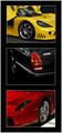
$peedVisionby RiderGalComment: I like the tight crops on these. I think the result is more compelling than if they had been more revealing shots of the cars. Lets see how my identification skills are, I'd guess top to bottom: Lamborghini (Diablo), Jag (not sure about that one), and Ferrari (F50). I guess I'll see how I did after the challenge. 8 |
| Photographer found comment helpful. |
| 05/04/2003 03:08:59 AM |
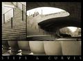
Downtownby ursulaComment: The top left image looks over cropped (blurry, low resolution). The top left, and bottom images are somewhat interesting, although not particularly drawing. However, the top right image is excelent. The curves and lines work quite effectively in it, and I think it would be better as a stand alone image than this is as a multi-image. |
| Photographer found comment helpful. |
| 05/03/2003 06:30:36 PM |
In the Blink of an Eyeby StevePaxComment: The colors here look washed out and the eye isn't in sharp focus. The concept has some potential, but the presentation lacks oomph. I'd have tried different angles and probably more dramatic lighting, as this ends up rather drab. |
| Photographer found comment helpful. |
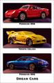
| 05/03/2003 05:29:52 PM |
Dream Carsby orussellComment: Heh.. how did a toyota celica get in there with two porsches? |
| Photographer found comment helpful. |
| 05/03/2003 05:28:34 PM |
|
| Photographer found comment helpful. |
| 05/03/2003 05:24:55 PM |
Oriental Breezeby bruster54Comment: I really like the center frame and how it shows up in minimalist ways only, however, it doesn't really fit into the tone of this sequence very well, since the other two show up very clearly and strongly. I think putting the center shot against a white background would have created an interesting contrast with the other two shots, but still maintained the same tone as the other shots. 7 |
| Photographer found comment helpful. |
| 05/03/2003 05:10:06 PM |
Thoroughbred Parkby RLSComment: Well, it's an interesting image. The top and bottom shots frame the middle shot pretty well. The effect here is effectively applied, and applicable to the shot, as it is intended to display motion. So I'd say this is more than just photoshop for the sake of photoshop, however, I wouldn't really say this is a photograph so much as a piece of art that used a photograph as it's basis, so I'm not as inclined to score it as highly in a photography contest. Good luck. 5 |
| Photographer found comment helpful. |
| 05/02/2003 08:16:50 PM |
DPChallenge Logo on Wooden Trash Binby orussellComment: It's somewhat more unique than just a plain logo, but in fact it becomes less clearly visable than a plain logo, and the new texture doesn't really connect in any way with the site or make this a more appealing design. The beveled, drop shadowed url is a bit over processed I think. Plain black text would probably have been more effective. |
| Photographer found comment helpful. |
Home -
Challenges -
Community -
League -
Photos -
Cameras -
Lenses -
Learn -
Help -
Terms of Use -
Privacy -
Top ^
DPChallenge, and website content and design, Copyright © 2001-2025 Challenging Technologies, LLC.
All digital photo copyrights belong to the photographers and may not be used without permission.
Current Server Time: 08/24/2025 03:22:06 AM EDT.