| Image |
Comment |
| 06/13/2003 06:39:50 PM |
|
 Photographer found comment helpful. Photographer found comment helpful. |
| 06/13/2003 06:33:12 PM |
Stuff Magazine - or - Playboyby DrJOnesComment: Oh dear, I'll never be able to think of trinity the same way again. = )
Just kidding. For what it is, it's well done. I particularly like how the sky is overcast in the background with what looks like stormy weather on the way. It's a nice change from the norm. This is probably one of the few shots I could actually see as making it onto a magazine cover. However, I think this style of photograph has a limited extent of artistic accomplishment, no matter how well you do it. (By that I don't mean nude or errotic photography, I mean cover girl straightforward pose cheesecake photography). So... how about a 7. |
| Photographer found comment helpful. |
| 06/13/2003 06:24:52 PM |
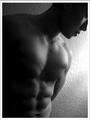
Male Fitnessby imagesloyolaComment: I doubt we'll ever see anything this artistic on the cover of men's fitness, but people are telling me the same thing about my shot, and I've decided I'm not interested in shooting magazine cover styled shots anyway, so I'm not penalizing for overly artistic shots on anyone else's either. I think this is a great shot, and it does fit your magazine quite well. The lighting and shadows are excelent, I like how only the form of his face is visable, and we don't see his actual face. And those muscles show quite nicely. Great work. 9 |
| Photographer found comment helpful. |
| 06/13/2003 06:16:35 PM |
Going Green Gazetteby cloud9Comment: I don't know why you went with a square crop on this one. The sides don't seem to add anything to the shot, and those trees that show up a little detract from the composition. It is a good subject and an interesting photo, but I'd have gone with a tighter crop. |
| Photographer found comment helpful. |
| 06/13/2003 05:57:41 PM |
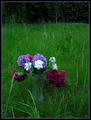
Country Livingby MonaComment: The idea of having a vase of flowers outdoors is an interesting one, but this photo ends up without much visual "oomph". I think it would help if it were a little lighter, and perhaps if the background was a bit more interesting. |
| Photographer found comment helpful. |
| 05/25/2003 09:12:21 PM |
|
| Photographer found comment helpful. |
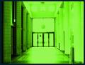
| 05/25/2003 09:08:54 PM |
The Portalby bil99Comment: I like the grid-like appearance of the left hand pillars. |
| Photographer found comment helpful. |
| 05/25/2003 09:06:13 PM |
|
| Photographer found comment helpful. |
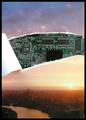
| 05/21/2003 11:43:00 PM |
my matrixby redhedComment: It needs some better lighting, but I do like the concept.. I thought about similar ideas as an interpretation of the matrix.. A dream world pulled over our eyes to keep us happy... |
| Photographer found comment helpful. |
| 05/21/2003 11:37:38 PM |
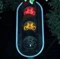
They control our lifeby pitsamanComment: I like the harsh contrast and the black and white with only hints of color showing, although perhaps a green focus color would have been preferable to the blue... although I do see tha tyou worked green into the rest of the piece nicely. |
| Photographer found comment helpful. |
Home -
Challenges -
Community -
League -
Photos -
Cameras -
Lenses -
Learn -
Help -
Terms of Use -
Privacy -
Top ^
DPChallenge, and website content and design, Copyright © 2001-2025 Challenging Technologies, LLC.
All digital photo copyrights belong to the photographers and may not be used without permission.
Current Server Time: 08/24/2025 08:24:40 AM EDT.