| Image |
Comment |
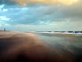
| 01/04/2004 01:56:18 AM |
a new day dawnsby joannadivaComment: The lense flares are cool, but the rest of the shot has not detail due to the contrast, leaving it rather uninteresting overall. That's too bad because the beams of light in the background look like they offered a lot of potential, but thye just don't come through very strongly because the shot is completely dominated by the sun flare in the top right. |
 Photographer found comment helpful. Photographer found comment helpful. |
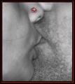
| 01/03/2004 06:00:11 PM |
Illusionby Spanish_GreaseComment: Great idea for a shot, and wonderfully executed. The cool blue tone was a good choice as well. |
| Photographer found comment helpful. |
| 01/03/2004 05:58:35 PM |
Helping Handby timj351Comment: It an interesting idea, but this photo seems to have been sapped of all the potential emotion that is present. To some extent I think we fill in the gaps naturally, assuming the awe of the boy and the tender smile of the officer, but you've cut that all out of the shot. The boy is completley passive in this shot, and the officer's hand carries a little bit of expression, but other than that the figures in this shot are cold and unemotional, which certainly couldn't have been the intention. I think including the officer's face isn't necessary, since having it cut off adds to the feeling that he is larger than life in the eyes of the child, but perhaps a side angle that showed the kids face or at least some pose with more expression to it would make this a much better shot. |
| Photographer found comment helpful. |
| 01/03/2004 03:50:10 PM |
Fire Islandby phaedrusComment: Great colors here, but I find it a little compositionally uninteresting. |
| Photographer found comment helpful. |
| 01/02/2004 03:32:09 PM |
First Snowby Crafty SueComment: I think I'd have gone black and white on this shot, if for no other reason than to keep that yellow sign in the background from drawing attention to itself. |
| Photographer found comment helpful. |
| 01/01/2004 11:14:41 PM |
Love in Redby RoosterComment: I'm really not a fan of the selective colorization here at all. The shot itself is interesting but of course the colored portion changes it dramatically and attracts all the attention. I can't say that this is a bad shot, it seems well done, it just doesn't work for me. |
| Photographer found comment helpful. |
| 01/01/2004 10:38:58 PM |
Exhuberanceby amsmythComment: I like the big x pattern that this makes, but this really isn't close enough or detailed enough to be very interesting. I'd recommend that you try to get closer, get sharper, and maybe try more unique angles or setups. |
| Photographer found comment helpful. |
| 01/01/2004 10:24:09 PM |
Finding Nemoby marboComment: You got some really vivid rich colors here, and they don't look oversaturated at all. Nice work. |
| Photographer found comment helpful. |
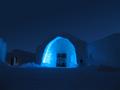
| 01/01/2004 10:23:14 PM |
IceHotelby indigo997Comment: Facinating.. I'm looking forawrd to the description to find out where this is. Maybe getting in a bit closer would have improved this, as well as maybe trying a less straight on angle, because currently only a small portion of the shot is your subject of interest, and it is dead center, which doesn't work out very well. Perhaps even shifting the frame just a little higher would have made this a much better shot. |
| Photographer found comment helpful. |
| 01/01/2004 06:51:31 PM |
Up or Downby JC_HomolaComment: Interesting forms and I especially like the angle you shot from. A nice abstract. Good work. |
| Photographer found comment helpful. |
Home -
Challenges -
Community -
League -
Photos -
Cameras -
Lenses -
Learn -
Help -
Terms of Use -
Privacy -
Top ^
DPChallenge, and website content and design, Copyright © 2001-2025 Challenging Technologies, LLC.
All digital photo copyrights belong to the photographers and may not be used without permission.
Current Server Time: 08/23/2025 05:01:26 PM EDT.