|
|
|
Showing 3841 - 3850 of ~4217 |
| Image |
Comment |
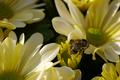
| 09/21/2005 09:39:05 PM | One, Two, Three, I see a beeby Photogirl_in_VancouverComment: 5 - Good potential, nice colors. Criticism; while it seems you have met the Challenge with the 'rule' (but I am not 'expert'), I would like to see a more precise 'placement' using the rule. Also, the focal point needs to be 'higher', as the 'bottom' of the bee, and the flower under it and left have the focus. This does not look 'natural' to me, (if it is my apologies), but the bee looks dead, and placed - if so, then a better 'positioning' and angle would have made this a better shot in my opinion. The soft lighting coupled with the 'yellows' and 'creams' is nice, but the darkness underneath detracts in my opinion to the 'feel' of this shot. Mainly the focal point(s) for me need addressing here, and that 'dark gap'. Up to 5 from 4 for potential. |  Photographer found comment helpful. Photographer found comment helpful. |
| 09/21/2005 07:31:52 PM | My Nephewby donfanaticComment: 5 - Good potential here. I think you captured a bit of character too, but, criticism; I think 'he' is getting 'lost' in the background'. I would like to have seen more definition, possibly even the use of a b/w or sepia, although I know that contradicts what I just said about the background and that it might not work well in b/w or sepia, so not sure. 'He' is also either 'softened' or 'blurred' so I would like to see again, more definition, more 'depth', by making 'him' stand out more. I like the perspective and angle, but would like to have seen an even sharper one. Possibly a slight nudge rotation on the right side upwards, not sure. Regarding the Challenge, while no 'expert', I would like to have seen either the child's face placed more on the 'intersection' or else the use of 'right third' used for his 'entire body'. So a tighter crop on the left side perhaps, but as I said, although I like the angle, if it was even sharper, you may also have obtained a 'rule of thirds' with your 'base/background', the grass perhaps going up 'two thirds'. | | Photographer found comment helpful. |
| 09/21/2005 07:24:27 PM | Lounging Aroundby Tommy 2 ToneComment: 6 - Good potential here. Criticism; whilst the eye(s) seem to be well placed for the Challenge/rule(s), I would like to see even more impact/contrast there. The carpet/floor is competing with the dog in my opinion and if it were not noticeable, more definition/focus on the dog, would have made this a better shot in my opinion. | | Photographer found comment helpful. |
| 09/21/2005 07:21:18 PM | Courageby deapeeComment: 7 - Nice and good potential. Criticism; the frame detracts in my opinion. Whilst no expert in this rule, and not only for this Challenge, I think this shot would have been better with more height, and therefore the flower (or centre) placed almost spot on the 'intersection'. The colors are nice, but would like to see a little more bold or contrast, again especially on the centre of the flower. I like the background, but the green coloring seems to slightly 'clash' with the green of the stem in my opinion, or rather, is not complementary, but minor. I think the frame adds to that 'conflict' too, not sure. It is the simplicity I like most in this shot. | | Photographer found comment helpful. |
| 09/21/2005 07:05:24 PM | Nigella damascenaby BBBastetComment: 7 - Nice shot. Well done for the correct name in the title. Criticism; while no expert in this 'rule', for this Challenge, I would like to have seen an even stricter application here. The 'red' in the background detracts in my opinion, so a tighter crop (or different angle), nudging the flower and "point of interest" further into the 'intersection', would have made this a better shot in my opinion. Nice colors, good focus on the flower detail, including the leaves. | | Photographer found comment helpful. |
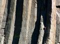
| 09/21/2005 06:58:28 PM | Almost Thereby SonifoComment: 7 - Good shot and good application of the rule(s) for the Challenge. Criticism; in my opinion, the pink/red(?) shirt detracts from the drama in this shot, therefore I think a selective desaturation, or b/w or sepia may have overcome this, not sure. Having said that, I do like the 'pinks' and 'greens/yellows' you have captured in the rock surface. Also, especially for this Challenge, and having your "point of interest" placed at an 'intersection', I would like to have seen your 'subject' in more focus, or emphasized somehow, or closer, not sure. | | Photographer found comment helpful. |
| 09/21/2005 06:53:14 PM | simpleby nidnodComment: 4 - Good effort compositionally, and to meet the Challenge/rule(s). Criticism; it is 'over' softened/blurred, and while perhaps this is what you were going for, there needs to be more 'depth' to pull that off in a composition such as this in my opinion. The 'background'/fabric dominates, including the 'fold', so that detracts, maybe a slightly different angle, different lighting, may have made this a better shot in my opinion. | | Photographer found comment helpful. |
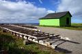
| 09/21/2005 06:44:42 PM | Little Green Shackby orussellComment: 6 - Nice perspective, nice colors. Criticism; fore left, minor details there, looks like 'garbage', so either cropped out, although in my opinion, if you had moved closer to the 'rack', and utilized 'it', with an even sharper perspective, while retaining the 'shack' at the 'rule intersection', would have made this a more dramatic shot. Perhaps you were trying to retain the shadow that I just noticed under that 'rack', but as I say, in my opinion, for this Challenge, and given your title, more impact on the 'shack' would have made this better. A lot of potential in this scene. Perhaps even a little darker/contrasted, not sure. | | Photographer found comment helpful. |
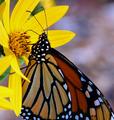
| 09/21/2005 06:38:25 PM | Hannibal Nectarby lshlesComment: 7 - Amusing title and good meeting of Challenge. Criticism; difficult, as you have applied the rule well in my opinion, although I am no expert, in regards to the Challenge. However, given the subject, I just wish the wings were not cropped. The colors are nice, the background is a little detracting though in my opinion, just a bit 'busy' for the subject(s). Maybe just a straightening/rotate, especially if you are going to 'chop the wings', retain or 'use' the symmetry to 'balance' the shot, not sure. | | Photographer found comment helpful. |
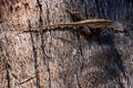
| 09/21/2005 06:30:52 PM | Lizzardby gg_139Comment: 6 - Good potential here. Criticism; lighting is the biggest issue and the liZard seems either out of focus or 'blurry'. Difficult with the tree bark background, but definition on the lizard, the lighting and making it 'contrast' somehow again the bark, would have made this a better shot in my opinion. Technically, while no expert in this rule, it seems you have used 'the top third', however the body of the lizard is on the 'intersection', in this case, I would like to have seen the head/eyes on that intersection, or else possibly with a different angle that 'top third' rule enhanced in some way. | | Photographer found comment helpful. |
|
Showing 3841 - 3850 of ~4217 |
Home -
Challenges -
Community -
League -
Photos -
Cameras -
Lenses -
Learn -
Help -
Terms of Use -
Privacy -
Top ^
DPChallenge, and website content and design, Copyright © 2001-2025 Challenging Technologies, LLC.
All digital photo copyrights belong to the photographers and may not be used without permission.
Current Server Time: 06/20/2025 03:29:15 AM EDT.
|