|
|
|
Showing 3821 - 3830 of ~4217 |
| Image |
Comment |
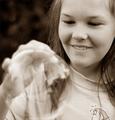
| 09/22/2005 07:55:35 PM | Hand Bubbleby isonajComment: 3 - For the potential. In my opinion this shot is all about the girl, not the bubble, or even the illusion with the hand. Nice 'candid' portrait style though but... 'if only' that bubble were the dominant feature (with good focus and not cropped and probably also retaining color) for the Challenge. |  Photographer found comment helpful. Photographer found comment helpful. |
| 09/22/2005 07:51:32 PM | Fallenby tenfrozentoesComment: 4 - Probably not the only one saying this, but the rotation 'diminishes' this shot in my opinion. Whatever way is right side up, I think would have made a much better, and perhaps unique in this Challenge, shot. | | Photographer found comment helpful. |
| 09/22/2005 07:47:34 PM | big bubble.......bathby willy_flewComment: 4 - A lot of potential here and it looks like you made an effort to try to be creative. Criticism; in my opinion, you would need to either go really 'simple' to pull this off, compositionally and colors, with the focus on the 'bath/bubble' entirely with the background and base 'neglible', to create an 'illusion' or else 'create depth' in your 'illusion' using the other 'pieces', while no expert at this, I think the latter would be harder to achieve. The 'scale' of the taps on the soapdish(?) will inhibit any illusion anyway. Creative use of what looks like a cardboard box at the 'back' though and the texture has potential too. I think the plant/leaves is disproportionate and detracts, as does the paper towel/napkin/serviette, though it does have a kind of 'rug' pattern so perhaps potential with that too, not sure. Angle and lighting need attention too. But mostly, for this Challenge, you have fairly good focus and detail on the bubble(s), so well done on that - not easy. | | Photographer found comment helpful. |
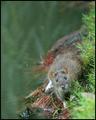
| 09/22/2005 07:36:49 PM | Curiosity......by WarbyComment: 8 - Great shot, great perspective. Good colors, detail and texture. Criticism; if the detail and focus on/in the rat, especially it's eyes/face/head, were as sharp as on the grass near it on the right, would have made this an even better shot in my opinion. Technically, while no 'expert', you appear to have applied the rule(s) strictly and well here and it enhances this shot even more in my opinion. Up to 8 from 7 after commenting. | | Photographer found comment helpful. |
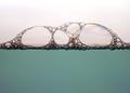
| 09/22/2005 06:06:28 PM | .oOBuBbLeScApeOo.by Keith ManiacComment: 8 - Nice shot for the Challenge. Good 'spectrum effect', be even better if it were uniform across all the bubbles to the left, and possibly a little darker, in my opinion. Nice 'base' color. | | Photographer found comment helpful. |
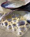
| 09/22/2005 05:59:30 PM | Beach Bubblesby GeeeComment: 8 - Good, and 'different' shot for this Challenge. Good texture and detail. | | Photographer found comment helpful. |
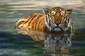
| 09/22/2005 07:57:22 AM | Fearlessby xylkeComment: 7 - Good shot. Criticism; would like to see more focus on the eyes/face. Whilst no 'expert' on the rules, and not only for the Challenge, I would like to have seen this cropped more on the right with more space on the left. The fly above it's right ear is a little distracting, but minor. Nice colors, though would like to have seen them even more vivid if possible. On looking closer, if possible and you had more space at the bottom/fore, perhaps even cropping the top off, and the fly, tighter in on left right, leaving just the tiger and utilizing the 'top row of thirds', may have made this better, not sure. | | Photographer found comment helpful. |
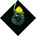
| 09/22/2005 07:02:06 AM | The Transparent Planetby RentrenzComment: 7 - Nice and simple. Criticism; frame detracts in my opinion. More definition on the bubble, would have made this an even better shot. Good placement, especially with the clouds. Up to 7 from 6. | | Photographer found comment helpful. |
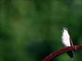
| 09/22/2005 01:21:39 AM | Feeding Restby scrum8Comment: 7 - Good shot. Criticism; whilst no 'expert' in the rule(s), I would like to have seen this using a stricter sense of the rules, especially for the Challenge. A tighter crop, or closer zoom, incorporating more (if possible) of the right of that rusted 'perch', more detail in the feathers, would have made this a better shot in my opinion. Like the colors and the background, just more definition on the bird, as you have in the 'perch'. | | Photographer found comment helpful. |
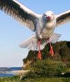
| 09/22/2005 01:07:04 AM | Hiby owenComment: 8 - Really like this shot and the perspective/timing. Good colors and background, and while no 'expert', good use of the rule(s), especially for the eyes. Criticism; though I would like to see the entire wing span, difficult with this crop and 'opportunity'. If it were a horizontal frame rather than vertical, who knows. The detail in the bird is great, including the feathers, feet, but especially the eyes. Just like to see all that 'enhanced' more if possible, maybe contrast, not sure. Good shot. | | Photographer found comment helpful. |
|
Showing 3821 - 3830 of ~4217 |
Home -
Challenges -
Community -
League -
Photos -
Cameras -
Lenses -
Learn -
Help -
Terms of Use -
Privacy -
Top ^
DPChallenge, and website content and design, Copyright © 2001-2025 Challenging Technologies, LLC.
All digital photo copyrights belong to the photographers and may not be used without permission.
Current Server Time: 12/15/2025 01:00:32 AM EST.
|