| Image |
Comment |
| 11/09/2005 10:17:04 PM |
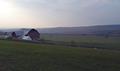
Confluenceby alanfreedComment: 7 - Very nice shot. Criticism; depending what is there on the left middle/fore, I wonder how this shot would have looked with the right cropped (cutting out that road(?)/bank and incorporating more of the left side of the frame. The colors are very nice and the reflection brilliant on the fairly calm water. |
 Photographer found comment helpful. Photographer found comment helpful. |
| 11/09/2005 08:50:13 PM |
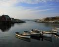
Seascapeby Tom_RobbrechtComment: 7 - Very nice. Criticism; I think it is the result of the diagonal sand/foreshore, which makes my 'eyes' think that the horizon is slightly off, but I 'measured' it and it seems spot on, plus I like the effect with that 'diagonal', in fact would like to have seen it even 'sharper'. Also, especially for the Challenge, I would like to have seen more 'land', especially with this, again, sharp perspective you've garnered. More sea/ocean, more sand/shells or more 'distant island/land', not sure. |
| Photographer found comment helpful. |
| 11/09/2005 08:20:45 PM |
|
| Photographer found comment helpful. |
| 11/09/2005 05:35:20 PM |
Serenityby robertachComment: 6 - Very nice. Criticism; seems it needs a nudge up on the right. |
| Photographer found comment helpful. |
| 11/09/2005 05:30:49 PM |
Tranquilityby kearockComment: 7 - Nice shot. Criticism; would like to have seen a bit more definition in the landscape(s). Nice 'soft' colors. |
| Photographer found comment helpful. |
| 11/09/2005 05:28:40 PM |
All Alone...by mphoyComment: 4 - Good potential. Criticism; sharper angle, incorporating more 'land'/view, would have made this better in my opinion. |
| Photographer found comment helpful. |
| 11/09/2005 05:27:51 PM |
Betweenby RKTComment: 7 - Nice. Criticism; more focus on the 'land' would have made this better in my opinion. |
| Photographer found comment helpful. |
| 11/09/2005 05:26:15 PM |
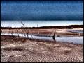
Into the Voidby gurlwithapenComment: 6 - Mainly for the potential. Criticism; like perhaps a few others are saying, and I realize you were likely going for this 'look/feel', but the grain/noise(?) added just does not complement this shot in my opinion. The texture in the dried/cracked mud and the dead trees, coupled with the 'contrary' water nearby, would have made for a great shot. Same goes for the colors. Compositionally, I think a slightly different crop, especially bottom left where that partial shadow is, incorporated or excluded, would have made this better in my opinion. Possibly also more of a horizontal 'framing', showing the more flat and expansive type landscape. Was your call though, not mine, but if this were 'clean', possibly an 8. Not sure if the frame helps. |
| Photographer found comment helpful. |
| 11/06/2005 07:21:41 AM |
Below The Surfaceby cheleComment: 7 - Do like this, unusual and good sharp angle. Criticism; a slightly 'neater' crop, choosing beginning/end of certain leaves to begin at the bottom, and possible (not sure) a wider 'framing' as well, would have made this better in my opinion. Up to 7 from 6. |
| Photographer found comment helpful. |
| 11/06/2005 07:20:14 AM |
Vasesby 3eyedcrowComment: 5 - Like the concept. Criticism; a different colored flower (and perhaps different type/shape) would have made this better, doesn't quite 'fit' in my opinion. The shot even without a flower may have even been better, perhaps with water in the vases (apologies if there is, can't discern it). The background colors are nice and especially so in the refraction, but again, the flower detracts in this shot for me. |
| Photographer found comment helpful. |
Home -
Challenges -
Community -
League -
Photos -
Cameras -
Lenses -
Learn -
Help -
Terms of Use -
Privacy -
Top ^
DPChallenge, and website content and design, Copyright © 2001-2025 Challenging Technologies, LLC.
All digital photo copyrights belong to the photographers and may not be used without permission.
Current Server Time: 06/21/2025 12:09:36 PM EDT.