| Image |
Comment |
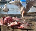
| 11/10/2005 04:38:03 PM |
SUSHI !!!by jrjrComment: 7 - Good idea. Criticism; difficult with this shot I imagine, but I would like to have seen perhaps a slightly sharper angle/perspective (ground up), and the focus more on the 'fish', or at least the fish in the bird's mouth, but difficult as I am sure it was keen to get away. Of course, the inclusion of the entire wingspan would have made this even better but, this is an obvious opportunity/timing shot and I think you did well to get this as is. |
 Photographer found comment helpful. Photographer found comment helpful. |
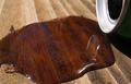
| 11/10/2005 04:36:14 PM |
CAR FIRE WALLby La VistaComment: 7 - Like the idea. Criticism; the toning is too overdone in my opinion and lessens the effect, or potential effect here. Maybe an even sharper (side on) angle/perspective. Different crop too, not sure. |
| Photographer found comment helpful. |
| 11/10/2005 04:34:57 PM |
One Man's Waste is an Ant's Treasureby laugComment: 7 - Good idea and good colors. Criticism; not much, maybe the crop. Also if the ant were a little sharper, and perhaps a few more ants (if possible -timing maybe), may have made this even better in my opinion. |
| Photographer found comment helpful. |
| 11/10/2005 04:33:59 PM |
An artist's wasteby medoComment: 7 - Good idea. Criticism; needs 'something' to bring the potential out more, but no idea how, maybe lighting, angle, not sure. Different crop perhaps too. |
| Photographer found comment helpful. |
| 11/10/2005 04:30:26 PM |
Breakfast for One...by YoungerComment: 8 - Good and creative. Criticism; perhaps a 'tidy up' ofthe coffee grains(?), not sure, might look too 'aesthetic' cleaned up though. Just needs a little 'something' to add a dramatic effect in my opinion, but no idea how or where, maybe lighting, background, not sure. |
| Photographer found comment helpful. |
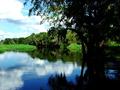
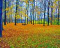
| 11/10/2005 05:56:33 AM |
Myakka State Parkby ArpeggioAngelComment: 7 - Nice, and good coloring. Criticism; not much, undecided if I would like to see more 'light' on that fore tree, but I do like this 'dark' effect there too so unsure. Difficult also to tell if it is 'straight', or needs a nudge up on the right. I think just a bit more detail on the right of frame, 'around' the tree, may have made this even better. |
| Photographer found comment helpful. |
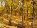
| 11/10/2005 05:54:27 AM |
Golden Forestby candleComment: 3 - Good potential here. Criticism; should be 640 at in width &/or height, especially for this Challenge. Different crop too would have helped. |
| Photographer found comment helpful. |
| 11/10/2005 12:38:40 AM |
Houston Woods Butler Countyby Crafty SueComment: 3 - I like the potential. Criticism; definitely at least 640, preferably width at least. Not sure what you did with the sat/contrast, but the tree on the left looks 'too blue', while you may have been going for a certain look/feel with that, it is not enhanced by the fact you cropped half the tree out. A different crop, slight nudge rotation up on the right and as stated 'bigger', would have made this shot much better in my opinion. |
| Photographer found comment helpful. |
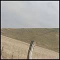
| 11/09/2005 10:37:28 PM |
Landscape with sheepsby RasmusComment: 5 - Mostly for the potential. Criticism; like to see it at least 640 on at least one side (preferably width), but possibly height too. Not sure if you rotated this, or this is how the scene looked, but either way looks like the 'horizon' needs a slight nudge up on the left hand side. Unusual view/angle and looks like it has potential and even though the colors are fairly 'drought' stricken (seemingly), like to see a little bit more contrast or color adjustment, somehow. Frame detracts in my opinion. And, if 'sheeps' was intentional, 'ok', otherwise, 'sheep'. |
| Photographer found comment helpful. |
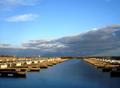
| 11/09/2005 10:19:43 PM |
Deserted docksby InnaNComment: 7 - Very nice. Criticism; not much and difficult as I don't know 'what is there' either side, but perhaps a different crop, especially with less sky, may have made this even better in my opinion. Like the 'straight lines' in the docks and far 'land'/causeway. |
| Photographer found comment helpful. |
Home -
Challenges -
Community -
League -
Photos -
Cameras -
Lenses -
Learn -
Help -
Terms of Use -
Privacy -
Top ^
DPChallenge, and website content and design, Copyright © 2001-2025 Challenging Technologies, LLC.
All digital photo copyrights belong to the photographers and may not be used without permission.
Current Server Time: 06/21/2025 12:08:08 PM EDT.