| Author | Thread |
Comments Made During the Challenge  |
|
|
11/15/2005 01:22:53 PM |
|
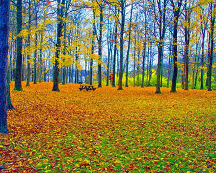
The colors seem a little "off" in this shot. |
|
 Photographer found comment helpful. Photographer found comment helpful. |
|
|
11/15/2005 11:18:03 AM |
|
The colour saturation seems way to much and the image is blurred, good luck |
|
| Photographer found comment helpful. |
|
|
11/15/2005 10:11:12 AM |
|
Color and oversharpening is the issue here. Blue tree trunks? Looks like a beautiful area. Try it again. |
|
| Photographer found comment helpful. |
|
|
11/14/2005 06:40:13 PM |
|
You took a simple landscape and made it surreal, but still inviting. I like it. |
|
| Photographer found comment helpful. |
|
|
11/13/2005 01:03:27 AM |
|
| Photographer found comment helpful. |
|
|
11/12/2005 05:39:30 PM |
|
The colors seem kind of over saturated. |
|
| Photographer found comment helpful. |
|
|
11/12/2005 01:07:48 AM |
|
Some of the pictures in this challenge would have been so beautiful if the subject had been focused properly. Unfortunately this is another photo I would have liked a lot more if the focus was right. |
|
| Photographer found comment helpful. |
|
|
11/11/2005 04:40:16 PM |
|
Nice colors. But there is nothing to look at, I mean the only object to look at is the bench far away but is kind of blurry. |
|
| Photographer found comment helpful. |
|
|
11/11/2005 01:11:51 PM |
|
Creative. This is interesting. Hope I remember to look at your technique. |
|
| Photographer found comment helpful. |
|
|
11/11/2005 11:48:41 AM |
|
Looks a bit grainy. Nice colors, though. |
|
| Photographer found comment helpful. |
|
|
11/11/2005 09:29:19 AM |
|
Very nice beautfiul colors, but they seem a bit oversaturated. |
|
| Photographer found comment helpful. |
|
|
11/11/2005 09:20:07 AM |
|
| Photographer found comment helpful. |
|
|
11/10/2005 10:53:55 PM |
|
Beautiful area, but way over saturated. The blue tree on the left should have given a hint there was a problem. Pretty blurry as well. |
|
| Photographer found comment helpful. |
|
|
11/10/2005 08:36:19 PM |
|
I like the composition of this shot...but some of the colors seem unnaturally bright to me. The trees on the left have something of a blue tinge to them. I like the picnic table in this shot...makes me want to pack a lunch and go hiking :-) |
|
| Photographer found comment helpful. |
|
|
11/10/2005 01:11:09 PM |
|
The colors here are a little too bright. |
|
| Photographer found comment helpful. |
|
|
11/10/2005 12:38:40 AM |
|
3 - I like the potential. Criticism; definitely at least 640, preferably width at least. Not sure what you did with the sat/contrast, but the tree on the left looks 'too blue', while you may have been going for a certain look/feel with that, it is not enhanced by the fact you cropped half the tree out. A different crop, slight nudge rotation up on the right and as stated 'bigger', would have made this shot much better in my opinion. |
|
| Photographer found comment helpful. |
|
|
11/09/2005 10:35:03 PM |
|
I like the rich colors, especially the blue trees, but somewhere along the line everything ended up fuzzy, blurred, whatever. Spoiled an otherewise great shot. |
|
| Photographer found comment helpful. |
|
|
11/09/2005 04:32:22 PM |
|
Seems a bit out of focus. Beautiful colors. |
|
| Photographer found comment helpful. |
|
|
11/09/2005 01:00:28 PM |
|
I like the bright colors. To me, the photo seems to tip a bit to the right. I wonder how this would look if rotated counterclockwise a bit? |
|
| Photographer found comment helpful. |
|
|
11/09/2005 12:04:43 PM |
|
nice shot. Maybe the colours are too saturated in my opinion. |
|
| Photographer found comment helpful. |
|
|
11/09/2005 12:00:05 PM |
|
too small, odd colors - probably intentional, but not to my liking. Very poor composition - tilted, centered horizon line, the table is off center but not in a 1/3 location. this had potential...but too many basic flaws. Learn from this and you'll knock us dead in a few challenges! |
|
| Photographer found comment helpful. |
|
|
11/09/2005 11:41:47 AM |
|
Seems out of focus to me and the colors appear over exaggerated. |
|
| Photographer found comment helpful. |
|
|
11/09/2005 10:45:28 AM |
|
pretty, think this would have benefitted if it hadn't have been square. |
|
| Photographer found comment helpful. |
|
|
11/09/2005 07:49:07 AM |
|
Looks oversaturated to my eyes. |
|
| Photographer found comment helpful. |
|
|
11/09/2005 06:19:50 AM |
|
| Photographer found comment helpful. |
|
|
11/09/2005 01:03:28 AM |
|
Way too much saturation for my taste. Otherwise it would have been a good photo. |
|
| Photographer found comment helpful. |
|
|
11/09/2005 12:46:18 AM |
|
I've been here.. Ohio right?!? Trees look blue.. |
|
| Photographer found comment helpful. |
Home -
Challenges -
Community -
League -
Photos -
Cameras -
Lenses -
Learn -
Help -
Terms of Use -
Privacy -
Top ^
DPChallenge, and website content and design, Copyright © 2001-2026 Challenging Technologies, LLC.
All digital photo copyrights belong to the photographers and may not be used without permission.
Current Server Time: 06/30/2026 09:47:07 AM EDT.