|
|
|
Showing 3631 - 3640 of ~4217 |
| Image |
Comment |
| 11/14/2005 04:26:04 PM | Circle of friends by LalliSigComment: 5 - Good idea. Criticism; for this type of shot, all 'frames' need to be uniform, at least compositionally, or else at least 1 & 3, in my opinion. Perhaps the blonde in the middle would have been more 'balanced', not sure. The 'missing' separating frames works, and even with visible frames, I think would work too - just be, obviously, a different 'shot/series' again. It has a studio/clean feel to it, which I do not think adds to the characters. It is also a 'personal' type shot (eg; good for these three girls), but for a 'stranger', me, has no 'personal appeal', if that makes sense. |  Photographer found comment helpful. Photographer found comment helpful. |
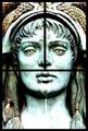
| 11/14/2005 04:21:21 PM | Lady Justiceby CalliopeKelComment: 3 - Nice 'photo', the triptych works quite well here, but in my opinion, this is still a shot of a work of art, and in that lies the appeal, in my opinion. | | Photographer found comment helpful. |
| 11/14/2005 04:19:30 PM | Rags to Richesby dsa157Comment: 5 - Good idea/concept. Criticism; the alignment/arrangement in #1 doesn't seem to be uniform with 2 & 3, just minor details like that in shots like this need to be spot on in my opinion. The colors have more potential than what you have captured, whether it be because of composition or 'focal points', not sure. Also, the white framing does not 'enhance' these shots, not sure, but likely black may have worked better in my opinion. Didn't 'see' the 'Rags to Riches' concept until looking at the title, so while this is 'a shot of Monopoly', I get the 'message', but it still is, well, a shot of Monopoly. | | Photographer found comment helpful. |
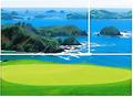
| 11/14/2005 04:01:46 PM | Golf with a Viewby SteveinnzComment: 3 - Nice colors. Criticism; a bit 'over bright'. The arrangement and frame placement doesn't work in my opinion. The color and size also do not 'enhance'. The cropping / framing / padding is not symmetrical. | | Photographer found comment helpful. |
| 11/14/2005 03:59:08 PM | WINTER WONDERLAND (Nature's artwork in ice)by BrinComment: 5 - Another shot which I am sure looks much better bigger. Very nice - what I can discern. Criticism; although the copy/flip of 1/3 works well here, I wonder if there may have been more simple beauty framing with just the original, but a different shot then, plus, would also depend how much space you had on the left to incorporate / arrange or not. The toning works but again, especially with losing so much detail, whether leaving the colors may have given this a boost at this size. | | Photographer found comment helpful. |
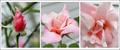
| 11/14/2005 03:55:04 PM | 'rose'by suemackComment: 4 - Like the potential. Nice colors. Criticism; if possible slightly different crops, to not 'cut off' the edges, especially 1 & 2. The angle in 3 doesn't 'flow on' from the first two in my opinion, but perhaps you were going for center detail. The frame works, but I wonder if a different color may have enhanced the images, especially the colors. | | Photographer found comment helpful. |
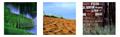
| 11/14/2005 03:34:14 PM | grassesby datcatComment: 4 - Like the concept. Criticism; of course you know how much detail you've lost at this size, but cannot be helped. The white background is not complementary to these shots in my opinion, not sure what color would have worked better. Arrangement, again not sure, the brick is a lot 'harder' than the first two and therefore seems a little out of 'line', especially seeing as the grass is out of focus in it, which likely works better larger, but in this, the main focus is on the bricks. Cannot discern what the 'sand' colored surface is in 2, guessing sand or earth, but the pattern makes me wonder. Perhaps, with the 'height' seemingly available in these shots of the grasses, a more vertical framing may have worked better, not sure. | | Photographer found comment helpful. |
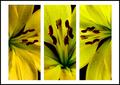
| 11/14/2005 03:24:22 PM | Liliesby gemeitComment: 4 - Good concept. Criticism; a bit dark, especially around the stamens, the yellow seems to have a green tinge to it too. Not sure on the placement, nor frame. The focus is best in 1 on the petals and 3 on the stamens, but not really able to discern the focus in the 2nd. | | Photographer found comment helpful. |
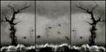
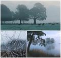
| 11/14/2005 06:57:49 AM | Winter Wildlife Wonderlandby AlexSaberiComment: 7 - Oh, very good. Criticism; not much, the color of the frame perhaps, maybe just a 'ice blue' not sure. Seems to be an issue on the right side of the web frame. Maybe the title just 'Winter Wonderland' may have given this even more punch, but that's your call. Good use of triptych to give a feel for, and create, a 'setting'. All very nice shots. edit:typo Message edited by author 2005-11-21 07:18:11. | | Photographer found comment helpful. |
| 11/14/2005 06:50:12 AM | Trois Papillonby L1Comment: 6 - Very good. Criticism; undecided on framing color choice, it works, but I wonder if a different color may have enhanced the butterfly (and flowers) more. Not sure if the slightly top placement was deliberate, but it also 'works' in my opinion. 1 & 3 are nice 'catches'. | | Photographer found comment helpful. |
|
Showing 3631 - 3640 of ~4217 |
Home -
Challenges -
Community -
League -
Photos -
Cameras -
Lenses -
Learn -
Help -
Terms of Use -
Privacy -
Top ^
DPChallenge, and website content and design, Copyright © 2001-2025 Challenging Technologies, LLC.
All digital photo copyrights belong to the photographers and may not be used without permission.
Current Server Time: 06/21/2025 05:51:07 PM EDT.
|