| Image |
Comment |
| 11/24/2005 11:31:12 PM |
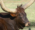
Odd Birdsby GermaineComment: 8 - Good. Two for one. Criticism; not much, maybe slightly tighter crop, with the birds top right and the face more centered, may have made this even better, not sure. |
 Photographer found comment helpful. Photographer found comment helpful. |
| 11/24/2005 11:30:16 PM |
The 6th Sentinelby RikkiComment: 7 - Very nice. Good colors. Criticism; difficult, especially for the Challenge (as you've obviously centered the '6th'), but like to see the interesting pattern on the petals more, so maybe a slightly different crop. A little sharper too, albeit difficult, may have made this even better. Not sure on the white frame. |
| Photographer found comment helpful. |
| 11/24/2005 11:25:27 PM |
Love comes in pairs! by gaealiComment: 8 - Good shot. Excellent colors and contrast control. Nice fairly simple background. Criticism; not much, maybe a little more space on the right, not sure. Up to 8 from 7. |
| Photographer found comment helpful. |
| 11/24/2005 11:24:16 PM |
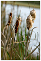
Tale of Four Tailsby jenesisComment: 7 - Nice. Criticism; a little sharper if possible on the seedheads(?) would have made this better in my opinion. Maybe a slightly sharper (ground up) angle, incorporating the tips more too, not sure. |
| Photographer found comment helpful. |
| 11/24/2005 11:23:22 PM |
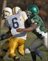
Six Meets Sixby coolharComment: 7 - Good. Criticism; difficult, maybe a different composition or crop. Good action shot, would like to see a little more context though, but then you'd lose the 'impact' likely so not sure. |
| Photographer found comment helpful. |
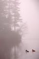
| 11/24/2005 11:19:01 PM |
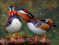
Two - Migration Together by notesinstonesComment: 8 - Very nice. Criticism; just sharper on the ducks if possible 'somehow', more definition on them, including colors. Nice overall 'feel'. |
| Photographer found comment helpful. |
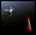
| 11/24/2005 11:18:18 PM |
Identity Crisis by aznymComment: 7 - Good. Criticism; maybe a slightly tighter crop at the fore, giving the 'cone' more height may have made this better in my opinion. Maybe also aiming for more 'symmetry' overall compositionally, not sure. It's dark, but I think that adds an element to this that helps it. Not sure on the thick frame. |
| Photographer found comment helpful. |
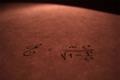
| 11/24/2005 11:16:14 PM |
Even for 100 yearsby lilcrazyfuzzyComment: 8 - Like the concept and angle/depth and colors. Criticism; a little sharper on the equation would have made this even better in my opinion. Maybe a tweak of the lighting, not sure, giving more 'feel' to the paper. Nice overall feel to this shot. edit:formula to equation Message edited by author 2005-12-01 05:18:45. |
| Photographer found comment helpful. |
| 11/24/2005 10:59:36 PM |
Is anyone watching?by ladpupmoeComment: 6 - Like it, poor dog, like the matching cards. Criticism; looks 'snapshottish', so if you had the chance, maybe a sharper angle, different lighting, or just something to create the 'illusion' would have made this better in my opinion. |
| Photographer found comment helpful. |
| 11/24/2005 10:49:17 PM |
Bored of Educationby scalvertComment: 9 - Very Funny. Thanks for the laugh. Criticism; not much at all, I like the whole set up, composition colors, background, pose, etc. Maybe to really nit-pick the book placed differently but trivial. Seems slight issues with the green on the wallpaper(?), but could be my monitor. Ok, maybe she could have something 'written' on the paper for added effect, but again minor. Well done. Up to 9 from 8. edit:typo & congratulations Message edited by author 2005-12-08 18:51:35. |
| Photographer found comment helpful. |
Home -
Challenges -
Community -
League -
Photos -
Cameras -
Lenses -
Learn -
Help -
Terms of Use -
Privacy -
Top ^
DPChallenge, and website content and design, Copyright © 2001-2025 Challenging Technologies, LLC.
All digital photo copyrights belong to the photographers and may not be used without permission.
Current Server Time: 06/22/2025 04:24:08 PM EDT.