|
|
|
Showing 3471 - 3480 of ~4217 |
| Image |
Comment |
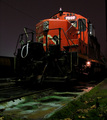
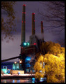
| 11/30/2005 08:54:15 PM | Industrial Powerby seebrownComment: 8 - Good shot, good colors, good perspective. Criticism; difficult, maybe more detail at the front of the train/locomotive, especially in the dark/black areas, may have made this better in my opinion. Slight crop adjustment too, especially at the top right, there is 'something' there. Like to see the colors even more vivid, but difficult, especially with the resulting contrast issues. edit:typo Message edited by author 2005-12-07 06:57:19. |  Photographer found comment helpful. Photographer found comment helpful. |
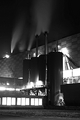
| 11/30/2005 08:21:41 PM | sugar fabricby soerenComment: 4 - Mainly for the potential. Criticism; firstly needs to be 640, in this case height. I see more potential in this shot than has been 'captured', whether you've lost some with the b/w not sure, but the unusual wall pattern, 'shapes' of the silos/tanks, the windows, etc, all could have been 'used' more in my opinion to give this extra punch, especially with the other similar shots you are competing against. | | Photographer found comment helpful. |
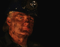
| 11/30/2005 08:18:49 PM | Underground Miningby JudiComment: 4 - Good potential. Criticism; difficult to tell, but seems to be more 'underground reading' here than mining - though obviously a miner (at least that's the assumption). Think you had more potential to get a better shot here, even if just reading (and minor yes, but adjusting your title to 'fit'). This seems a little blurry too, or it could be the focus, not sure, as it seems the man's hand is fairly sharp. Ok up to 4 from 3 (doesn't help you I know), mainly because I like this shot, or rather, the 'potential'. | | Photographer found comment helpful. |
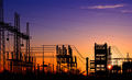
| 11/30/2005 08:09:52 PM | Our Industrial Strengthby TransitComment: 7 - Good. Looks genuine, but who knows. Criticism; not much, maybe 'somehow' bringing out more character, whether through the use of lighting, crop adjustment, or even 'using' the light on the hardhat, not sure. Just needs a little 'something' extra in my opinion. Maybe 'tweaking' the colors/contrast (eg; the blue of the hardhat) slightly if possible might have 'lifted' this a little. | | Photographer found comment helpful. |
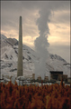
| 11/30/2005 08:02:01 PM | Copper Fieldsby NaldComment: 8 - Very nice, good use of color. Criticism; difficult as, as much as I like the fore 'grass' texture and color effect, just think if it were 'competing' less (especially for this Challenge) would make this even better in my opinion. Also difficult to tell, but seems the sharpest focus is on the mountain rather than the 'factory' (apologies if wrong there), so a shift in focus might have also made this better. An overall 'contrasting' type of feel to this shot, given the 'environment'. | | Photographer found comment helpful. |
| 11/30/2005 07:57:38 PM | Industrial Sunsetby shirokkoComment: 6 - Nice. Criticism; sun is a little distracting (dominant) on the left. The silhouette effect is good. Perhaps a slightly tighter crop at the bottom, not sure, as does 'work' like it is. Those 12 extra pixels in width would have helped this. Color is nice. Not sure on the frame, perhaps just a fraction too thick, especially at this size, in my opinion. | | Photographer found comment helpful. |
| 11/30/2005 07:27:10 PM | "We all leave a footprint on the earth"by John WhiteComment: 7 - Excellent perspective/angle/view. Criticism; your title nearly ruined this for me - it seems 'forced' and doesn't suit/complement this shot in my opinion, in fact detracts from it. Really like this shot, and if this view/idea is original, well done. | | Photographer found comment helpful. |
| 11/30/2005 07:08:34 PM | Winkin', Blinkin' and Nodby taterbugComment: 7 - Nice colors and perspective. Criticism; less trees in the fore and perhaps an even sharper perspective, and a slightly different crop at the fore, may have made this even better in my opinion. | | Photographer found comment helpful. |
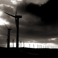
| 11/30/2005 07:06:14 PM | Thales the Miletianby bairasComment: 6 - Good coloring and use of lines and silhouetting. Criticism; apologies if wrong, but seems this is 'tilted' and needs a rotation up on the left, perhaps even only slightly. Maybe without the cloud top right, might have given this an even more unusual and dramatic feel (especially the silhouette effect), not sure. Those 5 extra pixels in width would also have helped this. | | Photographer found comment helpful. |
| 11/30/2005 07:03:01 PM | Working Conditionsby jjbeguinComment: 7 - Good concept and perspective. Criticism; difficult, as you were likely going for such 'darkness', but in my opinion a little more 'balance', and/or color/toning and detail, would have made this even better. The 'grain' works, but perhaps if it were either enhanced to make it more dominant, or the whole shot softened, not sure, just seems to be hovering in the middle, yet still noticeable, if that makes sense. edit:typos Message edited by author 2005-12-07 07:16:25. | | Photographer found comment helpful. |
|
Showing 3471 - 3480 of ~4217 |
Home -
Challenges -
Community -
League -
Photos -
Cameras -
Lenses -
Learn -
Help -
Terms of Use -
Privacy -
Top ^
DPChallenge, and website content and design, Copyright © 2001-2025 Challenging Technologies, LLC.
All digital photo copyrights belong to the photographers and may not be used without permission.
Current Server Time: 06/23/2025 07:21:31 AM EDT.
|