|
|
|
Showing 3451 - 3460 of ~4217 |
| Image |
Comment |
| 12/01/2005 07:21:16 AM | Watchful Eyeby yankoComment: 6 - Like the detail/texture. Good colors and contrast control. Criticism; 'if only' that eye were open more, good like this, but if it were open more or looking 'at', may have made this even better in my opinion. The detail is good, but especially on the 'brow' perhaps the lighting is just a fraction harsh, difficult to tell. Like the detail in the whiskers. I think the extra 10 pixels would have helped this, if you had the quality, or else just a 'wider' crop perhaps. Has the potential to be a good 'cat abstract', if that makes any sense, in my opinion. |  Photographer found comment helpful. Photographer found comment helpful. |
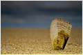
| 12/01/2005 07:07:35 AM | Defiantby seriocomicComment: 7 - Very good. Criticism; difficult, but even sharper on the shell, especially the top edge, making it 'pop' more would make this even better in my opinion. Like the simplicity here and 'composition' and colors. Would like to see more detail/texture in some of the sand too. Not sure on the white frame, but minor. | | Photographer found comment helpful. |
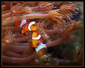
| 12/01/2005 07:04:16 AM | Rendevois In Coralby cloudsmeComment: 6 - Good capture, good colors. Criticism; can't tell if this is 'as is' or should be rotated, given their positions, could be either. Knowing the size of these fish, and how difficult aquarium shots are, seems you have done well. The colors are strong but do seem a bit 'dark', from what I know of these fish, but apologies if they are naturally this dark. Difficult, but also even more sharpness on the fish, as is on the coral just behind them, would have made this even better in my opinion. Not sure on the frame, especially the orange inner. | | Photographer found comment helpful. |
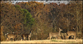
| 12/01/2005 06:56:07 AM | Sherwood Meetby FalcComment: 7 - Very nice, but, Criticism; in my opinion, whilst the people and dogs add an element here, the 'serenity' in this shot is broken by their presence, ie; I think it has more potential without them. Also, and no idea how, but some 'tweaking' with the colors or lighting, to try to enhance those rays, would have also made this even better in my opinion. Depending also what you had to work with, maybe a little more 'foreground' too, if possible. edit:typo Message edited by author 2005-12-08 18:10:15. | | Photographer found comment helpful. |
| 12/01/2005 06:52:22 AM | | | Photographer found comment helpful. |
| 12/01/2005 06:50:02 AM | Hellfire Four-Oby RKTComment: 5 - Good concept. Criticism; in my opinion, these types of shots need to have perfect symmetry and as far as I can discern, this needs a nudge rotation up on the right and also the angle/perspective, is slightly off on the center 'bar'/plate. Given the likely vibrant colors this also had, coupled with an assumed chrome, I think color would also have worked better with this. | | Photographer found comment helpful. |
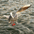
| 12/01/2005 06:46:38 AM | Traffic Jamby hyperfocalComment: 7 - Nice effect. Criticism; apologies if wrong, but seems needs a nudge rotation up on the left, 'field' doesn't seem level, but could be a slope, makes no difference to my score. Depending what you had to work with, if there were more birds 'up the top' of the frame I think possibly a bit more height here could have helped this, but not sure as I like the 'wide' framing, just difficult to appreciate fully at this size. | | Photographer found comment helpful. |
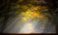
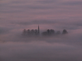
| 12/01/2005 06:29:26 AM | Sanctuaryby mexicoComment: 7 - Very nice. Criticism; I'm sure the size doesn't do this justice, but (and especially at this size) more detail/contrast with the trees and steeple(?) would have made this better in my opinion. Like the centered composition and think that cropped tighter top or bottom would also likely yield two good shots with slightly different 'feels' too. Just like to see it 'pop' more, as subtle as the scene/theme is. | | Photographer found comment helpful. |
| 12/01/2005 06:25:19 AM | Guy Fawkes Celebrationby tonygComment: 4 - Nice effect. Criticism; needs 640 height, which may also have helped out the ground lights too. Depending what you had to work with, either a more centered composition, or else, perhaps more 'empty space' on the right may also have made this better in my opinion. | | Photographer found comment helpful. |
| 12/01/2005 06:23:39 AM | Earth Bulbby stare_at_the_sunComment: 7 - Good. Criticism; not sure on the blue hand, works, but may be competing too much with the bulb in my opinion, but perhaps that is what you were going for. Also, not sure on the grain effect on the hand, again, works, and is unusual, but 'softer' 'feel' may have complemented the 'feel' of the bulb/globe better, not sure. Also, given the 'composition', I think that perhaps utilizing 640 in height too, perhaps with more 'empty space' around the globe, may also have helped this shot even more. | | Photographer found comment helpful. |
|
Showing 3451 - 3460 of ~4217 |
Home -
Challenges -
Community -
League -
Photos -
Cameras -
Lenses -
Learn -
Help -
Terms of Use -
Privacy -
Top ^
DPChallenge, and website content and design, Copyright © 2001-2025 Challenging Technologies, LLC.
All digital photo copyrights belong to the photographers and may not be used without permission.
Current Server Time: 06/23/2025 03:02:58 AM EDT.
|