|
|
|
Showing 3421 - 3430 of ~4217 |
| Image |
Comment |
| 12/01/2005 09:39:30 PM | " Yes Virginia, There is a Santa Claus"by autoolComment: 7 - Good - I see a lot of potential in this shot. Good (and apt/befitting) character 'capture'. Criticism; think there is more potential in this shot though, especially with the advanced editing - and the 'theme' (Christmas/Santa Claus/etc); perhaps if you had 'softened' the grass/shrubs/whatever in the background, as they bring too much 'reality' into this in my opinion, or possibly just a selective desaturation not sure. The detail is good in 'Santa's' glasses, beard etc, coloring good too, but perhaps some 'softening', or, not sure, but just to try to really emulate that 'spirit'/create the 'illusion' - if that makes sense, sorry, hard to explain/convey, but I tried. A few 'blown' issues in the white, but difficult with this, the beard's whiteness seems fairly good. Perhaps just a little more 'costume' incorporated (depending what you had to work with of course), and possibly even 640 x 640 (again that left background issue would come into play, unless more costume could be had on the right, etc), would likely have helped make this an even better shot in my opinion. |  Photographer found comment helpful. Photographer found comment helpful. |
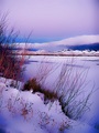
| 12/01/2005 09:30:54 PM | Snow by Sunsetby KivetComment: 8 - Very nice. Not sure if those colors are natural or 'tweaked' but very nice coloring too, the blues and the reds/pinks. Criticism; I'm sure this looks excellent wall size with this crop (vertical), and also looks good here/this medium, but an even 'wider' view (640 x 640), especially for 'here', may have given this even more 'punch', not sure. Maybe some type of further detail or 'texture capture' right at the fore, but likely very difficult to do that and still retain the equal 'balanced focus' you have achieved so - who knows. Very nice. | | Photographer found comment helpful. |
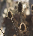
| 12/01/2005 09:26:48 PM | Autumn Sunby TallblokeComment: 6 - Nice. Criticism; a bit sharper if possible, especially to show the texture more. Perhaps a rotation and more selective crop (mainly to eliminate that stem on the left and the seedhead back right (losing it or incorporating it)) may have helped to make this even better in my opinion. The bokeh is nice, like to see the color just notched up a fraction if possible, but probably contrast issues in doing so, so who knows. Maybe even a 640 x 640, with more space to the left and above, but then there is that stem, and also depends what you had to work with. edit:typo Message edited by author 2005-12-08 16:34:34. | | Photographer found comment helpful. |
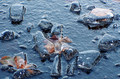
| 12/01/2005 09:23:31 PM | Frozen in Timeby RiponladyComment: 7 - Nice. Criticism; sure this size doesn't do it justice. No idea if possible (environment and camera/lens dependent) but a sharper, almost 'ground level' perspective on this 'seems' as though it may have helped showcase the leaves and ice/transparency more than has been achieved with this angle. Perhaps a slight shift in the focus too, not sure, but trying to get the detail and color in the leaves more. Even 640 x 640 might have helped this, especially in this medium/format/size. edit:typo Message edited by author 2005-12-08 16:38:07. | | Photographer found comment helpful. |
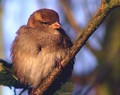
| 12/01/2005 09:05:30 PM | Just chillin'by PatrolComment: 7 - Very nice, nice complementary background color and 'bokeh' too. Criticism; definitely 640 width would have helped this. Sharper (though the detail in the feathers is good), and perhaps a slight crop adjustment (eliminating the minor distracting elements - thin tan/brown line on left and possibly the fork in the branch top right, etc), may have made this even better. | | Photographer found comment helpful. |
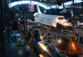
| 12/01/2005 09:01:23 PM | Shuttle Serviceby alanfreedComment: 6 - Wish you had gone down there with the others and got a closer shot. Criticism; difficult in this situation - the view is good from this perspective, but just, in my opinion, something closer, still incorporating the flag and concaved ceiling/skylights/framing etc, and that shuttle - but, perhaps you are not allowed shots so close, who knows. Even a different crop here - I just see more potential in such an opportunity but who knows what was, and was not, 'in your control'. Anyway, a good inside look with a seemingly wide-angle lens, so thanks. | | Photographer found comment helpful. |
| 12/01/2005 08:40:12 PM | My chicksby olnosComment: 7 - Good use of 'distortion'. Nice clean studio 'feel'. Good colors, lighting, etc. Criticism; would work a bit better if her legs were more 'together', as it is, the distorted effect accentuates that and detracts in my opinion. Perhaps also a little 'wider', more space one &/or either side, may also have made this even better in my opinion. | | Photographer found comment helpful. |
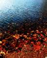
| 12/01/2005 08:36:29 PM | Sky and Leaves (On Water)by kdkaboomComment: 6 - Nice balance and colors. Criticism; bad pixelation, maybe due to resizing, who knows. That corrected and perhaps some more detail (or this would work as an abstract 'very soft' type shot too in my opinion), would have made this a much better shot, 'in my opinion'. | | Photographer found comment helpful. |
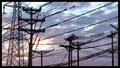
| 12/01/2005 08:27:35 PM | Electric Birdsby BriangellerComment: 6 - Good capture/opportunity. Criticism; this has/had more potential in my opinion, perhaps a different perspective, different crop, not sure. Difficult, and camera/lens dependent, but more detail in at least a 'few birds' would obviously have made this even better. Also the potential here for an unusual abstract possibly, who knows. Frame is too thick, especially at this size, and detracts, in my opinion. | | Photographer found comment helpful. |
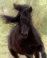
| 12/01/2005 06:25:45 PM | Horsepowerby lynnesiteComment: 7 - Very nice capture. Criticism; difficult, assuming you went for this 'soft look', which works, but still if there was a little more emphasis in certain dark areas (adv.editing maybe 'burn here there'/sharpening who knows) would make this 'pop' in certain places and make it an even better shot in my opinion. The cropping of the legs is minor, and if you had one 'full length' be 'another' good shot, but different to this (obviously). The background is nice and complements this, but perhaps the lighter areas at the bottom do not help 'accentuate' the horse and the movement/'feel' - but I imagine the contrast control issues would be difficult so who knows what could be done there, aside again, from selective 'adjustments'. Also (again depending what you had to work with), the mane on the left not cropped, but this is an 'opportune' shot so you've likely done all you could with what you had. Good overall 'feel' and good catch/capture. edit:typo Message edited by author 2005-12-08 16:57:21. | | Photographer found comment helpful. |
|
Showing 3421 - 3430 of ~4217 |
Home -
Challenges -
Community -
League -
Photos -
Cameras -
Lenses -
Learn -
Help -
Terms of Use -
Privacy -
Top ^
DPChallenge, and website content and design, Copyright © 2001-2025 Challenging Technologies, LLC.
All digital photo copyrights belong to the photographers and may not be used without permission.
Current Server Time: 06/23/2025 07:20:52 AM EDT.
|