|
|
|
Showing 3371 - 3380 of ~4217 |
| Image |
Comment |
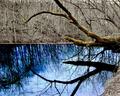
| 12/06/2005 05:42:53 AM | Divining Rodby SJCarterComment: 7 - Very nice, good desaturation, nice colorings. Criticism; perhaps (depending on the true color) more of a vivid green as is the blue and perhaps a slightly different crop, especially on the right to try to eliminate that 'bank'/edge, may have also made this better in my opinion. |  Photographer found comment helpful. Photographer found comment helpful. |
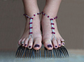
| 12/06/2005 05:40:45 AM | New Fashion Trend - Forkliftsby ColeyComment: 7 - Very creative and if this is original, very well done. Criticism; difficult, I do like this but think that it has more potential than you have captured, but no idea how to do so. Perhaps a toning or even b/w (despite losing the color in the 'accessories'), may have made this even better in my opinion. The 'mottled' flesh/skin (especially at the top) perhaps detracts slightly too, but minor. Just noticed, either this person has a little toe missing on their left foot or another shoot to include it was needed. | | Photographer found comment helpful. |
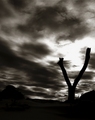
| 12/06/2005 05:37:02 AM | Fence post forked like a Snake tongueby KivetComment: 7 - Like the effect and the toning and 'feel'. Criticism; minor but don't think your title 'adds to this effect' as much as another, possibly more 'simple' one may have. Likely difficult, but if that 'fork' was more dominant and dramatized more, may have made this even better in my opinion. Perhaps a slightly different/sharper angle too, not sure. | | Photographer found comment helpful. |
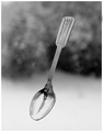
| 12/06/2005 05:35:06 AM | Falling Spoon ..by samanwarComment: 7 - Like the capture and the unusual (and seemingly uniform) pattern on the spoon face. Toning works well. Criticism; a few 'imperfections' here and there on the 'face', but may just be reflections and I am undecided if they add or detract from this shot. Perhaps a slightly different 'composition' arrangement may have made this even better but not sure on that as this works well as is. The background 'adds' an unusual element, just like to see the spoon handle 'pop' a little more at the top there against it. | | Photographer found comment helpful. |
| 12/06/2005 05:32:15 AM | Colorful Spoonsby NstiG8trComment: 7 - Really like the use of (and choice in sequence of) colors here and surrounding 'arrangements'. Criticism; difficult, as the 'wide'/horizontal framing works well, obviously better 'wall size', but perhaps 'here', a little more height, possibly bottom or just top, or maybe even both, may have made this better in my opinion, not sure. The symmetry is slightly higher on the left, but that may also just be the angle. | | Photographer found comment helpful. |
| 12/06/2005 05:28:17 AM | Waiter, there's a bug on my plate!by scalvertComment: 7 - Good effort and idea and well done if this is original. Criticism; of course the classic 'a fly in my soup', but much harder to execute especially given your 'utensils'. Seems you have gone to a lot of trouble to set this up. Right down to (I presume) the choice of shirt on the 'bug'. Perhaps some type of 'toning down', or 'softening' of the 'bug', so that it was a little more subtle, coupled with a slightly different crop/framing, especially to gain more 'context' (difficult I am sure as you likely were on a ladder to do this, who knows), may have made this even better in my opinion. | | Photographer found comment helpful. |
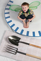
| 12/06/2005 05:25:03 AM | Stand for Somethingby dw_photoComment: 7 - Like this. Criticism; perhaps slightly more handle may have made this even better in my opinion, not sure. I also wonder about the flooring, 'works' and also gives a complementary pattern, and colors (mostly), but wonder if either slightly softer on the flooring, or perhaps even some type of desaturation, even if only slight, may have also made this 'pop' more. | | Photographer found comment helpful. |
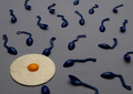
| 12/06/2005 05:23:15 AM | Insemination by GolferDDSComment: 7 - Good concept and creative, if this is original, well done. Criticism; the cropping mainly, also I think that if this had a more offset lighting, a slightly softer focus and a better depth of field, may have made this even better in my opinion. Perhaps the egg even 'raw', who knows, but that was your call. Perhaps a slightly sharper angle too, not sure. | | Photographer found comment helpful. |
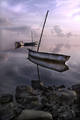
| 12/03/2005 07:06:37 PM | A Tranquil Reflectionby JeanComment: 8 - Very nice. I like how the horizon has almost disappeared. Criticism; difficult, either a slight tweaking to bring out a little more subtle color, or even (maybe, and depending what was there/what you had to work with) a horizontal crop, really 'using' that 'vacant horizon', may have made this even better in my opinion. | | Photographer found comment helpful. |
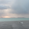
| 12/03/2005 07:02:45 PM | Free as a birdby indy79Comment: 7 - Really like the color combinations in this. Criticism; 'if only' that bird really 'stood out', very difficult though. Good perspective, perhaps a tighter crop, quality dependent, not sure. Maybe even going for a 'thirds' type of composition here, with less clouds, may also have given this an extra 'edge'. | | Photographer found comment helpful. |
|
Showing 3371 - 3380 of ~4217 |
Home -
Challenges -
Community -
League -
Photos -
Cameras -
Lenses -
Learn -
Help -
Terms of Use -
Privacy -
Top ^
DPChallenge, and website content and design, Copyright © 2001-2025 Challenging Technologies, LLC.
All digital photo copyrights belong to the photographers and may not be used without permission.
Current Server Time: 06/23/2025 03:46:50 PM EDT.
|