|
|
|
Showing 321 - 330 of ~4217 |
| Image |
Comment |
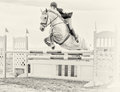
| 08/09/2009 08:06:16 AM | High Ho Silverby pats66Comment:  Critique Club Critique
First Impressions
Critique Club Critique
First Impressions
Oh, I did like this during voting, but the main subject - 'High Ho Silver' was placed too high in the frame for me (no pun intended). I gave this a 6.
Photograph Information, Technicals & Composition Review
A deeper depth of field to get more of the horse's features in focus would have been better in my opinion.
Toning: I am a little undecided on the high key b&w effect for this image, I don't think it is enhancing the subject - but with a little more depth/contrast, perhaps. Composition: as mentioned, I think the horse is placed to high within the frame - I wonder about a tighter crop on the left and at the bottom, if the quality was there.
I know this image is being mostly about the horse, but there is still a rider there and they are not making eye contact with the camera, nor looking in the direction of the camera, minor, but I still think it has an impact on the 'connectionability'.
Some interesting elements in the image, especially the 'braces' (no idea what they are called) on the horse's hooves/ankles - alas the detail is near lost.
Comments, Score & Placement Review
264/419 is a fairly good showing in a Free Study, and a score of 5.45 also so. Horses are always a favorite (including with me).
All of your commenters were taken with the image and this is affirmed by their average score given of 7.33.
Summary
Good capture, and an artistic processing, which as mentioned, is a little too 'depthless' for me, but obviously appeals to many others - and if you prefer it this way, then that is the main thing. A variation in cropping I think would definitely have given the image a little more edge. |  Photographer found comment helpful. Photographer found comment helpful. |
| 08/09/2009 07:56:15 AM | Summer Radianceby SenayComment:
Critique Club Critique
First Impressions
Ah - I pull another of your images, the luck of the draw. I gave this image a 5 in voting. First impressions, as best I recall were: a nice face which shows the eyes fairly well.
Photograph Information, Technicals & Composition Review
The focus seems sharpest on her hair, which the lighting also helps, as it is strongest there. There is fairly good lighting in her left eye, but a more even spread across the face, or just a little more on the right, would have been better, for this style portrait, in my opinion. 1/15 shutter speed?, hmm... for a portrait, that's a long time to ask someone to stay still.
Compositionally, I think the eyes placed further up the frame and a tighter crop at the top of her head/hair, would have allowed more balance. I think there's also room to take some off the left side of the frame, despite the fairly good negative space use.
I don't mind the framing so much, but not sure it is enhancing her features, especially her eyes. Although it does look like you've made an effort to try to pick up and use the color of her eyes.
It would be nice to see this young lady with a little more subtle make up - remembering that the photograph will pick up every little flaw. The mascara seems a bit 'clagged'.
The natural light is nice, but giving a little direction to your subject, especially to work with the light better and allow it to highlight her various features, including by experimenting with angles and poses, may have produced something a little stronger. There are overexposed areas on the face, so adjusting your exposure levels and/or adjusting the position to the light, would have helped there.
The background seems very dull and uninteresting and with the somewhat muted colors, blends in all the more. Minor, but her t-shirt softened to not be so noticeable may have also helped a little.
Comments, Score & Placement Review
346/419 seems a bit harsh for the image, I think it has good potential and you are on the right track. 5.13 is an ok score, especially in a Free Study.
You certainly got some extra-helpful comments during voting that provide excellent pointers for future use and learning.
Summary
Good potential that may have been able to be tweaked in pp, but I think the main ingredients need to be had in camera at the time of shooting. You're on the right track, good luck with the next portrait. Experiment, experiment, experiment.
edit:typoMessage edited by author 2009-08-09 09:02:57. | | Photographer found comment helpful. |
| 08/08/2009 09:06:13 PM | Love the light at sunset....by StormyWeathersComment:
Critique Club Critique
First Impressions
The light is nice. A bit of a snapshot feel to the image, however the quality and lighting pull it beyond that 'realm'. I gave this a 4 during voting.
Photograph Information, Technicals & Composition Review
Photographic technicals all look to have worked quite well. What would really strengthen this image is a refined crop, or, in retrospect (so as to speak), to be able to 'align' the background behind him, especially the head area, to complement him.
As is, whilst I like the vertical framing and think this does suit this, I think a tighter crop may have given this a little extra. I did try it, but after doing so not sure, it changes the feel of the image. I guess it depends what you were aiming for. The shadow is interesting on the left, but it is 'chopped', the rocks are a nice element, and I like the 'boyhoodness' of his clothing, including his sandals. If the quality is there, this image likely lends itself well to a head and shoulders crop, especially to really showcase that nice catch of light in his eyes.
Comments, Score & Placement Review
373/419 is fairly low down the pack and your score of 4.92 seems a bit harsh for the quality of the image. My only guess (before reading the comments) is that people may not have lingered long enough to appreciate the interesting elements to the image.
All your comments are helpful, one in particular extremely so.
Summary
Of course a personal image, which I'm sure will be treasured, but given a similar opportunity again, just a fraction check on the surroundings and composition and, if possible without ruining 'a moment', some encouragement or direction to allow the boy's character to shine through a little more. | | Photographer found comment helpful. |
| 08/08/2009 08:43:23 PM | Olive's Virgin Nectarby rmezzoComment: 7 - Ooo, what a nice way to present mozzarella and tomato (needs more basil). Wish the plate didn't dominate the image so much and I do wish to see a bit more oil, especially for the Challenge. Bit of salt, mmm. | | Photographer found comment helpful. |
| 08/08/2009 02:54:25 PM | Low Tideby orvaratliComment:
Critique Club Critique
First Impressions
Ah good, an easy critique for me - you know I liked this. I gave this an 8. Beautiful scene, beautiful colors and nicely captured elements.
Photograph Information, Technicals & Composition Review
Composition wise - the biggest issue I had with this image is the solitary rock in the middle at the bottom of the frame. I liked that it gave more context and think that it cropped out might leave the image unbalanced... but not sure. It may also allow that interesting underwater detail to come into play more too, which would be a very good thing.
For an aperture of f7.1 there is an amazing amount of detail in the image, but I can't help but wonder about an increase in the aperture to allow even more detail, especially in the fore rocks, water and also the 'greenery'.
Comments, Score & Placement Review
Average of 8.33 from your commenters speaks for itself, they were all taken with the image. Nothing in your comments gives you any 'critiquing' of the image itself, which makes it difficult if you are seeking that, which I guess you must be if you ticked the CC box. A few mention the location is familiar to them, I wouldn't be phased by that at all. The same scene has a myriad of images to be captured of it and each photographer has their own style. It also creates a challenge for you to capture the scene in your own way, and uniquely, each time you visit it.
I just read your Photographer's Comments and glad to see what I just said was spot on to your outlook for this. Good stuff.
As for your score, 13/419 is excellent placing in a Free Study, however I'm somewhat surprised to see your score of 6.69. You got 160 votes, which is around 10 more than the average I've seen so far, which I guess is indicative of the power of the thumbnail view.
Summary
With the image/scene captured as is, I think more detail and a slight crop refinement, and possibly a fraction more light on the land, may produce an even stronger image. | | Photographer found comment helpful. |
| 08/08/2009 02:35:18 PM | Fourth of July Skyby Pipe_DreamComment:
Critique Club Critique
First Impressions
Nice colors and long exposure effect. I gave this a 6 in voting.
Photograph Information, Technicals & Composition Review
I wonder whether a little deeper DOF would have allowed more detail in the water and fore rocks to come into play. Compositionally it is quite sound, although the unlevel horizon bothers me slightly, which I imagine a perspective correction or even 'straightening' would fix. The flag is an interesting element, but seems a bit out of place composed within the frame as is.
The colors are good in the sky and on the water, but there seems a slight cast on the fore rocks, but could be enhanced by the sunset glow and the color of the rocks themself, either way, I wonder about tweaking them a fraction in pp to lessen the.. magenta (not sure).
Comments, Score & Placement Review
154/419 and a score of 5.84 is decent in a Free Study.
An average of 6.5 from your commenters seems like some honest voting that matches some of their comments. I agree with the placement of the horizon and also wonder about a variation of that to showcase other elements of the image, however it does still work as is.
Summary
Some tweaking in pp to adjust the color and some slight perspective correction would likely have produced a stronger image. Whether a variation in crop would enhance the image, I'm doubtful - I think it would just produce 'another' image, showcasing the top or bottom part of the image, which both have their own unique elements. | | Photographer found comment helpful. |
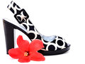
| 08/08/2009 01:12:55 AM | prettyshoes1by KazzarComment: I gave this a 5. Thought it fit the username quite well, but wanted to see the shoes dominate more and the focus on them stronger/sharper. | | Photographer found comment helpful. |
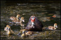
| 08/08/2009 01:11:29 AM | Quackersby scarbrdComment: I gave this a 6 and recall being amused how they were (seemingly) moving quite rapidly toward the camera. | | Photographer found comment helpful. |
| 08/08/2009 01:10:10 AM | [user]SongBird[/user]by taterbugComment: I gave this a 5. Thought it did kind of fit. Looking now in retrospect, pretty clever for this songbird to sing with its mouth full... | | Photographer found comment helpful. |
| 08/08/2009 01:08:09 AM | S H O Eby IndigoButterflyComment: I gave this a 7, thought it suited the username well. I thought the high key style worked well for the subject(s). | | Photographer found comment helpful. |
|
Showing 321 - 330 of ~4217 |
Home -
Challenges -
Community -
League -
Photos -
Cameras -
Lenses -
Learn -
Help -
Terms of Use -
Privacy -
Top ^
DPChallenge, and website content and design, Copyright © 2001-2025 Challenging Technologies, LLC.
All digital photo copyrights belong to the photographers and may not be used without permission.
Current Server Time: 12/21/2025 03:11:03 PM EST.
|


![[user]SongBird[/user]](https://images.dpchallenge.com/images_challenge/1000-1999/1069/120/Copyrighted_Image_Reuse_Prohibited_809073.jpg)