Thank you for taking the time to provide me with some very valuable feedback on my photo of my son.
You're welcome.
Originally posted by StormyWeathers:
I am trying to learn as much as possible about this so please let me ask you a few additional questions...
sure
Originally posted by StormyWeathers:
1. The crop comment also didn't seam to work for me either but I think the composition could have been stronger and I only did the best with the background given. That being said I will look for better composition when framing the the shot next time.
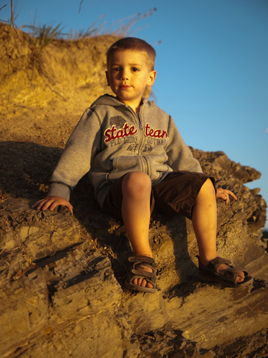
Here's the one I started playing with, just fyi (but remember, I wasn't happy with the crop):
With children, my preference is to catch them unaware - their character usually shines through best then. Also, firing off a whole sequence of frames can be beneficial at times (especially when they tune out to the shutter sound).
Originally posted by StormyWeathers:
2. He is very hot in the face and I am wondering what kind of sequence you would use when shooting a shot like this?? I am using a very fast f2 lense and by default usually shoot wide open, especially with my wide angles because DPF isn't really an issue. I see in this case I notice the blur in the face and would correct for this next shot. My question is would you use a spot metering for his face and let the other light levels fall where they may?? What are your thougths?
First and foremost - I'm more of an 'art appreciater', than a technical & 'orthodox' photographer - although I often admire (and aspire to) the technicals. Ask in the forums, there are a lot of excellent portrait photographers here, many of whom specialize in natural lighting.
Having said that, in this situation, spot metering likely isn't a real option - you'd lose the moment. But, if you were wanting to set the scene up and then, eg: 'naturally' allow / direct your child into the frame - then yes, I guess the full set up might be in order. I know a little of spot metering/light metering, but because digital photography does it auto for you these days, the need to learn more, hasn't been there for me - yet (but I'll get there). I can't sufficiently answer your question on light metering, again, ask in the forums - or view some portfolios and ask directly - you might luck out, but you might get some help.
If it was me, and I was intentionally going for light metering, yes, I would on his face, but also being mindful of the reflective surfaces in the surrounds. More than likely (and this is just my current 'style'), I'd be focussed on the DOF and focal points and let the camera do the rest (usually always have it on the Manual setting). Lighting is not something I have ventured far into, I am more interested in composition and 'moment' and unique perspectives, captures and views.
Originally posted by StormyWeathers:
PS - I notice that you have a Fujifilm FinePix 2800Z. This is a fairly entry level camera but you have a really good understanding of photography? Do you have other cameras or how did you gain your knowledge of photography?
Some of my favorite images were taken with my little Fuji. Alas it sits quietly on the shelf these days, partly because of intermittent technical issues (age), but mostly because I 'grew to' Nikon & lenses a few years ago. Most of my images these days are taken with a D90. My profile lists my humble list of cameras & lenses. I intentionally keep the Fuji as my default - because in my opinion, whilst the camera (& lens) is important and give a quality and effect not found in a P&S, it is what is 'captured onto the sensor' that is the main thing - I leave the Fuji there primarily for the 'book/cover' clan.
My knowledge of photography, especially the technicals is very limited. My knowledge of what makes a good picture - at least in my mind, is quite fine tuned. I am still and always will be learning. Commenting on 4000+ images and voting on 50,000+ has helped in more ways than one.
Thank you for taking the time to provide me with some very valuable feedback on my photo of my son. I am trying to learn as much as possible about this so please let me ask you a few additional questions...
1. The crop comment also didn't seam to work for me either but I think the composition could have been stronger and I only did the best with the background given. That being said I will look for better composition when framing the the shot next time.
2. He is very hot in the face and I am wondering what kind of sequence you would use when shooting a shot like this?? I am using a very fast f2 lense and by default usually shoot wide open, especially with my wide angles because DPF isn't really an issue. I see in this case I notice the blur in the face and would correct for this next shot. My question is would you use a spot metering for his face and let the other light levels fall where they may?? What are your thougths?
Thanks,
Stormy Weathers.
PS - I notice that you have a Fujifilm FinePix 2800Z. This is a fairly entry level camera but you have a really good understanding of photography? Do you have other cameras or how did you gain your knowledge of photography?
Originally posted by macrothing:
Critique Club Critique
First Impressions The light is nice. A bit of a snapshot feel to the image, however the quality and lighting pull it beyond that 'realm'. I gave this a 4 during voting.
Photograph Information, Technicals & Composition Review Photographic technicals all look to have worked quite well. What would really strengthen this image is a refined crop, or, in retrospect (so as to speak), to be able to 'align' the background behind him, especially the head area, to complement him.
As is, whilst I like the vertical framing and think this does suit this, I think a tighter crop may have given this a little extra. I did try it, but after doing so not sure, it changes the feel of the image. I guess it depends what you were aiming for. The shadow is interesting on the left, but it is 'chopped', the rocks are a nice element, and I like the 'boyhoodness' of his clothing, including his sandals. If the quality is there, this image likely lends itself well to a head and shoulders crop, especially to really showcase that nice catch of light in his eyes.
Comments, Score & Placement Review 373/419 is fairly low down the pack and your score of 4.92 seems a bit harsh for the quality of the image. My only guess (before reading the comments) is that people may not have lingered long enough to appreciate the interesting elements to the image.
All your comments are helpful, one in particular extremely so.
Summary Of course a personal image, which I'm sure will be treasured, but given a similar opportunity again, just a fraction check on the surroundings and composition and, if possible without ruining 'a moment', some encouragement or direction to allow the boy's character to shine through a little more.
This is one of those images where you don't want to be hypercritical, but at the same time a rare opportunity was missed - could'a, woulda, should'a which is always the enemy of a hobby that is time and place dependant. In this case, the lighting was perfect, but the setting was, unfortunately, the same color cast as the subject. What should be a very healthy looking golden skin tone is lost in the background as it's very similar - there isn't a direct contrast. This type of color works best when it's evenly applied onto a subject and here, the part of the subject's face that is directly lit by the sun is uneven and blotchy. You can see this by comparing the even tone of the legs to the face. There is also a direct focal point issue from the feet to the head - the head is just slightly out of focus which is a DOF problem due to the angle at which it was taken - which could account for the blotchy color. A little more height might have solved the DOF problem, but not the lighting issue. Now, having said all this from a technical perspective, from an artistic standpoint, this is a very good photograph - very natural looking pose and subject. While time is always an issue with photography, time taken to carefully examine the setting and technical issues would have made this a top contender for a prize.