| Image |
Comment |
| 12/19/2005 07:09:12 PM |
Inner Sanctumby RikkiComment: Gave this a 6. I liked the colors (including the use of them against the black) but the middle candle was 'out of synch' and other minor balance/cropping details overall kept this shot from being 'more' in my opinion. |
 Photographer found comment helpful. Photographer found comment helpful. |
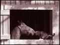
| 12/17/2005 11:29:05 PM |
DSC_0667BBB.jpgby ColeyComment: '7', likely, not sure. Gave the 'real entry' a 7. Here is the b/w I suggested may have made this better so I won't contradict myself there, and it definitely eliminates the skin/flesh issues in the color, but this is a different angle and closer. With the centered composition this needs to be more symmetrical (framing & angle especially) in my opinion. The 'dark edges', are too harsh and grainy also in my opinion and detract overall. At this angle it is more noticeable what forks are 'out of synch'. I think if this were 'zoomed out' a bit more (similar to the 'real entry'), make this better, in my opinion. There's also that issue of the 'little one missing' in this shot too, as per my original comments. |
| Photographer found comment helpful. |
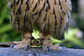
| 12/16/2005 11:56:25 PM |
OWLfeet1301.jpgby YoungerComment: Good, 'odd' potential with this in my opinion. Nice colors. 'If only' the talons were sharp (of course the tie/cuffs detract but little you can do about that) and overall just a little sharper (even though the 'soft' does 'work'), make it even better in my opinion. A slight nudge rotation up on the right too, and possible crop variation also may have made this even better. Like it, especially the colors, patterns and texture 'contrast' with the rock/wood/whatever the owl is standing on. |
| Photographer found comment helpful. |
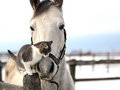
| 12/16/2005 11:29:39 PM |
IMG_2389.jpgby Rando D300Comment: Very nice capture and colors. Opportune of course in all likelihood but, 'if only' the ears weren't cropped, but still, good shot. The simple background and lines look good. Contrast control of the whites looks well done too. |
| Photographer found comment helpful. |
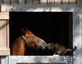
| 12/16/2005 11:27:44 PM |
Unusual Friends IIby MarjoComment: This is also very good and the quality (at this size anyway) is still good enough in my opinion. Is this better than the other? - maybe by a 'whisker' (pun intended) in my opinion, but it's a matter of taste. This color version (and slight crop variation) just has a little more 'feel' or 'depth' to it. The extra pixels do help of course. A lot of potential in this shot for variations in toning, crop, saturation, etc - all producing a really well (again) naturally framed, well captured (opportune of course (good luck if you try to reshoot)) and nice character shot with good shadow play and textures as well. Thank you for posting this version. |
| Photographer found comment helpful. |
| 12/15/2005 11:52:52 PM |
Unusual Friendsby MarjoComment: Good capture. Presume the quality wasn't enough to put this at 640 - likely a 'distant opportune capture'. Very nice. 'Natural framing' adds a lot to the character of this shot. |
| Photographer found comment helpful. |
| 12/15/2005 11:50:27 PM |
Hi thereby MarjoComment: Serendipity. Looks like a little jumping spider, barely discernable, but could be traces of 'his/her' web there too. Very nice colors and background. Good macro and angle, showing the Zinnia very well. Quality dependent, an even tighter crop to 'produce another shot' with the spider dominating - also be good. |
| Photographer found comment helpful. |
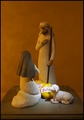
| 12/15/2005 11:23:03 PM |
The Baby Cheesesby KarenNfldComment: 6 - Very good. Obviously your title helps but even without it, more than half a second looking at 'most' should 'get it'. Can't see the pun is original but I have not seen it done 'visually', so well done. Criticism; in my opinion, if you could have 'somehow' (angle/perspective variation likely) shot this without the base of the carving(s) visible, would have helped this 'illusion' to be even better. The lighting is 'directed' well but perhaps a little variation or subtlety may have also given this extra 'drama'. Perhaps a little 'closer' too would also have been better, even just for more detail/texture on the 'characters'. |
| Photographer found comment helpful. |
| 12/15/2005 11:15:59 PM |
On Dangerous Ground by fadedbeautyComment: 7 - Very good & seemingly very dangerous (couldn't see any evidence of safeguards). Criticism; not much, maybe more selective cropping (eg on the left) perhaps an even slightly sharper angle and, difficult, but having the 'focal point(s)' more centered in the frame, may have all made this even better in my opinion. Good set up & idea (well done if original). |
| Photographer found comment helpful. |
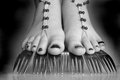
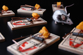
| 12/15/2005 04:20:53 PM |
Frosty Forksby JennAppleComment: Gave this a 4. Thought it had a little more potential than you captured. I liked the concept and the snow/ice gave an extra element. Perhaps just a little too close, resulting in focus issues, but I realize you were likely trying to capture the snow/ice as well, so difficult. Apologies in advance if wrong, but does seem like you may have used a flash with this, so the 'burning' on the outer edges emphasized that, so perhaps without the burning may also have made this better in my opinion. edit:removed temporary note re sizing Message edited by author 2005-12-17 17:45:22. |
| Photographer found comment helpful. |
Home -
Challenges -
Community -
League -
Photos -
Cameras -
Lenses -
Learn -
Help -
Terms of Use -
Privacy -
Top ^
DPChallenge, and website content and design, Copyright © 2001-2025 Challenging Technologies, LLC.
All digital photo copyrights belong to the photographers and may not be used without permission.
Current Server Time: 06/24/2025 05:35:23 AM EDT.