|
|
|
Showing 3161 - 3170 of ~4217 |
| Image |
Comment |
| 12/28/2005 10:44:43 PM | just a weed....by suemackComment: 7 - Very nice. Always like this unusual perspective, especially for flowers. Criticism; very difficult, but would like to see it sharper and, bigger (height, making this more square), but the choice of horizontal is your call, obviously. The frame does not 'enhance' the simplicity nor colors of this shot in my opinion. Like the colors, especially the dappled blue sky with the clouds overhead of the 'bunch'. |  Photographer found comment helpful. Photographer found comment helpful. |
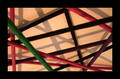
| 12/28/2005 10:36:11 PM | Abstract shadowsby aartiprasadComment: 3 - Looks like good potential. Criticism; frame is too thick in my opinion, especially for here/this size. Size also, if this were 640 width would have helped it. If the focus were a little sharper, even just on one strand/stick/'whatever' and the lighting adjusted (this looks too artificial and has a slight 'tint' to it), would have made this better in my opinion. | | Photographer found comment helpful. |
| 12/28/2005 10:33:49 PM | at the frontdoorby visaksenComment: 6 - Good perspective and use of DOF, especially to fit the Challenge well. Criticism; difficult, needs 'something' to 'raise' it in my opinion, no idea what nor how, perhaps adjusting the tone/color, not sure. Maybe more height for added 'pattern effect', but not sure on that either. | | Photographer found comment helpful. |
| 12/28/2005 10:31:00 PM | polka dotsby ursulaComment: 8 - Very nice. Criticism; not much, perhaps a crop variation or 'bigger width' may have made this even better, not sure. Toning works well. Good fit for the Challenge. | | Photographer found comment helpful. |
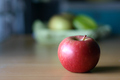
| 12/28/2005 06:59:55 AM | Separatedby arbil14Comment: 5 - Nice and simple, nice colors. Good potential. Criticism; 'if only' the fore of the apple were as sharp, or sharper as the 'core' seems to be (and that a fraction sharper too), make this even better in my opinion. The reflection/blown part is slightly detracting, but fairly minor. | | Photographer found comment helpful. |
| 12/28/2005 06:56:58 AM | Wide Openby dogzComment: 6 - Interesting. Criticism; just like to see more detail in the part that is in focus, 'somehow', whether the toning, etc not sure. Likely easier to discern out of focus remaining features/face at a larger size, but at this size, perhaps 'allowing a fraction more focus in' may have helped this here, who knows. Perhaps a slightly tighter crop, especially on the right too. Up to 6 from 5, mainly for the extreme and good use of a very shallow depth of field. | | Photographer found comment helpful. |
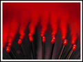
| 12/28/2005 06:47:33 AM | R E D by gaurawaComment: 7 - Very good, especially to highlight the 'depth'. Criticism; not much to be done in basic to the dust spot(?) and few other minor 'marks', really only the lighting 'reflections' detract in this, but only slightly in my opinion, as well as perhaps a touch more attention to 'symmetry'. Difficult, but sharper on the very fore 'prongs' would also have made this even better in my opinion. Not sure on the frame. Good strong color and idea, assuming this is a hairbrush. Up to 7 from 6, mainly for the very good DOF. edit:typo Message edited by author 2005-12-28 19:38:05. | | Photographer found comment helpful. |
| 12/28/2005 06:46:06 AM | Lunch Timeby NstiG8trComment: 8 - Nice pose/capture, the 'remnants base' adds a good element too. The background/depth also very good. Colors nice and simple and enhance the squirrel. Criticism; not much other than sharper on the squirrel (face/paws especially) and possibly a crop variation (top and bottom, especially where the sunlight is 'nudging in' at the fore) may have made this even better in my opinion. Likely different to try to adjust (bump) the contrast here at all given the snow. Up to 7 from 6. Up to 8 from 7, mainly for the excellent DOF. | | Photographer found comment helpful. |
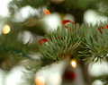
| 12/28/2005 06:44:55 AM | Noelby conglettComment: 6 - Very nice. Background/DOF/bokeh is very complementary. Criticism; having said that, the dark green 'line' on the left, which I presume is the lighting cord/cable, detracts, but fairly minor. Like to see that 'stem/branch/needles' enhanced, 'somehow', just a bit more, making it really 'pop' and dominate. Perhaps a slight crop adjustment too, mainly at the top/bottom, trying to not 'cut' any 'circles' too much, may have also made this better in my opinion. Good potential here and nice and simple, including the colors. | | Photographer found comment helpful. |
| 12/28/2005 06:43:26 AM | Natural Sculpturesby pidgeComment: 7 - This is nice, nice capture. Criticism; difficult, dependent on environment, etc - but perhaps a sharper (ground level/up) angle/perspective, to really enhance those 'sculptures', defining them more, may have made this even better in my opinion. Like to see that fore 'sculpture' sharper too, but difficult. Up to 7 from 6, mainly for the 'unique factor'. | | Photographer found comment helpful. |
|
Showing 3161 - 3170 of ~4217 |
Home -
Challenges -
Community -
League -
Photos -
Cameras -
Lenses -
Learn -
Help -
Terms of Use -
Privacy -
Top ^
DPChallenge, and website content and design, Copyright © 2001-2025 Challenging Technologies, LLC.
All digital photo copyrights belong to the photographers and may not be used without permission.
Current Server Time: 06/25/2025 07:35:32 AM EDT.
|