|
|
|
Showing 3101 - 3110 of ~4217 |
| Image |
Comment |
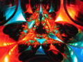
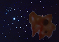
| 01/04/2006 06:12:55 PM | Wada Fractal Patternby seebrownComment: I gave this a 3. I did not 'think too hard' during voting of what this may have been or how it was achieved but on the quick look (which is usually all you get from most voters), my thoughts leaned toward this being a shot of a kaleidoscope pattern, or similar. I admit that I voted partly on that, that you 'just took a 'straight shot' (versus unique/unusual) of an existing pattern'. It is not until I now see your photographers comments that I see you set this up. That is a moot point anyway as 'we' don't get that inside information. Your title may have counteracted that presumption, had I know what a Wada Fractal Pattern was, or looked it up (which I didn't and didn't). I also cannot recall paying attention to the title in this. My voting was based mostly on the quality; the colors were a little too harsh and the focus was off (looked like it was too close/needed to be a macro). Just a note re now knowing what this is, looks like the camera lens can be seen in the reflection, so had I 'known', I would likely have voted this 'down' for that as well. The concept was good but perhaps a fraction more 'context' (to see these were ornaments) or else just a better focus, would have made this better in my opinion. Finally, just looked at that web page and see that this 'method' does seem to have some good potential, keep trying, you'll hit a winner sooner or later (and yes, I have just learned what a Wada Basin Fractal Pattern is). edit: added 'Basin'Message edited by author 2006-01-04 18:26:12. |  Photographer found comment helpful. Photographer found comment helpful. |
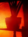
| 01/04/2006 06:38:28 AM | Solstice Shadowsby melismaticaComment: Gave this a 3. Perhaps if you had concentrated more on the patterns within the shadows than the shapes, would have made this better in my opinion. Colors are nice, but just a variation in cropping/composition and possibly even angle, may have helped this. | | Photographer found comment helpful. |
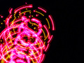
| 01/04/2006 06:35:49 AM | spining lightsby polkopComment: I gave this a 4. There was a pattern there but in my opinion the colors were too harsh (ie: contrast/etc) and the pattern a bit too 'busy', especially for the composition. Also 640 width (height too perhaps) may have helped this, again, with a slightly different composition, depending of course what you had to work with. | | Photographer found comment helpful. |
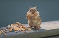
| 01/03/2006 05:27:24 PM | I Can Do It!by TooCoolComment: Looks like your patience and 'offerings' paid off. Good capture with a nice clear/clean background. Of course if the chipmunk were a fraction sharper, make this even better, but you know that, plus obviously not an easy thing to do. Looking at all the Chipmunk Story shots, looks like there might be a couple of good sets of triptychs/whateverptychs there. | | Photographer found comment helpful. |
| 01/02/2006 11:01:10 PM | space amoebaby BeetleComment: I gave this a 5. I liked the concept and composition and it was a good fit for the username. My main 'criticism' was/would be that it appeared flat, contrast/pp/something seemed a little too 'tweaked' to the point it started to verge on digital art, in a way. My monitor is usually fairly good, but this does seem a fraction dark, but then that is presumably what you have gone for with the 'space' theme. Perhaps trying to create more distance/depth between the 'amoeba' and the 'space/stars', and either more detail or a lighter color on the 'amoeba' to try to make it 'pop' more, may have made this better in my opinion. | | Photographer found comment helpful. |
| 01/02/2006 04:47:52 PM | Hypnotic Gazeby sajinComment: Excellent capture and colors. I like the detail in the ears - just to possibly contradict that, if that sharp focus were on the nose 'upwards', may have made this even better (or just a 'different' shot, if that makes sense) in my opinion. The whiskers at the bottom and the curvature of the back/spine cropped, again, works as is, but with the inclusion (dependent of course what you had to work with), may have made this even better. I am sure this size doesn't do this justice. Like how you've captured a 'uniform shape' in the reflection in the eyes, adds to this. | | Photographer found comment helpful. |
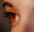
| 01/01/2006 10:26:10 PM | "MacroThing"by CutterComment: 8 - Nice macro, seems 'natural' (no make up, neat image, etc), good 'feel'/detail in the skin and lashes. Nice coloring. I like the seemingly 'thoughtful capture' in the eye. Criticism; difficult, but perhaps a little sharper focus on the iris/eye, but the detail in the lashes/brow/hair is good. Perhaps a slightly tighter crop on the right, even though it adds 'context'/perspective, still may have made the 'features' pop just a little more. Thank you for doing a 'quality shot' of my 'username'. Up to 7 from 6. Up to 8 from 7. | | Photographer found comment helpful. |
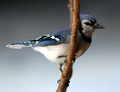
| 01/01/2006 10:25:57 PM | "Jay Bird" the Blue Jayby DrakeComment: 8 - This is very nice, really like the colors. Background is nice and simple and 'pure'. Criticism; difficult, especially seeing as this is likely 'opportune', but sharper, but you likely know that, especially on the face. A little lighter too, as is on the tail/wing, make this better in my opinion. Difficult to adjust the lighting/contrast, especially seeing as the 'rear end' looks like it is starting to 'go' as is. Good capture though. Up to 8 from 7. | | Photographer found comment helpful. |
| 01/01/2006 10:25:46 PM | Hi! I'm Tasha4Pawsby SandyPComment: 8 - Very good. Hope you get a smile from this. Criticism; only the bottom 'cut' really, but likely done the best with what you had. Like the straw 'element', good eye capture. Perhaps if the nose and eyes were a little sharper, but not sure, and don't know if the '4paws' would have gained the same focus in doing so. Up to 8 from 7. | | Photographer found comment helpful. |
| 01/01/2006 10:25:39 PM | gurlwithapenby arsenalComment: 8 - Very good. Criticism; a little dark in my opinion, but I realize that is the style you were going for. Good capture of the username. Nice setting and angle. Up to 8 from 7. | | Photographer found comment helpful. |
|
Showing 3101 - 3110 of ~4217 |
Home -
Challenges -
Community -
League -
Photos -
Cameras -
Lenses -
Learn -
Help -
Terms of Use -
Privacy -
Top ^
DPChallenge, and website content and design, Copyright © 2001-2025 Challenging Technologies, LLC.
All digital photo copyrights belong to the photographers and may not be used without permission.
Current Server Time: 06/25/2025 04:43:03 PM EDT.
|