|
|
|
Showing 3081 - 3090 of ~4217 |
| Image |
Comment |
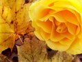
| 01/08/2006 12:09:06 AM | fallrose_filtered.jpgby trobergeComment: Nice colors and color combinations. 'If only' the texture of the petals were as discernable as the leaves, make this even better in my opinion. I like the composition. |  Photographer found comment helpful. Photographer found comment helpful. |
| 01/08/2006 12:08:02 AM | lizard2gothicglowcompentry.jpgby trobergeComment: Difficult, but maybe a '6', not sure, hypothetically, re this is a 'Free Study IX Out-take'. I like the composition and pose, but again, seems just 'too' over processed. Obviously this was something you were going for. I think that the detail in the skin/texture 'naturally' would have been better, but just my opinion. Contrast seems a bit high too, making for a little too dark, especially at this size, but again, likely what you were aiming for. | | Photographer found comment helpful. |
| 01/08/2006 12:03:55 AM | Running Freeby trobergeComment: I gave this a 7. I liked the composition but, criticism; the feet cropped was a fairly minor issue, but mainly it was the pp effects (looked like burning/dodging) that seemed a little 'too much' that it started to detract from the natural 'feel' of this, in my opinion. | | Photographer found comment helpful. |
| 01/08/2006 12:01:12 AM | Vintage Toy Store Catalog Coverby trobergeComment: I gave this a 6. I thought it was good. The toning works well and I like the frame. Criticism; not much, maybe a variation in lighting, tryning to create a little more 'depth', may have made this even better in my opinion. Perhaps a fraction more detail too. | | Photographer found comment helpful. |
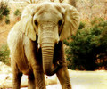
| 01/07/2006 11:59:23 PM | tortoisesfwsm.jpgby trobergeComment: Good capture. Unusual, especially the .. bokeh(?), looks like it might be the body/shell. Never knew how 'human looking' their eyes were. Seems it may be a fraction blurred, but difficult to tell. The lighting, while shows up the texture and eye well, just seems a little 'harsh', or unnatural. Sorry, difficult to explain, but I tried. edit: just realized this was an 'out-take' as well.. hypothetically ..'6', maybe '7' for the issues stated above (pretend anyway, obviously). Message edited by author 2006-01-08 00:10:43. | | Photographer found comment helpful. |
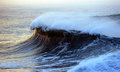
| 01/07/2006 11:41:55 PM | cliff waveby MacDonaldComment: Nice capture. Seems a bit grainy - whilst no expert in photography, at first guess I'd say it might have something to do with the high ISO you used, but not sure on that. Perhaps someone with more knowledge will help. | | Photographer found comment helpful. |
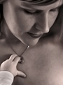
| 01/07/2006 05:17:23 PM | unconditionalby tateComment: 7 - Like this and the subtlety. Criticism; depending what you had to work with of course, but more of the baby's hand and a little sharper on it, a fraction softer on 'Mother's' face and an adjustment/softening of the skin (looks a little 'blotchy', but could be the toning), all likely make this even better in my opinion. I like the crop/framing, with the Mother's face in the top of the frame at this angle. The little hair showing through does add something, but I think a fraction more may have given a 'inner' framing effect to this, not sure though. The glare/reflection on the lipstick(?) slightly detracts, but minor - and obviously 'your call' on having Mother wearing lipstick anyway. | | Photographer found comment helpful. |
| 01/07/2006 05:12:34 PM | Me as a mother by unnevaComment: 7 - Nice and the toning works well here. Good composition and capture on 'Mother's' face. Criticism; mainly the 'blowing' on the Mother's hair, but very difficult I imagine to control, especially using this toning. Perhaps a variation in lighting may have helped. Having said that, it does add a certain element to this shot, but if it were a fraction more subtle, make this even better in my opinion. Perhaps a slightly tighter crop on the right, and more 'baby' on the left (dependent of course what you had to work with) may also have made this even better. | | Photographer found comment helpful. |
| 01/07/2006 05:03:19 PM | Makes me cookiesby myceliumComment: 7 - Like this. I think you captured a good 'motherly' and 'homey' feel in this. Her 'cheery smile' really makes this. The colors all blend together well. I like the use of 'Mother' in the DOF, just the right amount. Criticism; not much, and fairly minor, things like; the finger/fingernail, the plate not 'level', more detail in the cookies/pies/whatever perhaps the napkin/serviette filling the whole bottom of the frame might have made this better and maybe, 'Mother' just a fraction softer, yet the focus still as sharp (if that makes sense) may have all have made this even better in my opinion. Maybe her head not 'cut', but works fine as is so who knows. Perhaps also a background that uses one of the colors in the napkin/serviette, may have given this something extra, but again, minor. | | Photographer found comment helpful. |
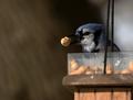
| 01/06/2006 06:20:04 PM | IMG_4338.jpgby Rando D300Comment: Nice capture and 'peanut elements'. 'If only' the bird 'popped' against that very good DOF even more (whether it is the lighting or focus, not sure), but obviously opportune and difficult (especially with that natural, and good, lighting 'direction'). I like the composition. Good simple colors, but again, if only the bird and the 'blue' popped a fraction more, make this an even better shot in my opinion. | | Photographer found comment helpful. |
|
Showing 3081 - 3090 of ~4217 |
Home -
Challenges -
Community -
League -
Photos -
Cameras -
Lenses -
Learn -
Help -
Terms of Use -
Privacy -
Top ^
DPChallenge, and website content and design, Copyright © 2001-2025 Challenging Technologies, LLC.
All digital photo copyrights belong to the photographers and may not be used without permission.
Current Server Time: 06/25/2025 08:53:59 PM EDT.
|