|
|
|
Showing 3031 - 3040 of ~4217 |
| Image |
Comment |
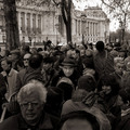
| 01/21/2006 06:11:08 AM | Eye Contact by jjbeguinComment: 8 - Good. Like the b&w/toning. Criticism; the white car in the background detracts, but fairly minor. If the main subject was more prominent, 'somehow', whether this could be achieved in pp with contrast/etc, who knows, but if the gentleman 'popped' out of the crowd just a bit more, make this even better in my opinion. Also, dependent what you had to work with, if the subject was more centered, with a little 'more' bottom and right incorporated into frame (and possibly 'less forehead' at the bottom), may also have made this even better in my opinion. Up to 8 from 7. |  Photographer found comment helpful. Photographer found comment helpful. |
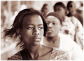
| 01/21/2006 06:01:14 AM | Girl from Ipanema by whiteroomComment: 8 - Nice capture/candid. Toning works well. Criticism; not much shot-wise, possibly the lady's shirt (the lightness) behind 'the girl' detracts/distracts slightly, whether the toning helped/hindered that, who knows. Depending what you had to work with, possibly a little more height and context top/bottom especially, maybe the left as well, but again minor and 'nit picking'. The biggest 'detractor' in this in my opinion is the title, it does 'work', but knowing the history of this song, just doesn't 'suit' it in my opinion, whether or not this girl is from Ipanema or not, but again, minor and yes, just my opinion. Up to 8 from 7. edit:typo Message edited by author 2006-01-23 07:16:18. | | Photographer found comment helpful. |
| 01/20/2006 10:10:03 PM | Happy Hour ?by e301Comment: 7 - Like the moment and character capture and the b/w works well. Criticism; mainly wish the top of the sign were incorporated (depending what it said, etc - and of course if you had it originally to work with/from), other than that, perhaps a little more height may have also made this better in my opinion. | | Photographer found comment helpful. |
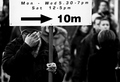
| 01/20/2006 09:25:38 PM | look both waysby oilofoleComment: 4 - Mostly for the potential - Good idea. I think many will 'miss' your 'effect' here, I nearly did. Criticism; mainly the composition and the reflections. If the 'ghostly figure' was either further into the frame, or else the frame cropped, a little more of the car perhaps, and the sign especially (as that is what the Challenge is about) 'placed' better within the overall framing/composition (in this case likely 'left'), the reflections on the sign diminished (difficult, both for 'basic editing' and the actual shooting/location) and cropping out/eliminating the upper left 'green sign' - all have made this much better in my opinion. Also, given the 'vertical nature' of the two main subjects, perhaps a vertical framing may have worked better, but I realize you've tried to incorporate the 'crosswalk'. | | Photographer found comment helpful. |
| 01/18/2006 04:22:00 PM | Hung Out To Dryby sajinComment: I gave this a 6. Liked the concept and thought the use of backlighting was good. The 'criticism' I had was; a variation in cropping/angle (dependent of course) to get it more symmetrical/balanced (ie; top left corner out and a fraction more space, maybe, on the right), the few 'blown' areas and just a sharper perspective/angle to 'use the backlighting' a bit more effectively (gain more transluscence in the fins/mouths etc), would likely have made this even better in my opinion. After reading your comments that this was in a market, likely difficult to gain a sharper perspective/perfect 'backlighting' and yes, the 'close up' shows a bit more detail re the backlighting, but this entry was more 'interesting', in my opinion. | | Photographer found comment helpful. |
| 01/18/2006 03:34:49 PM | winter bluesby ursulaComment: I gave this an 8. The colors and lighting and OOF 'circles' really made it in my opinion. I wondered what type of flower this is and thought it was real, but on closer inspection - perhaps it is 'fabric'(?). If so, the fact that you 'hid' that so well (mostly via angle/lighting/water effects) created a good illusion. The only real 'criticism' I may have had, and very minor, would be (again, especially for this size), to have had perhaps a little more 'height'. If this is a real flower, and you know what type it is, if you could include the name in your comments, I'd be interested. Nice shot and yes, 'Congratulations'. edit:even better then (I thought 'perhaps' it may have been 'colored' whilst voting, that or a flower I didn't recognize - it was only after looking closer today I 'wondered' whether it was fabric), thank you for including that information. Message edited by author 2006-01-18 15:55:01. | | Photographer found comment helpful. |
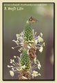
| 01/15/2006 08:17:09 PM | Bugs Life 1by loriprophotoComment: Nice capture and focus. Vertical framing works here. Sacrificing the fore flower and more of a horizontal crop/frame (depending of course quality/what you had to work with), perhaps make 'another' also very good shot, in my opinion. Minor, especially at this size, but there seems a slight touch of 'sharpening halo' up around the edges, including the 'copyright' & title (which you obviously put there for a reason, but if someone wanted to 'steal this', it'd still be great with that text cropped, as you likely are well aware). Make a nice print (with the copyright a little more subtle, but your call, obviously). | | Photographer found comment helpful. |
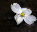
| 01/14/2006 06:25:51 PM | Dogwood pondby smilebig4me1xComment: Like this. Not sure if I notice it as much because I've read your 'Photographer's Comments' or not, but the 'pp', if it were a little more subtle, make this even better in my opinion.
temporary note:
'what am I?' is waiting for hints, if interested (will remove this temporary note once I see you've read it) | | Photographer found comment helpful. |
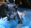
| 01/13/2006 11:58:31 PM | Where's the bird?by MacDonaldComment: 10 min edit -

messed the 'left' (cat's right) eye up a little trying to fix the colors, don't look too closely
good luck if you reshoot | | Photographer found comment helpful. |
| 01/13/2006 07:42:06 PM | Where's the bird?by MacDonaldComment: Like the potential here. The colors in this are nice. I think that this shot would be even better taken at a sharper (ground level/up) angle/perspective, allowing the feathers to create a pseudo framing at the bottom especially. Trying to either eliminate the background (which detracts in my opinion) &/or possibly even trying to place more of the feathers 'behind' (or use a similar or complementary color) in the background and sharper on the cat's face (especially eyes/nose) would have made this a much better shot in my opinion. Even this 'as is' with a nudge rotation up on the right and a crop variation (especially at the top) would likely be even better, again, in my opinion. edit:typoMessage edited by author 2006-01-21 07:03:11. | | Photographer found comment helpful. |
|
Showing 3031 - 3040 of ~4217 |
Home -
Challenges -
Community -
League -
Photos -
Cameras -
Lenses -
Learn -
Help -
Terms of Use -
Privacy -
Top ^
DPChallenge, and website content and design, Copyright © 2001-2025 Challenging Technologies, LLC.
All digital photo copyrights belong to the photographers and may not be used without permission.
Current Server Time: 06/26/2025 08:27:23 AM EDT.
|