|
|
|
Showing 291 - 300 of ~4217 |
| Image |
Comment |
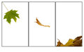
| 10/21/2009 06:50:41 AM | Ees hampster Mr Fawlty. . . . by burtctComment: 6 - I like your title. I wonder about a variation in size/proportions in #1 & #3 to allow #2 to dominate more - all three images are too similar and not really showcasing the £5 filigree Siberian hamster. |  Photographer found comment helpful. Photographer found comment helpful. |
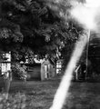
| 10/21/2009 06:41:03 AM | Stagesby Pug-HComment: 7 - Unique. Look at those bugs in the middle - ha. Looks like it needs a little further something, especially in the middle and end photograph - but could be the colors confusing my mind... | | Photographer found comment helpful. |
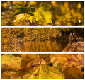
| 10/21/2009 06:36:55 AM | inevitabilityby LutchenkoComment: 7 - Nice concept. I can imagine the title there in the space below - would look good. Difficult at this size, but a little sharper on #1 and more visible in #3. Middle one is delightful. Maybe the black frames a touch thinner, but again - the size restrictions. All just personal preference of course. Your vision. | | Photographer found comment helpful. |
| 10/21/2009 06:29:24 AM | | | Photographer found comment helpful. |
| 10/17/2009 07:40:59 AM | Fireplaceby tinkie2010Comment:  Critique Club Critique
First Impressions
Critique Club Critique
First Impressions
Seems to meet the Challenge. Quite good symmetry. Perhaps could have been enhanced by some cloning out of minor issues here and there.
Photograph Information, Technicals & Composition Review
A slighty deeper DOF would have allowed the flames (fire) to become more apparent.
Compositionally, don't mind the front on aspect, but perhaps a slightly tighter crop would have evoked a feeling of being 'in front of' this fire more. But depends what you were aiming for.
Comments, Score & Placement Review
61/96 and a score of 5.26 is a fairly good score for an entry that ended up in the bottom third.
Your commenters don't really give much indication of what they felt could have improved the image, save for perhaps the first comment.
Summary
I wonder about a more 'level' point of view/perspective, whether this may have given the image an edge. That coupled with the deeper depth of field, as mentioned above, would likely have produced a stronger image for this Challenge.
edit: typoMessage edited by author 2009-10-17 07:50:53. | | Photographer found comment helpful. |
| 09/17/2009 08:52:23 PM | wall of cloudsby cginoComment: Beautiful, awesome and 'cool'.
PS
Sorry to read about your cats ....
- any chance of a sneak peek (even a snapshot) at the two new babies...? | | Photographer found comment helpful. |
| 09/17/2009 07:42:32 PM | Lost in the Seaby BeefnCheezComment:
Critique Club Critique
First Impressions
Can't see anyone. But I haven't been much good at finding them so far with other entries in this Challenge. On first impressions the subjects look too small to have a person in there...
Photograph Information, Technicals & Composition Review
Ok, just read your Photographer's Comments. Yes, I saw the stripey fish, no it didn't seem to fit the Challenge description for me. Yes, I understand you 'changed this description' and 'wanted to enter something', I understand that urge to enter, but changing the description of the Challenge like this, in a challenge such as this one, just doesn't work and makes it look like you misunderstood the Challenge or didn't read the description.
As is, it is difficult for me to properly critique this submission.
I can mention that the toning seems harsh and the oversaturation isn't enhancing your subjects. The out of focus areas at the bottom of the frame also detract.
Comments, Score & Placement Review
68/73 is not bad considering there is no person in there. Quite a few comments in-Challenge and an average score from them of 5 makes me wonder whether they were not holding the Challenge theme strongly in mind or liked your interpretation or gave you the benefit of the doubt and assumed they could not find a person.
Ok, just the read the comments received and there's a bit of a mix in there of how they perceive this image and your interpretation for this Challenge.
Summary
I don't think this fits the Challenge, no matter how 'out of the box' you want to be. I understand the concept, but perhaps choosing the other Challenge theme (Back to School II) may have been easier to shoot for. | | Photographer found comment helpful. |
| 09/17/2009 07:22:10 PM | World Windowsby posthumousComment:
Critique Club Critique
First Impressions
Bzz.. can't see anyone, but after my last 'critique' I'm tempted to head on down to your comments for a quick cheat, but I won't, yet. The big flash of white, I'm not sure what it adds to the image. The only 'maybes' I can see are what looks like a boot and a leg on top of a ghosted exposure something, middle right of frame, or otherwise maybe something happening in that 'window' far left middle of frame - either way this looks like multiple and/or long exposure photography trickery to me.
Photograph Information, Technicals & Composition Review
Oh (after reading your Photographer's Comments), now I see her (  skewsme skewsme - (no pun intended!)), at the window of the left, but the scale was all wrong in my mind before so I was totally off with what I saw. I can clearly see the face now. It is total trickery I tell you. You created an Alice in Wonderland type image and I do really like that. I still can't place/get context/position on this, perhaps you were inside a house shooting a window from inside the house with her looking outside, yet still shooting out another window that showed a different scene outside, I don't know - don't want to know, don't 'remove' the illusion. I also really like the b&w conversion, it suits this well.
On looking longer and closer and gaining a little more perspective, this probably isn't even a multiple exposure, but of course at a shutter speed of 13, you may have brought some 'movement' into play manually.
But I do wish there wasn't that big flash of white smack bang in the middle. Maybe a slightly more refined crop at the top, only for added balance. I like the interesting elements such as the steps, the little barn, etc.
Comments, Score & Placement Review
64/73 is pretty low down the pack, but you're not phased by this any more I'm surmising. Score of 4.9 - nearly hit the 5 with this out of the box entry. I'm confident without the white flash this would have scored higher, and enabled those who may have missed 'Mrs Waldo' to see her.
You received some good feedback (and quite a bit too) during the Challenge.
Summary
This grows on you the more you look at it. As an aside, this cropped very boldly, would likely make a lovely, unique and interesting character capture and artistic portrait of your 'Mrs Waldo'.
edit: wording & typosMessage edited by author 2009-09-17 19:27:26. | | Photographer found comment helpful. |
| 09/16/2009 07:35:34 AM | Waldo @ the farmby tinkie2010Comment:
Critique Club Critique
First Impressions
Good for a Where's Waldo Challenge. Maybe not even subtle enough. I didn't vote in this Challenge.
Photograph Information, Technicals & Composition Review
I like your composition, the lighting and scene are pleasant and warm.
The HDR use is new to me, especially in regard to using it in Challenge entries. I find that with this image, the HDR has enhanced the nice warm lighting, which is good, but what bothers me is the few 'whiteish marks' around the boy's lower torso. I can't discern what they are and can't help but wonder if they are a result of overlays from different frames. Apologies in advance if wrong.
There is some slight blur (again, could be movement), however it grows on me the more I look at it and it adds to the overall softness of the image.
Lastly, 720 in this Challenge would have strengthened your entry (the 'hidden person' aspect aside), if the quality was there.
Comments, Score & Placement Review
27/73 is a good placement and your score of 5.66 doesn't really reflect that. I can only surmise that it is because there were a low number of entries in this Challenge and it was an overall low scoring Challenge.
Most of your commenters like your coloring and the light, however there isn't too much feedback on why you received an average score of 6.5 from them.
Summary
A little more subtle with the person for this Challenge and possibly a little more context/foreground, with the technicals slightly more refined (even if leaving it soft, but the HDR/movement issues eliminated), would have made this a stronger entry in my opinion. | | Photographer found comment helpful. |
| 09/16/2009 07:22:44 AM | He's upstairsby snafflesComment:
Critique Club Critique
First Impressions
Tough pick.. I didn't vote in this Challenge, nor am I very familiar with  heida heida's work. However, I am familiar enough to give my first instant impression of this image which was: the feel/finish/processing is not dramatic enough to be distinctly in the style of heida, in my opinion. The subject/context and scene are quite 'dark', but my interpretation of most of the images of heida's that I have viewed is that, the subjects themself are rarely 'dark', but the mood and/or processing gives them a dark feel, which is usually contrasted by an innocence or other contrary and complementary aspect. Hopefully that makes sense. However, that is my interpretation of her art, this is obviously yours - and that is one of the beauties of admiring art, we all see something different.
Photograph Information, Technicals & Composition Review
With this scene as is, and using it for this Challenge, I wonder whether a variation in your technicals would have allowed more mood and drama to come into play and light up the scene differently. I like the light coming through the window, but the lack of discernible detail in the foreground, which takes up quite a bit of the frame, is detracting from the interest on the landing/up the stairs. The details discernible in the ceiling dominate too much, and again, draw the attention away from the most interesting aspects of the image (in my opinion), which are the window and possibly the door/doorway. The doorway being 'chopped' makes it a minor feature however.
The broken railings/'sticks' (which on first view I assumed was ironwork/castings), perhaps are an interesting element, however from this angle/perspective are not showcased well enough to be identifiable enough to add to the image.
Comments, Score & Placement Review
118/126 and a score of 4.57 is pretty low, but this is/was a very difficult Challenge. To try to submit an image without a human in it, made it even more difficult to emulate this lady's distinctive style.
Your one comment in-Challenge eludes to perhaps not a strong contender for this Challenge (or maybe they weren't concerned with that, hard to tell), however liked your originality regardless (and their score reflects that). Your other post Challenge comment seems to be familiar with her work and gives a good indication of why they thought the entry not so strong for this Challenge, which is good feedback to receive.
Summary
A little more context and simplicity, coupled with some 'distinctive processing elumation' would likely have given this a little more strength. However as mentioned above, a very difficult Challenge to shoot for, and almost as difficult to receive votes from others who may not be familiar enough with the work of the artist honored, [user]heida[/i]. | | Photographer found comment helpful. |
|
Showing 291 - 300 of ~4217 |
Home -
Challenges -
Community -
League -
Photos -
Cameras -
Lenses -
Learn -
Help -
Terms of Use -
Privacy -
Top ^
DPChallenge, and website content and design, Copyright © 2001-2025 Challenging Technologies, LLC.
All digital photo copyrights belong to the photographers and may not be used without permission.
Current Server Time: 06/18/2025 09:05:40 PM EDT.
|