| Image |
Comment |
| 10/07/2005 01:12:12 PM |
|
 Photographer found comment helpful. Photographer found comment helpful. |
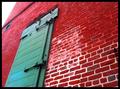
| 10/07/2005 01:08:50 PM |
Door of Contrastby littlebertha34Comment: I think you should have cropped the sky out, leaving the only white as the white on the bricks, because your sky is blown out and detracts from the complementary colors of red and green. |
| Photographer found comment helpful. |
| 10/07/2005 01:07:23 PM |
|
| Photographer found comment helpful. |
| 10/07/2005 01:05:35 PM |
|
| Photographer found comment helpful. |
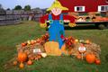
| 10/07/2005 01:04:58 PM |
Pretty Pollyby Mr_PantsComment: Polly is very pretty. Some of the reds seem a bit overcontrasted but your comp is good. |
| Photographer found comment helpful. |
| 10/07/2005 06:49:07 AM |
Complementary.Colors.by TejComment: green, yellow and orange are all contrasting colors (side-by-side on the color wheel) and black is a shade, not a color. Complementary colors are across from each other on the CW. This is a lovely photo, however. |
| Photographer found comment helpful. |
| 10/06/2005 11:39:28 AM |
|
| Photographer found comment helpful. |
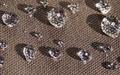
| 10/06/2005 11:38:55 AM |
Drops of rainby liquid shadowComment: There are no complementary colors in this photo. Maybe you should study the color wheel and find out what comp colors are? |
| Photographer found comment helpful. |
| 10/06/2005 11:36:08 AM |
|
| Photographer found comment helpful. |
| 10/06/2005 11:35:31 AM |
Palmsby sarimiliComment: Foreground seems a tad oversharpened/blown out. Good use of comp colors! |
| Photographer found comment helpful. |
Home -
Challenges -
Community -
League -
Photos -
Cameras -
Lenses -
Learn -
Help -
Terms of Use -
Privacy -
Top ^
DPChallenge, and website content and design, Copyright © 2001-2025 Challenging Technologies, LLC.
All digital photo copyrights belong to the photographers and may not be used without permission.
Current Server Time: 08/15/2025 08:07:21 AM EDT.