| Image |
Comment |
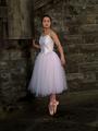
| 09/12/2005 11:14:31 AM |
Ballerinaby kiwinickComment: your background is not straight and is very distracting from your beautiful ballerina. |
 Photographer found comment helpful. Photographer found comment helpful. |
| 09/12/2005 11:13:22 AM |
Dade, age 5by HBunchComment: Nice capture. I like your set-up because the tree offers a non-distracting backdrop, however, his face is too light and his arm fuzzy.
I like the title: Ready or not, here I come! |
| Photographer found comment helpful. |
| 09/12/2005 11:10:23 AM |
Girl in loveby birgirComment: I don't like the red and black with this background. She has beautiful blue eyes but my eyes are drawn to the background and the red shirt first. Lay a piece of paper over the right half and see what you think. A portrait should be just about the subject and the rest is just icing to complement, not detract. |
| Photographer found comment helpful. |
| 09/12/2005 11:08:06 AM |
Briannaby nico_blueComment: Except for the office chair, this has a very high fashion feel to it. |
| Photographer found comment helpful. |
| 09/12/2005 11:07:11 AM |
Relaxationby DufusComment: The fire takes away from the photo. Try laying a piece of paper over the left half and see how you like it. I love the glow from the fire but we don't need to see it. This is a portrait of a beautiful girl not a campfire.....limit distractions! |
| Photographer found comment helpful. |
| 09/12/2005 11:03:57 AM |
Amyby rayg544Comment: Too much background. With advanced editing, you could have done so much more to make this a more flattering shot. This is just too flat. |
| Photographer found comment helpful. |
| 09/12/2005 11:01:26 AM |
Serenadeby taterbugComment: A bit too dark for me. His hand in the foreground is much lighter than the rest of the photo. With the intensity in his eyes, this photo would have more of an impact with more even lighting. |
| Photographer found comment helpful. |
| 09/12/2005 10:58:55 AM |
RYANby mandyturnerComment: Do you want us to look at him or the tree? I would have cropped most of the right side off. It's OK to center portraits. Very handsome young man! |
| Photographer found comment helpful. |
| 09/12/2005 10:57:12 AM |
|
| Photographer found comment helpful. |
| 09/12/2005 10:56:11 AM |
Shyby NusbaumComment: Nice DOF. I think you could have cropped more off the right but it does give the photo more depth. |
| Photographer found comment helpful. |
Home -
Challenges -
Community -
League -
Photos -
Cameras -
Lenses -
Learn -
Help -
Terms of Use -
Privacy -
Top ^
DPChallenge, and website content and design, Copyright © 2001-2025 Challenging Technologies, LLC.
All digital photo copyrights belong to the photographers and may not be used without permission.
Current Server Time: 08/09/2025 08:29:35 PM EDT.