| Image |
Comment |
| 07/04/2005 01:25:31 PM |
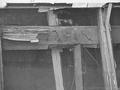
brakeby SeanBellComment: Too little contrast not sure what the focus of the shot is supposed to be. |
 Photographer found comment helpful. Photographer found comment helpful. |
| 07/04/2005 01:24:58 PM |
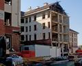
Demolitionby burtctComment: Subject is too jumbled not sure what I was supposed to be looking at. I don't see demoltion not enough focus . |
| Photographer found comment helpful. |
| 07/04/2005 01:23:17 PM |
|
| Photographer found comment helpful. |
| 07/04/2005 01:22:48 PM |
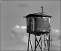
Dry Towerby BlackDotComment: Well composed , while I am by no means an expert in photoshopping things I think this photo has a ton of potential that hasn't yet been realized. I think by playing with levels and textures you could get an excellent shot out of this. |
| Photographer found comment helpful. |
| 07/04/2005 01:20:00 PM |
Foreshadowingby ecdillonComment: Nice use of shadow and negative space. While the exposure is a bit dark it works .. excellent composition. I don't know how I would have felt about use of highlighting that may have messed up the cassette shadow. |
| Photographer found comment helpful. |
| 07/04/2005 01:17:26 PM |
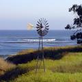
Old Windmillby beckettbootsComment: Very nice tone and saturation. I think you should have cropped a bit off the left because that emptiness combined with the tree on the right makes the picture feel too lopsided. A longer exposure giving motion to the windmill would have been nice too bad the clouds weren't cooperating with you. |
| Photographer found comment helpful. |
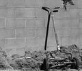
| 07/04/2005 01:15:42 PM |
Dad's old mowerby jaaadComment: Good subject, personally I feel this is a case of trying to force a picture into the rule of thirds when it doesn't really make sense to do that. The empty space here is not contributing to the shot and actually adds ugly space to the shot. |
| Photographer found comment helpful. |
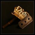
| 07/04/2005 01:14:23 PM |
Razor Sharp by carlosComment: nice shot I like the composition. Good subject I am always more critical of lighting on staged shots since you have the opportunity to play with it. In this case I think a bit more highlight on the piece hanging down might have been nice. |
| Photographer found comment helpful. |
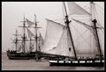
| 07/04/2005 01:12:51 PM |
18th Century War Shipsby KonadorComment: Very nice shot I think the framing is too thick but, that is a personal taste thing. If you played with levels a bit could you have brought out a little more contrast ? |
| Photographer found comment helpful. |
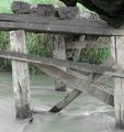
| 07/04/2005 01:11:23 PM |
Bridge (gone) to greener pasturesby gprinslooComment: Exposure is a bit too long and has washed out the colors. You might have been trying to get the flowing effect of the water which made you lengthen the exposure time , but, then you need to compensate with smaller apeture , or a ND filter. |
| Photographer found comment helpful. |
Home -
Challenges -
Community -
League -
Photos -
Cameras -
Lenses -
Learn -
Help -
Terms of Use -
Privacy -
Top ^
DPChallenge, and website content and design, Copyright © 2001-2025 Challenging Technologies, LLC.
All digital photo copyrights belong to the photographers and may not be used without permission.
Current Server Time: 08/05/2025 07:46:12 PM EDT.