|
|
|
Showing 241 - 250 of ~1263 |
| Image |
Comment |
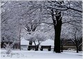
| 04/08/2008 01:49:24 AM | March Madnessby Donna21Comment: Hi Donna, here's a critique...
This is a great snow image. The detail in the trees is amazing. I would be tempted to crop this image closer. The buildings on the left don't really add to this composition. I'm not sure about the right - there's some really nice branch detail there, so you'd have to trade this off against getting rid of the building. So I'd try some closer crops to see how much of these can be removed and still keep the feel of the image. The tree and the benches are the important part, and enough of the detailed branches needs to be kept to show the feeling. There's some subtle colours here. I can see blues, greens, and also some warmer pinks on the left, with an almost peach-blossom feel. I would work with some colour balance adjustments to see what can come from these subtle colours, and whether they could be enhanced, or desaturated to improve the overall image. |  Photographer found comment helpful. Photographer found comment helpful. |
| 04/08/2008 01:31:41 AM | Just Thinkin'by karmatComment: Lovely shot, and a lovely letter to go with it. :) I'm sure my 4yo daughter would love a pink portrait of herself. There are 2 things that I think let the photo down in the scores. Firstly, the soft focus is great, but needs to be sharpened. Soft focus is a large area softness, and still needs the pixel-size sharpening on top so that soft focus doesn't lean toward blurry. The other thing is the dynamic range. This is a great high-key portrait, but the highs don't quite go to white. Careful tweaking of the levels or curves will improve this image a lot. And white BW is nice, a little bit of pink never goes astray. :) | | Photographer found comment helpful. |
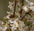
| 04/08/2008 01:20:41 AM | Early springby SoulMan1978Comment: Critique...
I agree with the comments made. The bee is the focus of this image, but it doesn't stand out from the flowers at all. A different viewpoint may have helped to outline the dark bee against some light flowers instead of blending in to the dark stems. I would crop off 3/4 of this image, leaving the bee in the top-right thirds point, so it's looking down into the image. Then dodge the bee to bring it out a little. | | Photographer found comment helpful. |
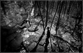
| 04/08/2008 01:14:47 AM | The passion of rock climbingby keibo84Comment: Hi Kei. Here's a critique for you...
I think the comments have already covered this one. BW shots in particular need good large areas of light and dark to define the composition. This photo is all high contrast detail. Half close your eyes and stand back from your computer and it's hard to see anything in this image. Even sitting close, it took me a bit to figure it out, and I didn't even see the climber at first. He's the focus of the image, so the viewer's eye should be drawn to him first, and then be allowed to wander around the other details. An image needs large detail as well as small detail. If left in colour with less contrast, perhaps the blocks of colour will help to define it better? A closer viewpoint would help, preferably without the harsh backlighting. The wide lens could do some really great shots of this. I like the spread-limbed pose of the climber, which would be enhanced if you got really close to him and cut out the trees/mats/other person. You do have some other better climbing shots. :) | | Photographer found comment helpful. |
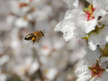
| 04/08/2008 01:03:17 AM | Bby VenomComment: Hi Brandon, I think your lighting and colours are really good. With advanced editing, you could certainly do a little dodging/burning to drop the background and bring out the foreground a little, but it doesn't need much. Ideally the foreground flowers would be a little more crisp focus with a flower right in front of the bee, but that's pretty hard to control. :) You could crop this shot closer, use some USM to sharpen it really crisp, and add a nice white border, and I think this shot would have scored better. | | Photographer found comment helpful. |
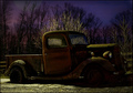
| 04/08/2008 12:58:29 AM | Night Runner...by NikonJebComment: Hi Jackson. Well, as the comments indicate, it is very dark. Perhaps it shows differently on your monitor. Get a print made and you'll see what others see, and then you'll probably agree that it's too dark. I think a lot could be improved with adding off-camera flash lighting, but it would be hard to do well without destroying the dark streetlight character of this truck, which is very nice. I can see why you like it as it is. Composition may be improved with a wider lens to get a more dynamic angle on the truck without losing the nice colours in the sky. I like the contrast between the cool background and the warmer foreground lighting. But as was said before, I think the only reason you didn't score better is that it is so dark, and the truck is lost in the contrast. | | Photographer found comment helpful. |
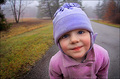
| 04/08/2008 12:46:28 AM | Hello there!by timfythetooComment: Hi Tim, another great shot of Rowen. The sharpening is slightly overdone for me, and has instroduced some colour seperation, like it's printed on a printing press, and the colours haven't lined up properly. But I love the colours and the light. | | Photographer found comment helpful. |
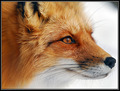
| 04/08/2008 12:32:56 AM | Red Foxby AlainComment: Great shot Alain! It looks like snow in the background, which really adds to the shot, even if it isn't. :) | | Photographer found comment helpful. |
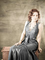
| 03/04/2008 10:33:29 PM | Teresaby signal2noiseComment: I like the dress as a silver dress better than the blue. Much more elegant. :) I agree with most things already said, so I won't repeat, but nobody has commented on her eyes. She looks crosseyed, and a bit woozy with half-closed lids. As she's looking down, it's really hard to get the eyes open unless you specifically tell her to open them. Alternatively, tilting the head forward more can help to open the eyes. One of my friends closes his eyes a lot in photos, and I worked out it's because he lifts his chin for photos, and that results in closed eyes. With his chin down and in, his eyes are much better. | | Photographer found comment helpful. |
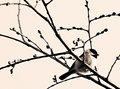
| 03/04/2008 10:22:38 PM | chickadeeby krnodilComment: An editing idea for you - you could try leaving the colour in the bird, and just desat the rest of the image. | | Photographer found comment helpful. |
|
Showing 241 - 250 of ~1263 |
Home -
Challenges -
Community -
League -
Photos -
Cameras -
Lenses -
Learn -
Help -
Terms of Use -
Privacy -
Top ^
DPChallenge, and website content and design, Copyright © 2001-2025 Challenging Technologies, LLC.
All digital photo copyrights belong to the photographers and may not be used without permission.
Current Server Time: 08/06/2025 03:40:14 AM EDT.
|