| Image |
Comment |
| 05/02/2008 08:22:08 AM |
Melby chesireComment: Nice crisp contrast. A little background seperation would be nice, maybe with a rim light on the left side to balance the off-centre subject. But overall, I like it. |
 Photographer found comment helpful. Photographer found comment helpful. |
| 05/02/2008 08:20:40 AM |
Salt Princessby NaldComment: I like the slightly dirty colours of the background. It makes a nice contrast with her dress. Here skin tones are a little too orange, but the composition is good. I wish her eyes were open. :) |
| Photographer found comment helpful. |
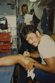
| 05/02/2008 08:17:21 AM |
DIY Surgeryby Art RoflmaoComment: The guy in the background is reading your instructions from the standard Navy procedure document for "My wife shot me with a BB gun", right? :) |
| Photographer found comment helpful. |
| 05/01/2008 01:27:21 AM |
The Calmby timfythetooComment: Wierd, that's 2 challenges in a row that a Too has been first up on my voting list! (The odd one out was first up too.) With nearly 500 entries, that's pretty wierd. :) Anyway, back to this image, I'm wondering what it is saying. It's called the calm, but he actually just looks sleepy, with half-closed eyes, slightly grumpy mouth and messed up hair. NR is a bit severe with some soft patches. I love the simle lighting setup and the vignette - is this your 430 in the background, or PS vignette? Overall, another nice portrait from the Too family. :) |
| Photographer found comment helpful. |
| 04/25/2008 07:49:55 AM |
Blue Dayby rinacComment: Pentax have actually invented an intelligent time-correction sensor. The camera looks at the photos and surroundings, taking into account fashions and cultures, etc, and adjusts the time accordingly. Unfortunately this function has been having some problems in NZ, where the results have been mis-calculated up to 15 years in the past. Pentax are still working on this problem, and apolgise for the inconvenience. :) (Tee hee hee)
|
| Photographer found comment helpful. |
| 04/25/2008 07:19:20 AM |
IMG_7891-colorborder.jpgby timfythetooComment: Nice composition, and good lighting balance between foreground and background. Overall a nice picture...except for the fact that she's giving you that "Hey you, get yourself and your camera outta my kitchen" look, and the guy is thinking "I'm just cuttin' up these rolls, I'm not getting involved. Yep, this is me, just cuttin' rolls.". Sorry, I couldn't resist. :) |
| Photographer found comment helpful. |
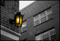
| 04/13/2008 04:51:50 AM |
Brightby cjoconn22Comment: Nice. I like the simple lines and composition. There's a slight bluish spot in the lamp, which is slightly odd, but overall very nice.
|
| Photographer found comment helpful. |
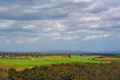
| 04/08/2008 07:00:52 AM |
Serenityby ChinabunComment: Here's a critique for you...
Well, this is a photo of some blue and some green. To really hold the viewers interest, a landscape needs to have some promiment feature or interesting lines to make the composition. This photo has one straight line across the horizon, with blue and clouds above and green below. The colour of the green grass is very lush, but that's all this photo has in it. Find something interesting to add to the foreground, and make use of more depth to join the foreground object to the background. |
| Photographer found comment helpful. |
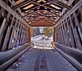
| 04/08/2008 03:41:56 AM |
Under The Covered Bridgeby ZeppKashComment: Hi Jason, a critique for you...
Nice HDR work without going overboard on the HDR. :) This seems to reflect well what you probably saw when you were there. The texture and shape of the bridge seems to be making a frame. It's a nice pattern of lines and the perspective directs the eyes to the picture in the centre of the frame. Unfortunately that picture within the picture is very small, and there's not a lot there, and I think this is where the picture is lacking. Maybe if you walked further along the bridge, it would open up a nicer scene behind? Or mabye make it a portrait location for somebody in winter clothing, sitting against the wall, or walking in or out. This shot doesn't quite work as a standalone landscape, but it makes a nice location, and is just waiting for the addition of an interesting subject. Message edited by author 2008-04-08 03:43:27. |
| Photographer found comment helpful. |
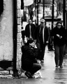
| 04/08/2008 03:36:27 AM |
Smoker's Havenby bradshawComment: Hi Ian, here's a critique for you...
The wide aperture does a reasonable job of seperating the foreground from the background, but to help this further, you could lighten the lady and darken the background a little. The high-contrast isn't really working in the foreground, and she looks like a newspaper printed cutout stuck onto the street.
It looks like the background is artificially blurred by editing. This shot would have been better taken at f/2.8 to get some genuine DOF blur, although you probably wouldn't get as much seperation as this unless you have a 5D with an 85 f/1.2 lens. :) Anyway, I like the feel you were going for. |
| Photographer found comment helpful. |
Home -
Challenges -
Community -
League -
Photos -
Cameras -
Lenses -
Learn -
Help -
Terms of Use -
Privacy -
Top ^
DPChallenge, and website content and design, Copyright © 2001-2025 Challenging Technologies, LLC.
All digital photo copyrights belong to the photographers and may not be used without permission.
Current Server Time: 08/05/2025 10:30:15 AM EDT.